A landing page UI/UX Design for B2B SaaS platform that provides AI services for dealerships.
CLIENT
Carbox (Previously CarShowroom)
ROLE
UI/UX Designer
SERVICE
Landing Page Website Design
Project Details
Problem
In the era of the internet and social media, utilising a marketplace for online selling is a must-have for all businesses, not excepting dealership businesses to sell their vehicles online. To increase the chance of getting more sales in the crowded sea of the internet, having a professional car image that uses a stunning showroom background can increase the sales potential, but, the showroom cost itself is high and not all dealerships can afford that. That’s why, Carbox (Previously CarShowroom) provided the service to utilise AI to create a professional showroom background for the dealership without the need for an actual showroom and its costly price.
The client already has all the business ideas and requirements, they just asked us to create the most engaging way to showcase their business advantage in a professional, modern landing page.
Goals
Create a landing page website that consists of several pages to promote Carbox’s new SaaS platform for dealerships.
Create an interactive web design that is user-friendly and has a modern visual. The pages that need to be designed are the home page, about us page, showrooms page, pricing page contact us page, and signup/login page.
Role & Responsibility
My role here is as a UI/UX Designer who worked alone in designing the whole website for this client. I collaborated with the company CEO and their development team to discuss the features and information to be added to the site.
My responsibility is to design the requested web pages in high fidelity, create a prototype, create a version for desktop and mobile devices, and create a design system for future updates of the website.
Constraints
The design process is going well, the client is very communicative, and the requirements are clear and easy to understand. There is no real constraint that happened in this project, everything is going well until the end when the client is satisfied with the design.
Design Process
Since the client only wants the outcome to be a full-page website design in a quite short time, they just need us to deliver the high-fidelity design, thus not including time to do a deep research or ideation since they already have a detailed design brief. What we do here is just try to understand their business goals, look for their competitor, and jump to crafting the high-fidelity design. We didn’t create a rough sketch or wireframe since the client already gave us a design reference on the requirements document.
Competitor Analysis
The client gave us two of their competitor which are Autofox.ai and CarCutter. Their website content is just like a regular web design pattern but what I researched is about how they display information on their layout. The client also asked us to use some of the images from the competitor's website on the design since they don’t have any image assets at the moment and will be sure to change them later when available.

The research and competitor analysis phase is just to look for some reference. After that, we go straight to preparing the design style guide to be used on the design later.
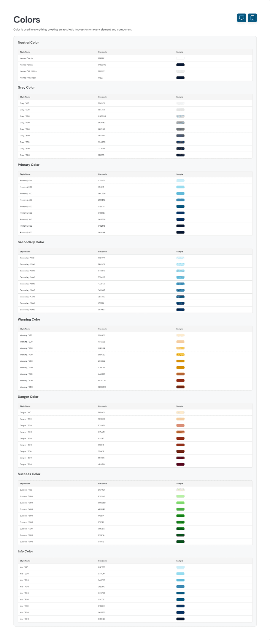
Design System
The client only requested that the main colour used should be blue. Other than that, we’re free to explore any design style to match it. Here, we create a design style guide for the colour, typography, and components.
For the colours, we used the blue colour as requested and added a secondary colour which is the lighter shade of cyan. The reason to chose this colour is because the client also gave us some reference on their previous website project and wants to reimplement it on this project too.
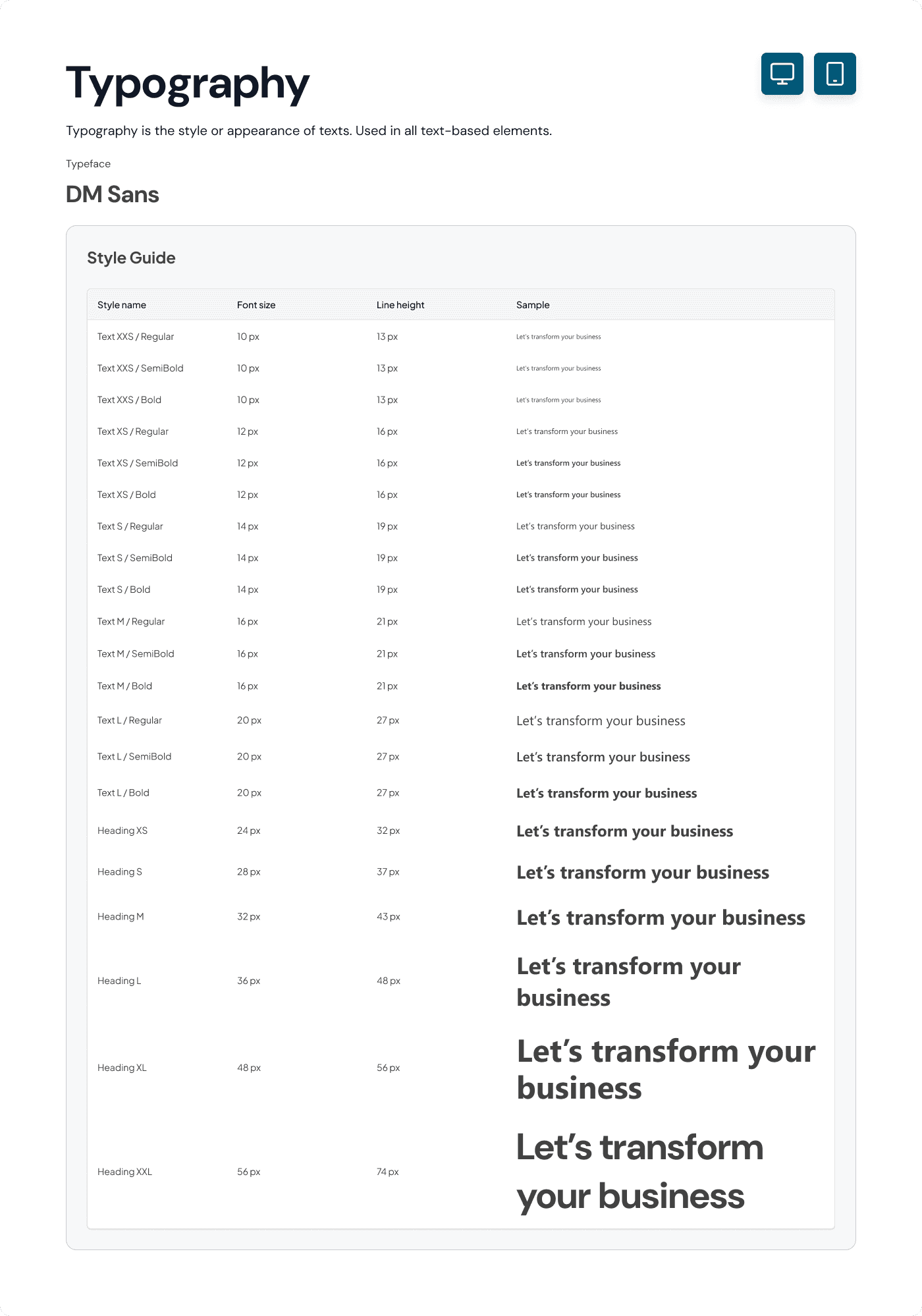
For the typography style, we initially used the Segoe UI typeface as the client referenced, but the developer had trouble installing it so we had to change the typeface with a font that is available on Google Fonts, that’s why we chose to use DM Sans as the main typeface.
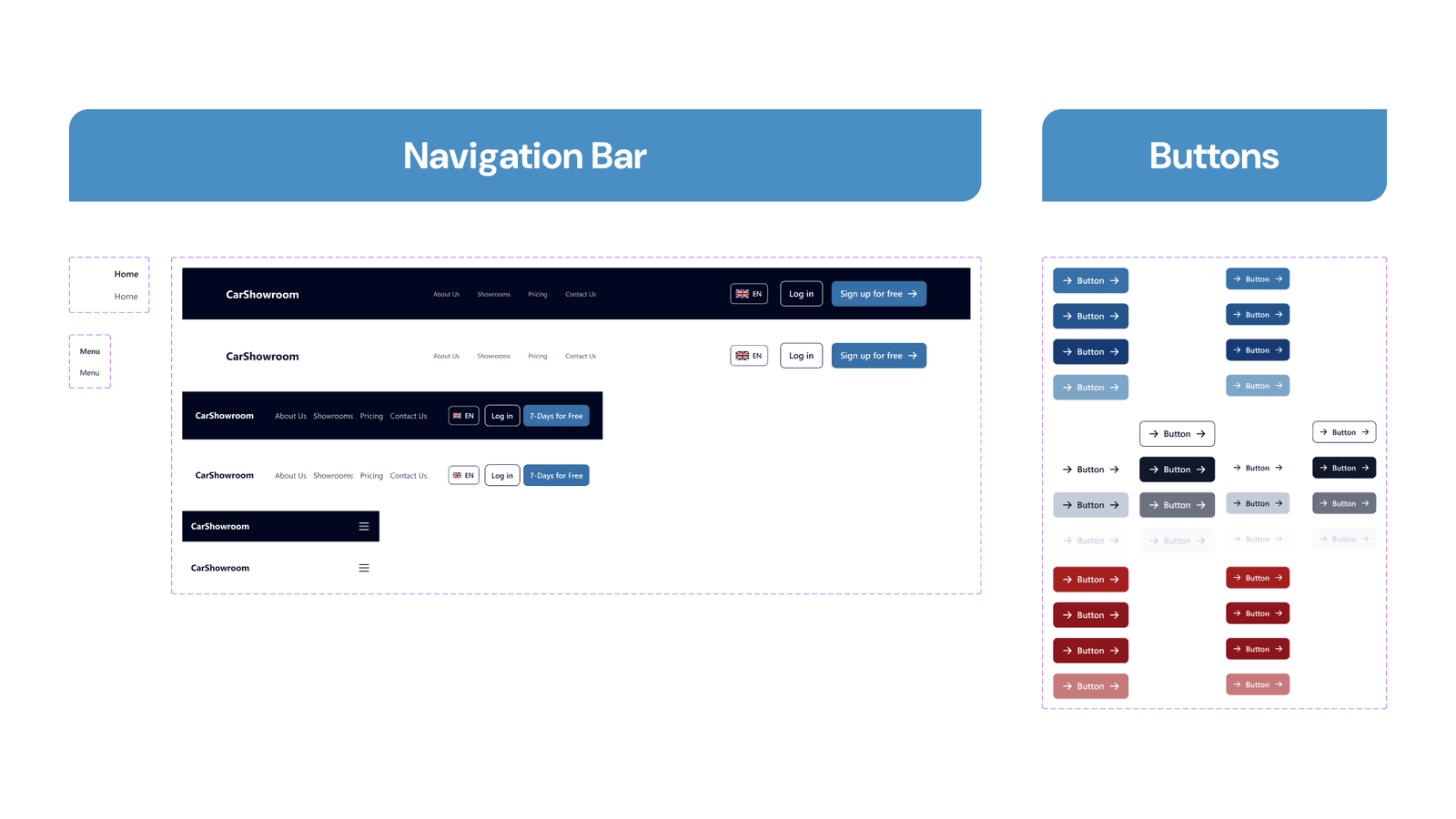
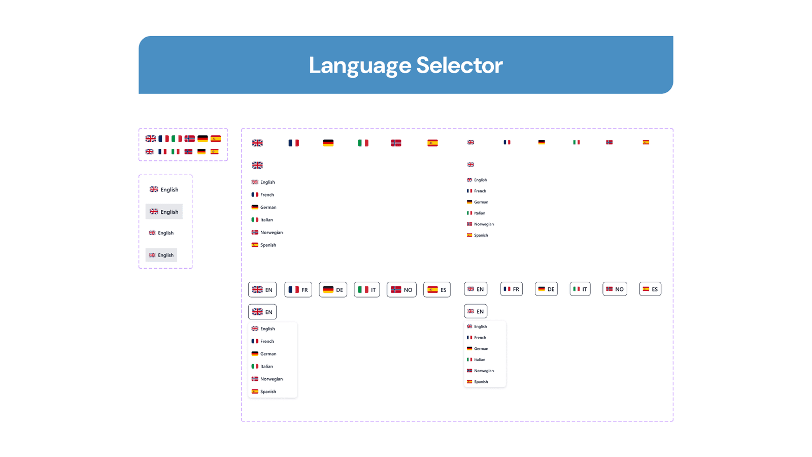
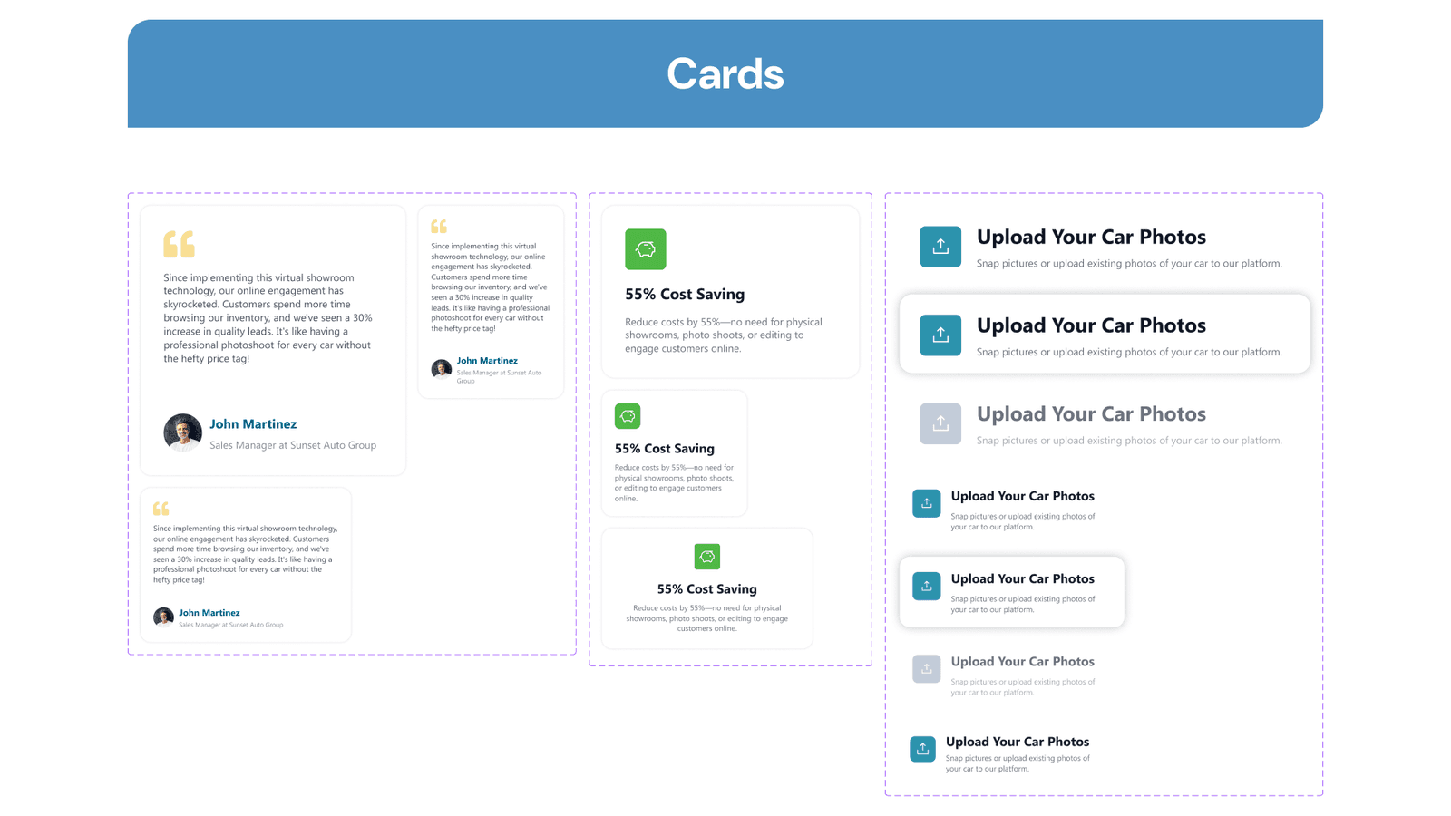
Along with designing the project, we documented various interactive components that we used, here are all of the design style guides and components that we created.
Final Design
Since the deliverable is a high-fidelity Figma design, we tried to explore and create the design directly using the defined style guide. Here is the breakdown of all the designs that we created on this project and approved by the client.
Home Page
The home page is the main page that will define whether users will stay to explore the website or go away, that’s why it needs to be designed to catch their attention and engage them with great content in each section. Here we will explain every section on this page and why it’s designed that way.
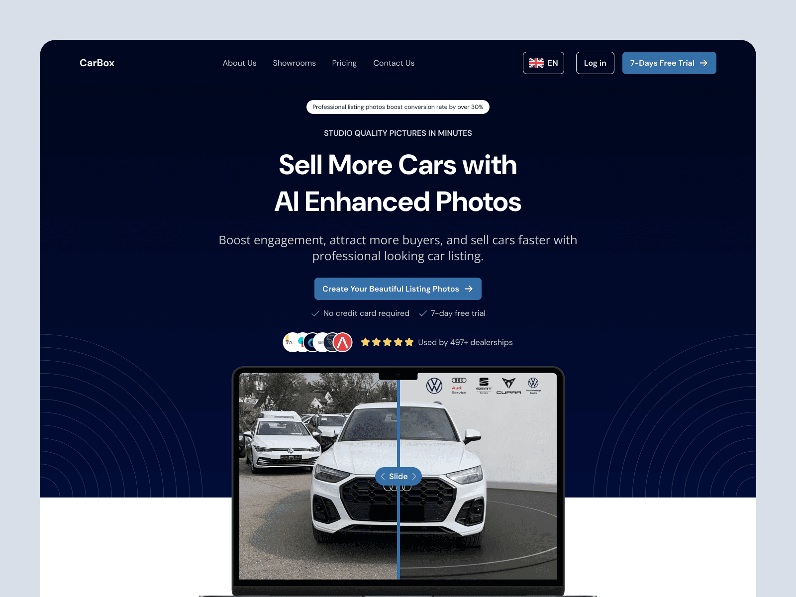
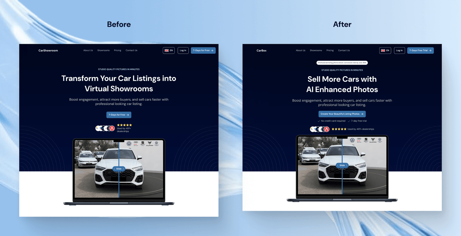
Hero Section
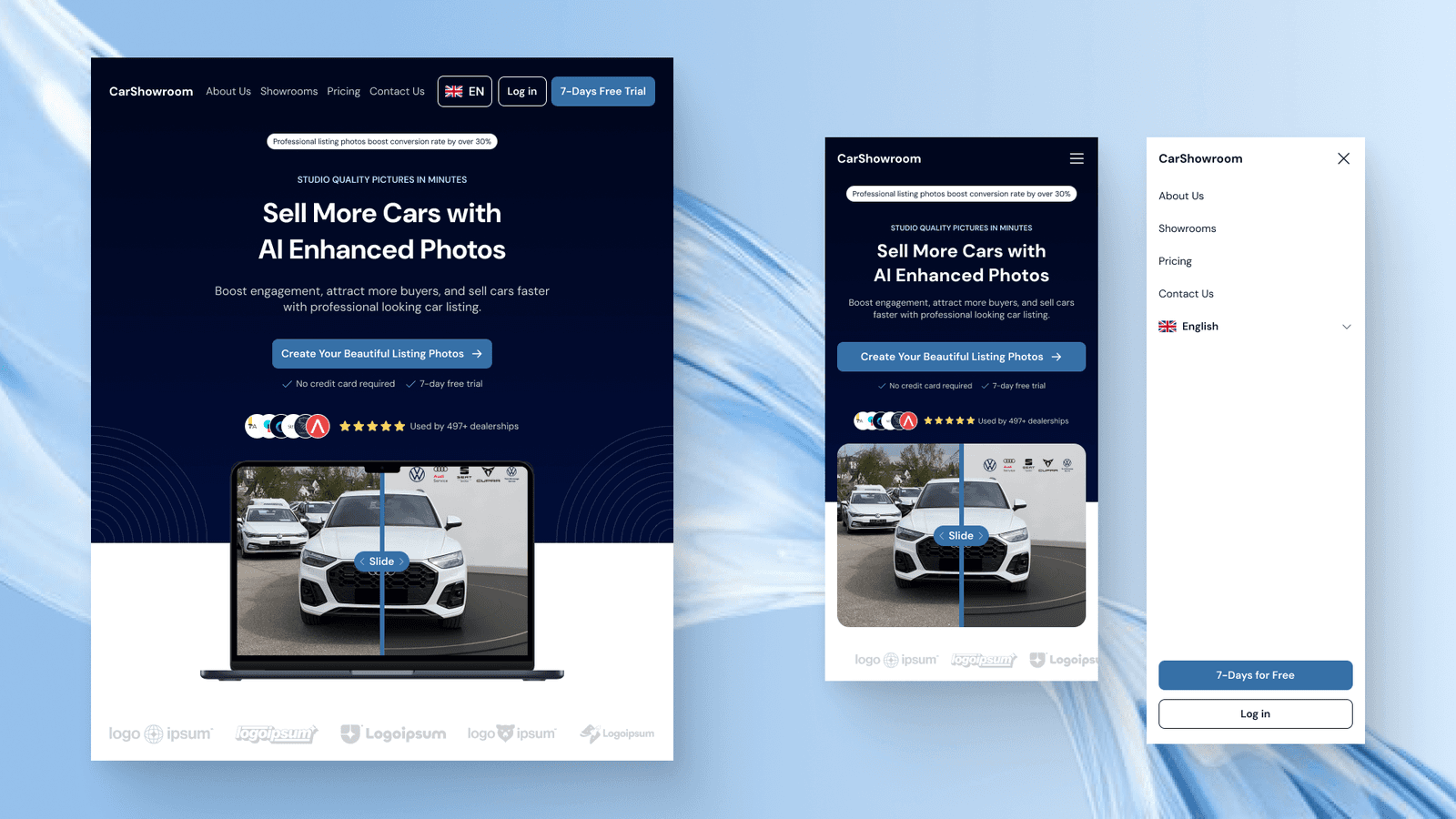
Since this is the section that users first see when entering the website, it has to be engaging and interactive making users want to scroll down to learn more. The content on this hero section is crafted with the main text and subtitle, highlighted text that says its main feature, a badge that shows the benefits of using the service, social proofs, CTA, and an interactive comparison slider that lets users slide between the before and after using the service.
The primary blue colour is used on every CTA and interactive design element. A dark blue gradient is used on the hero background with the addition of a circle line illustration. The reason behind this background design is to highlight the main information displayed in the centre of the page.
Other than the use of a dark background, the website implements a lot of white colour to show simplicity and minimalist design. Many elements of this design are interactive, such as the client’s logo under the laptop illustration that can be hovered to view the original brand colour. The comparison slider can also be played around by simply sliding it left and right to see the before and after using the service.
The client approved this hero section design by saying that this can be effective in hooking visitors and engaging them to interact with the site.
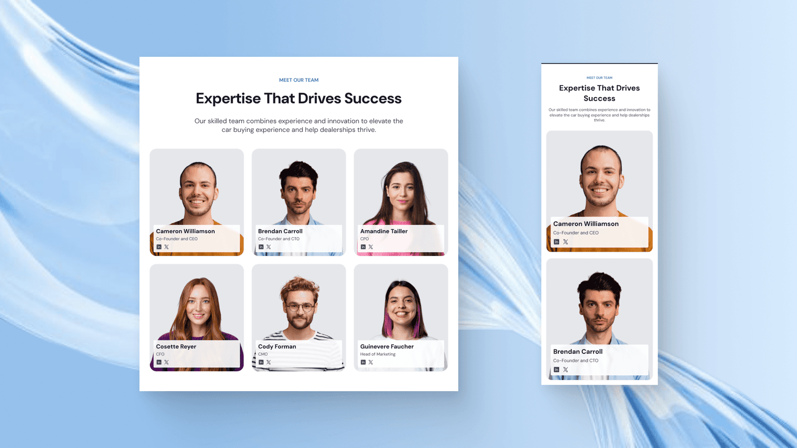
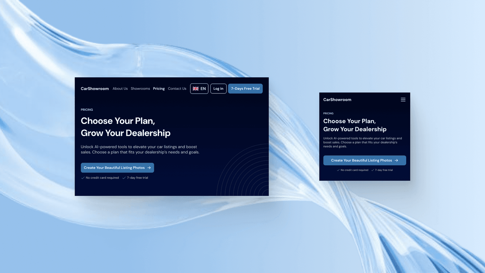
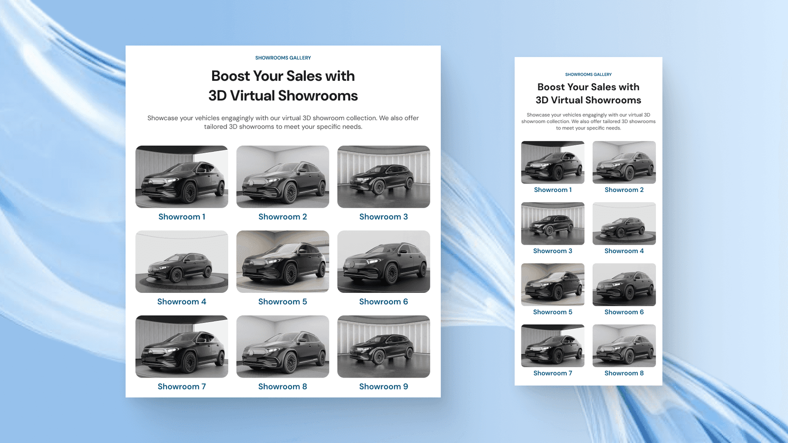
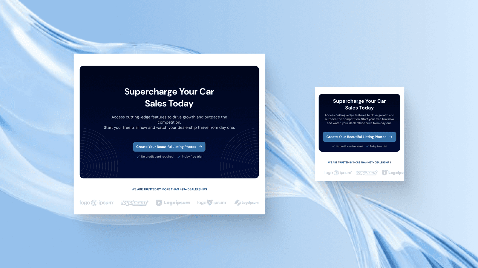
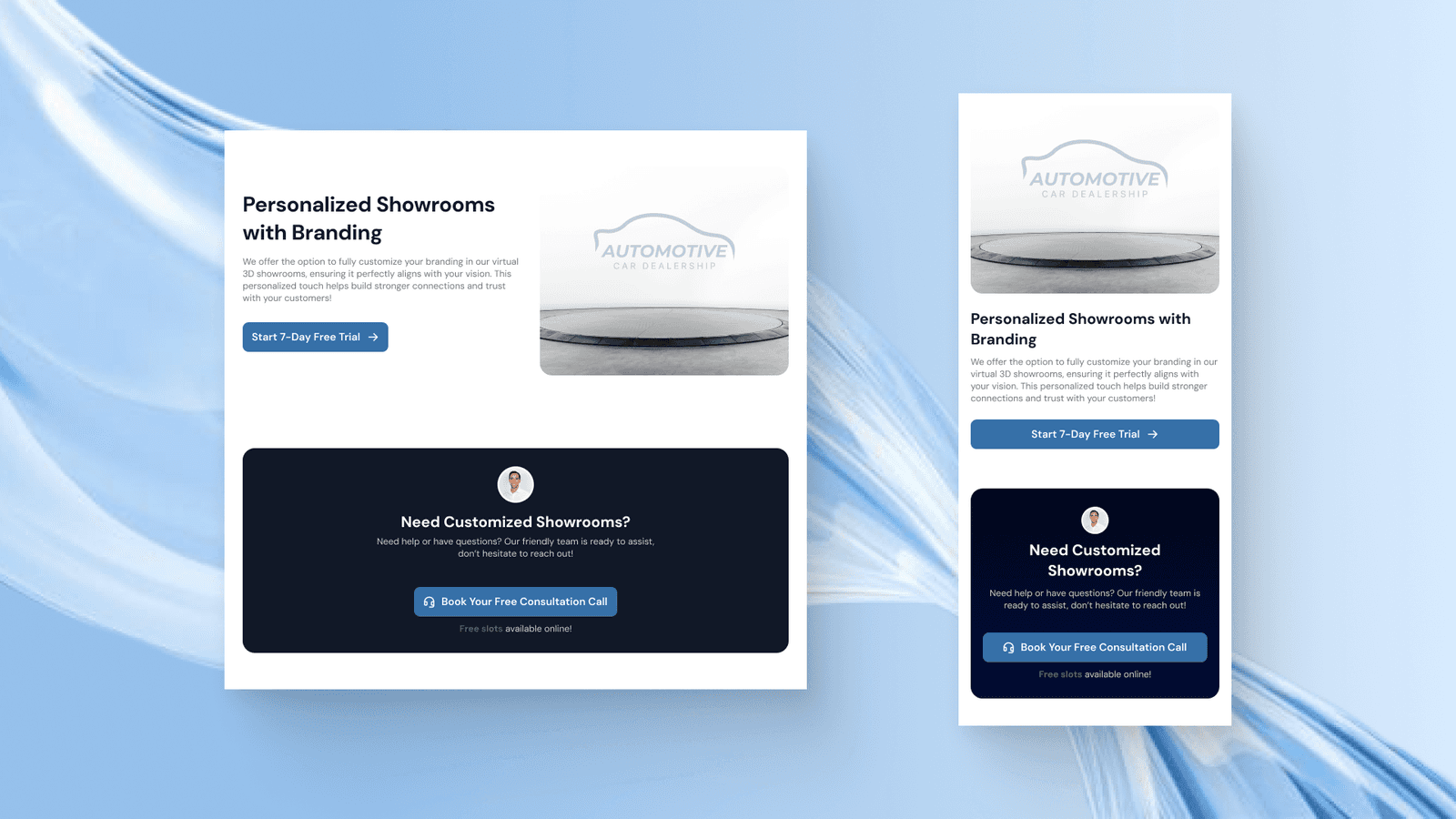
On all the design, we created the tablet and mobile phone versions of the design with all the interactivity still in place, like this one:
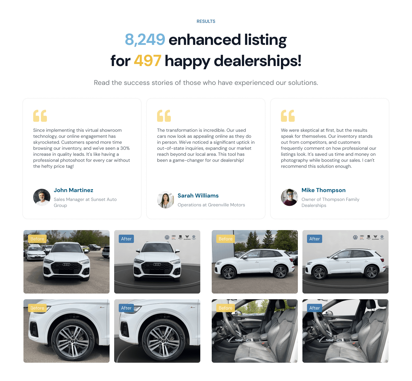
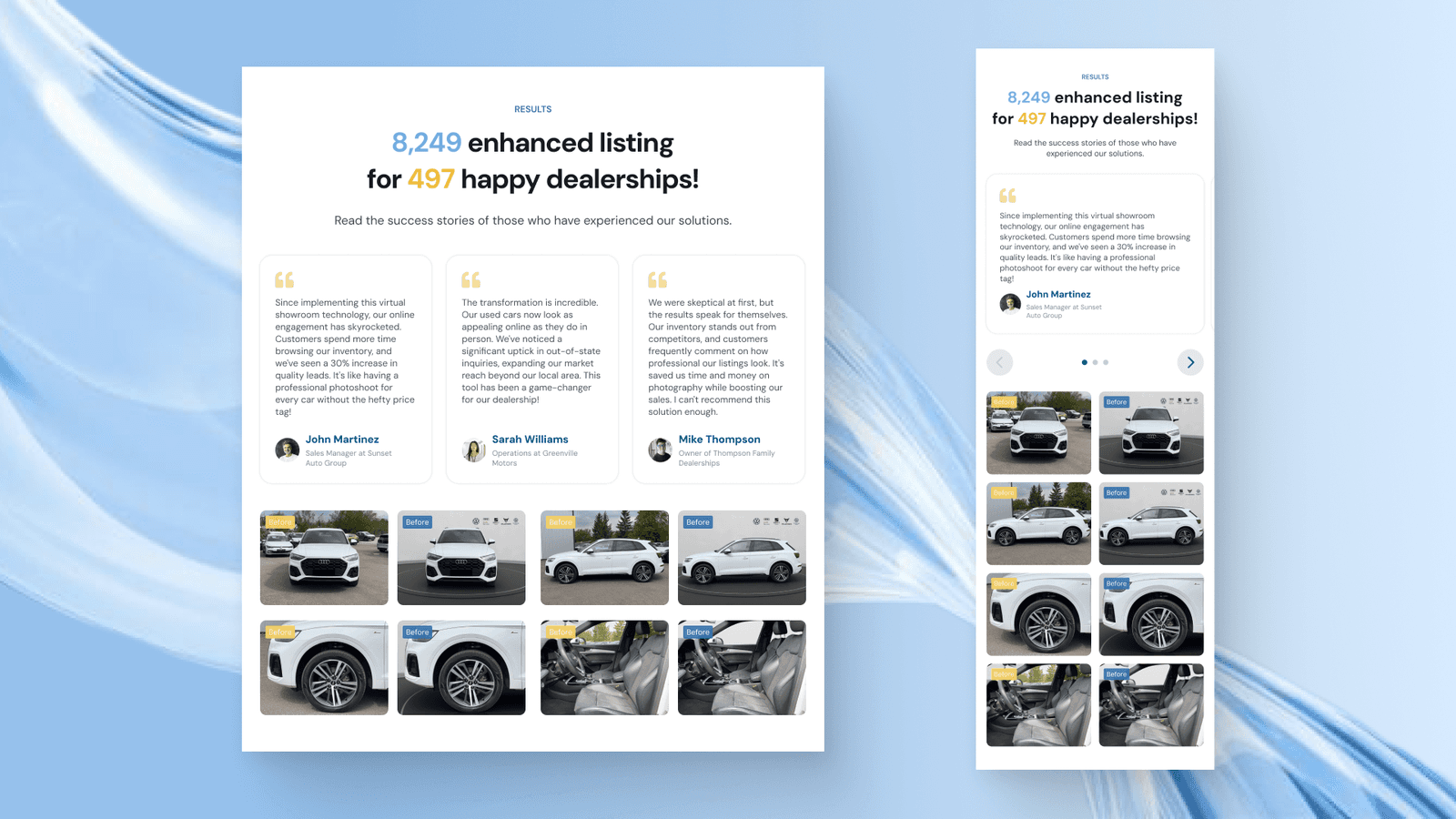
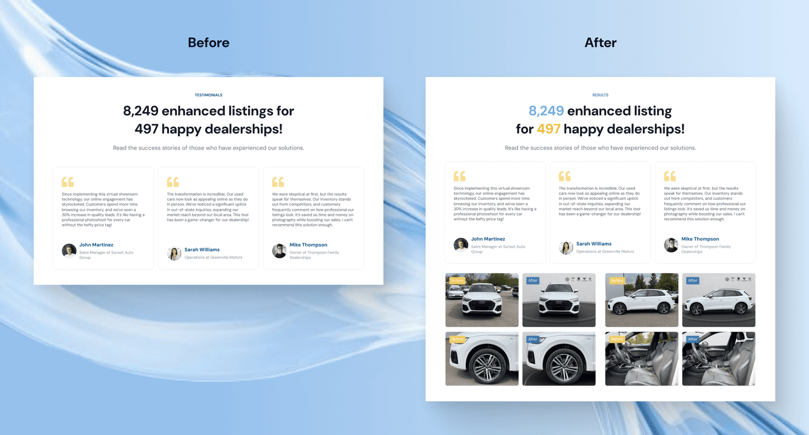
Result Section
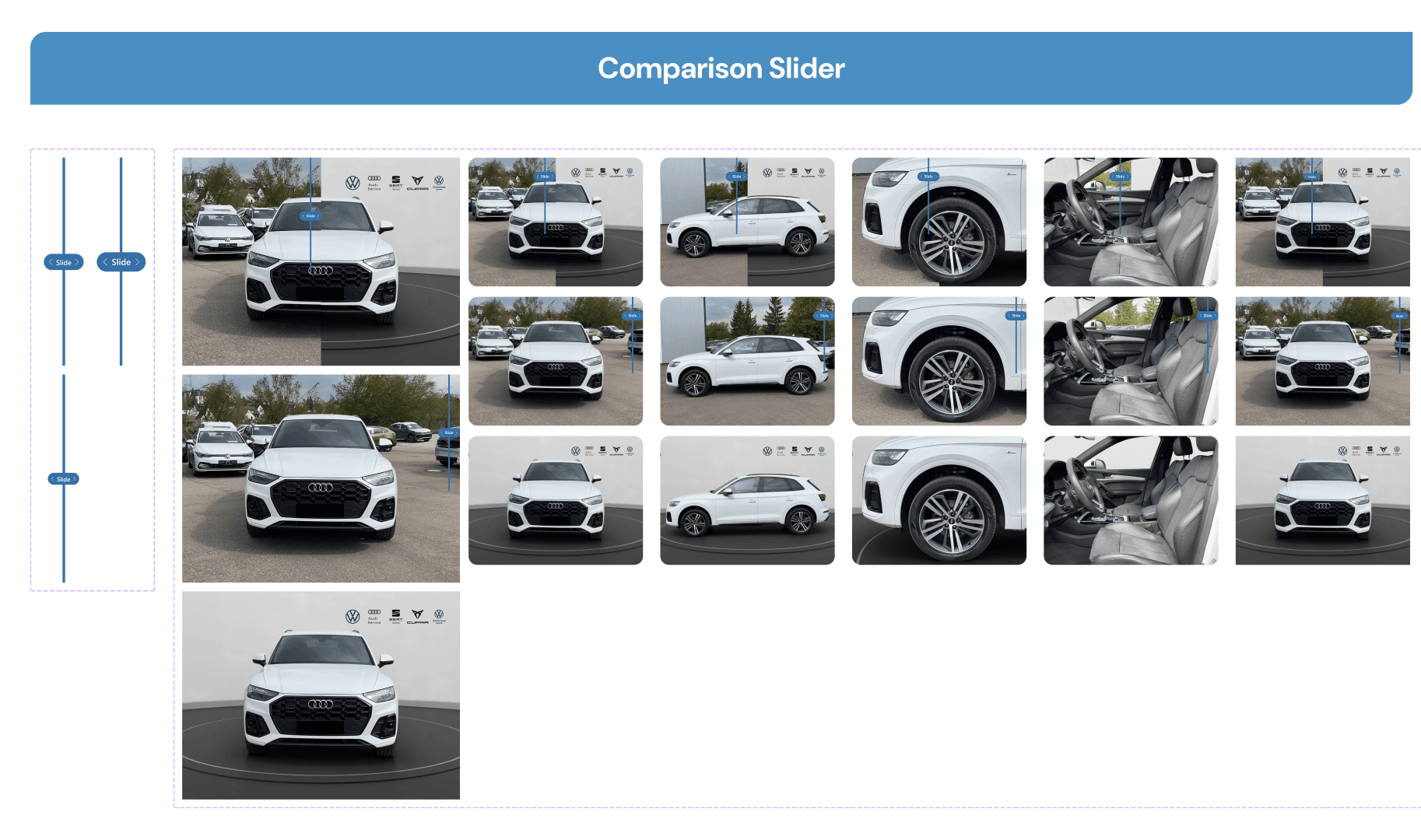
As the section to make users believe in the company service, we need to make sure to give as relevant social proof as possible. Here, we highlight the number of positive results that the company have achieved along with showing some testimonials and before and after images.
Here we use bright colours to catch users' attention and force them to view the highlighted information.
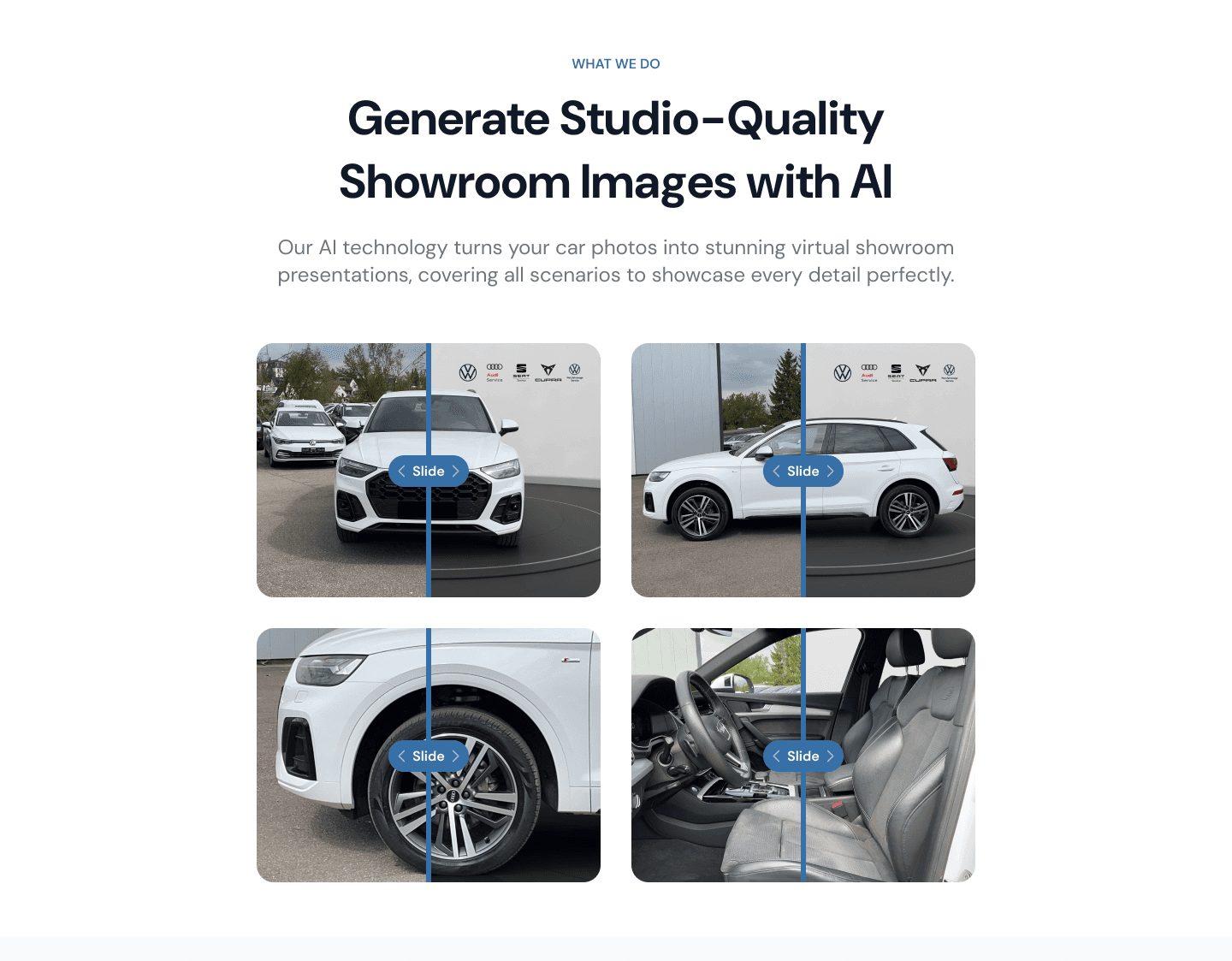
What We Do Section
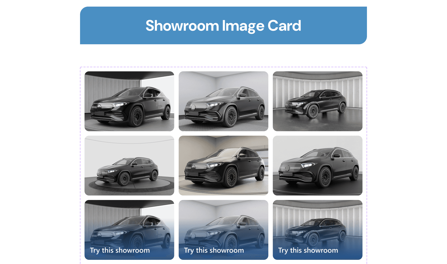
Next, we have a section to explain what the company do and why it solves users' problems. In this section, we have four comparison sliders of various car perspectives to show users that the company service can even be used in various use cases like changing the background of the car interior and from different angles.

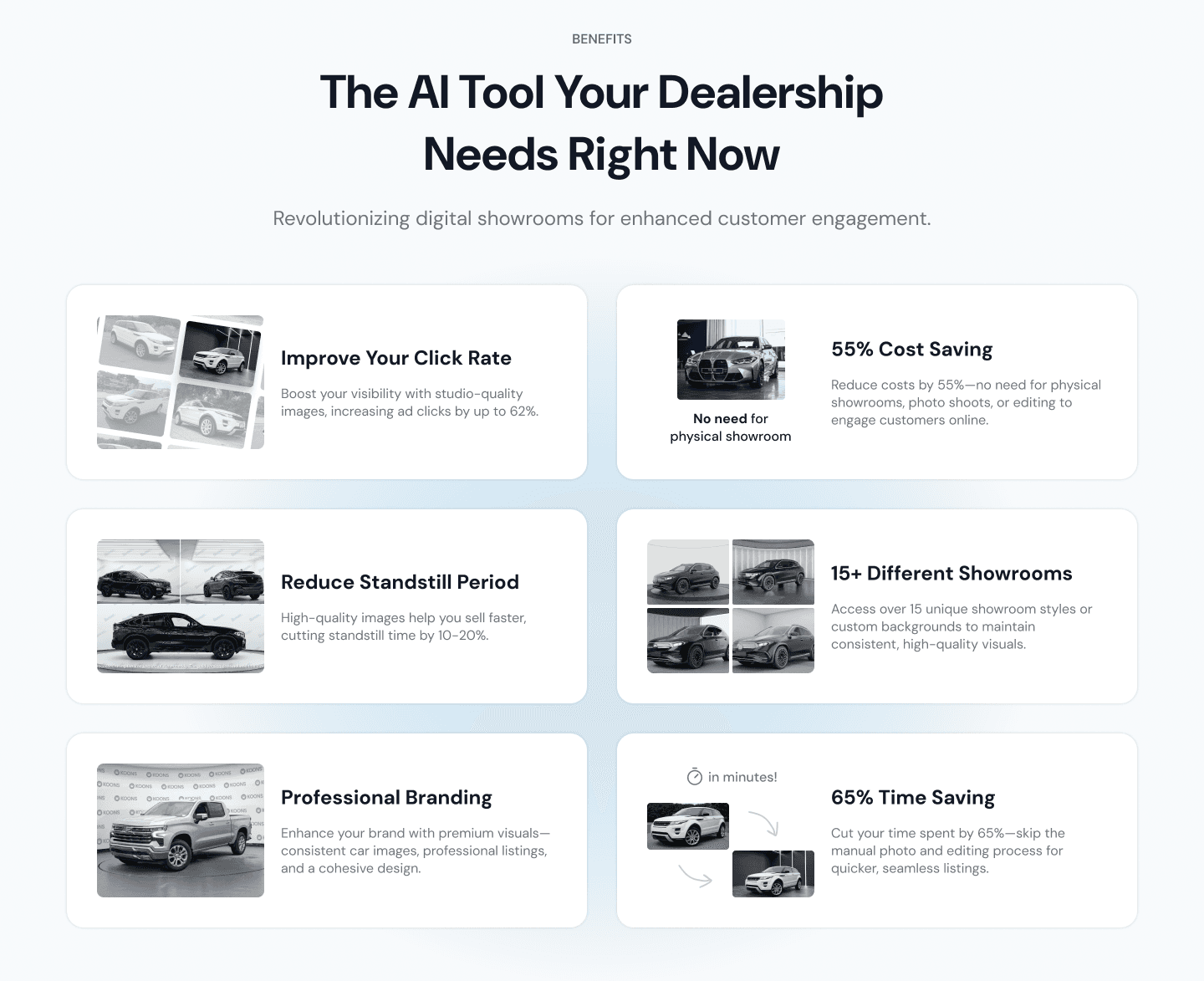
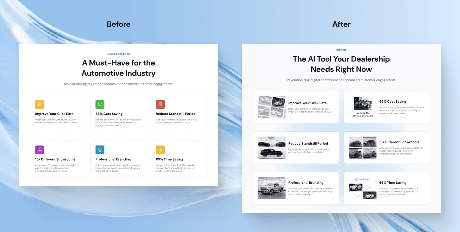
Benefits Section
Here is the features or the benefits section to show how this service is different from the traditional way and how it can help users increase their car sales.
The design here is created as a card that has text and respective illustrations. We designed it like this with a subtle radial gradient background to highlight each feature in a way that users will see it as a benefit that they have been looking for all this time.

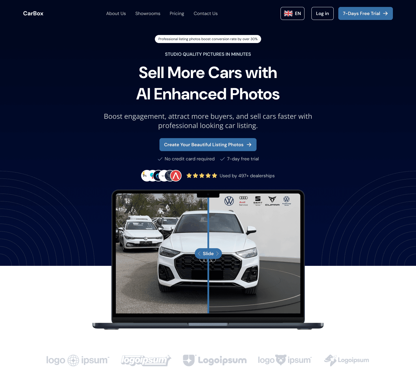
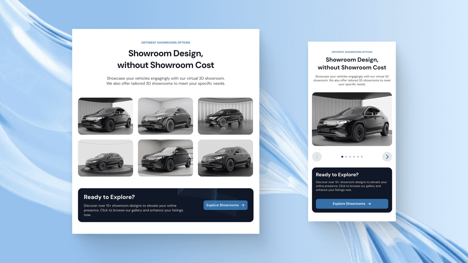
Different Showroom Option Section
After showing the benefits and features of using the service, we also displayed all the available showroom designs to show users that the business is real and has proof of work within creating a high-quality showroom background for their vehicle.
Under the six showroom designs, there is a small banner to engage users to explore more of the showroom design and try to create with their images.

On the mobile phone version of this section, the showroom design is created as a carousel slider for layout efficiency and interactiveness.
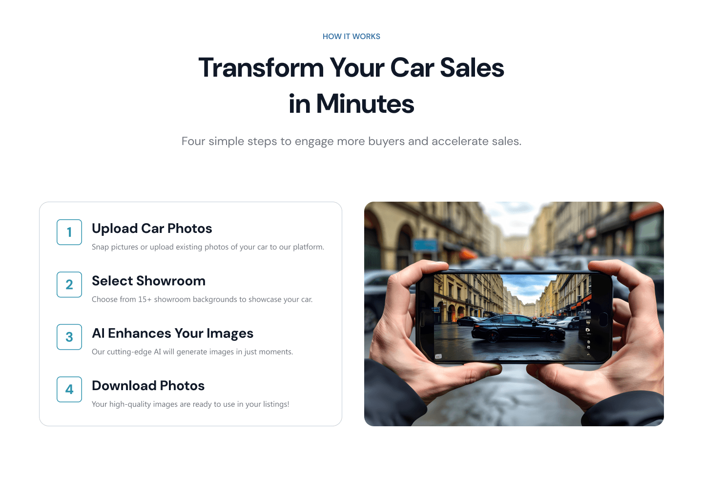
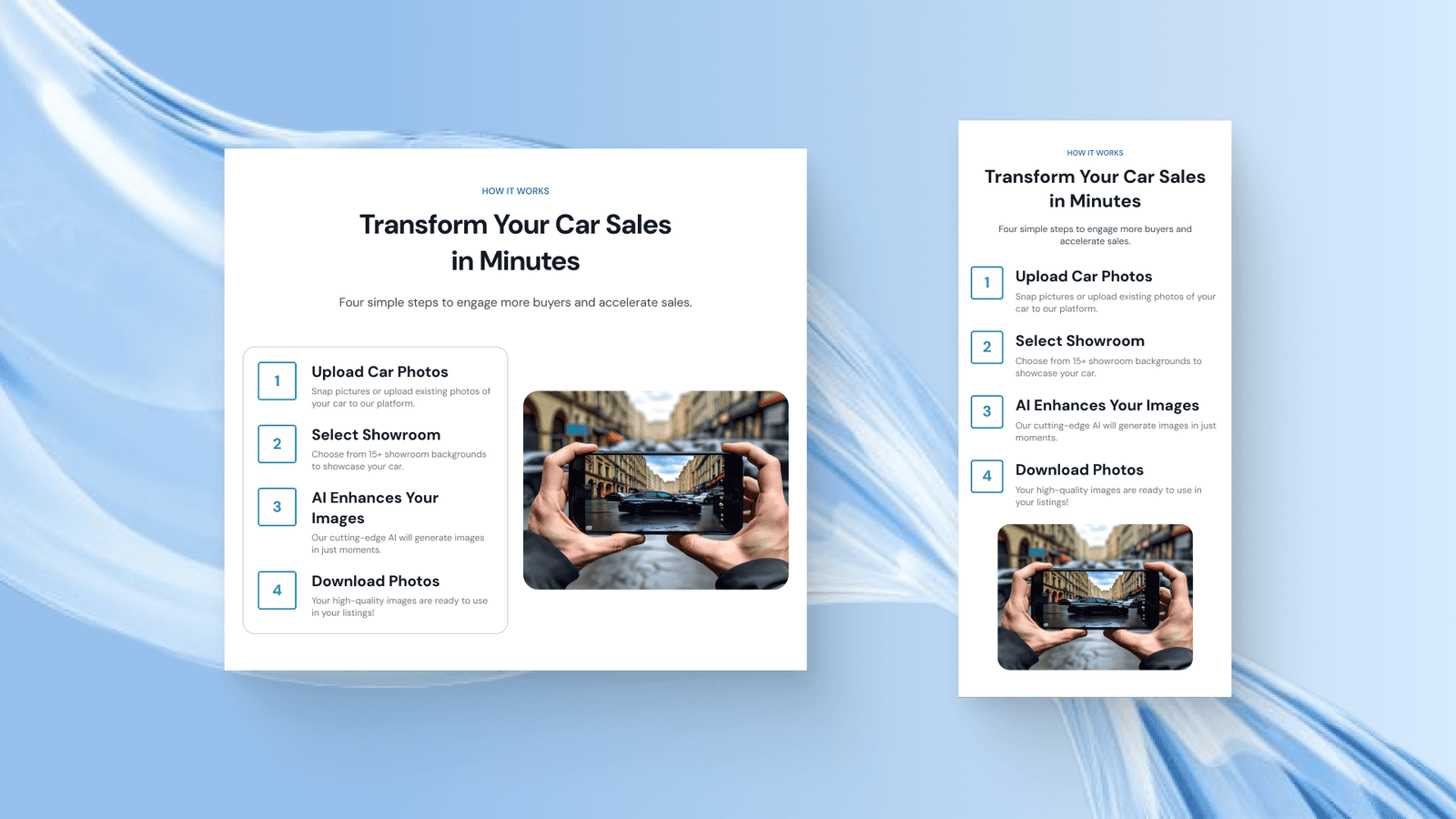
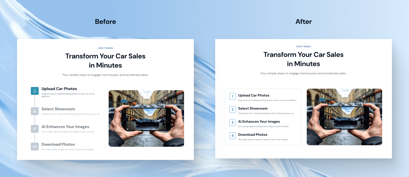
How it Works Section
Next is the how it works section which displays the 4 simple steps to get started in using the service. The design here contains the steps list on the left side and an image on the right which will change automatically when users hover over any steps.
The challenge in this section is how to make those steps flow nicely and feel natural. The use of numbers instead of icons is because we want each step instruction to be as clear and simple as possible so users will know how easy to use the service is.
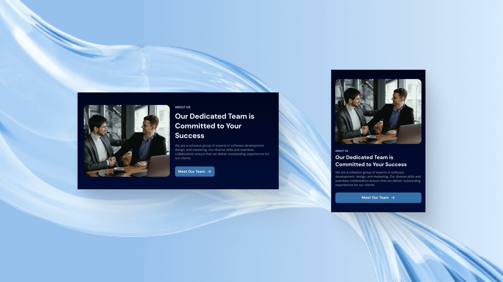
About Us Section
Then there is this brief about section that highlights the professional team behind Carbox and invites users to learn more about it on the About Us page. The design of this section is purposed to be brief information but highlighted enough so that it won’t be ignored by users, that’s why we use another dark blue fill here to match the balance of the overall content design.

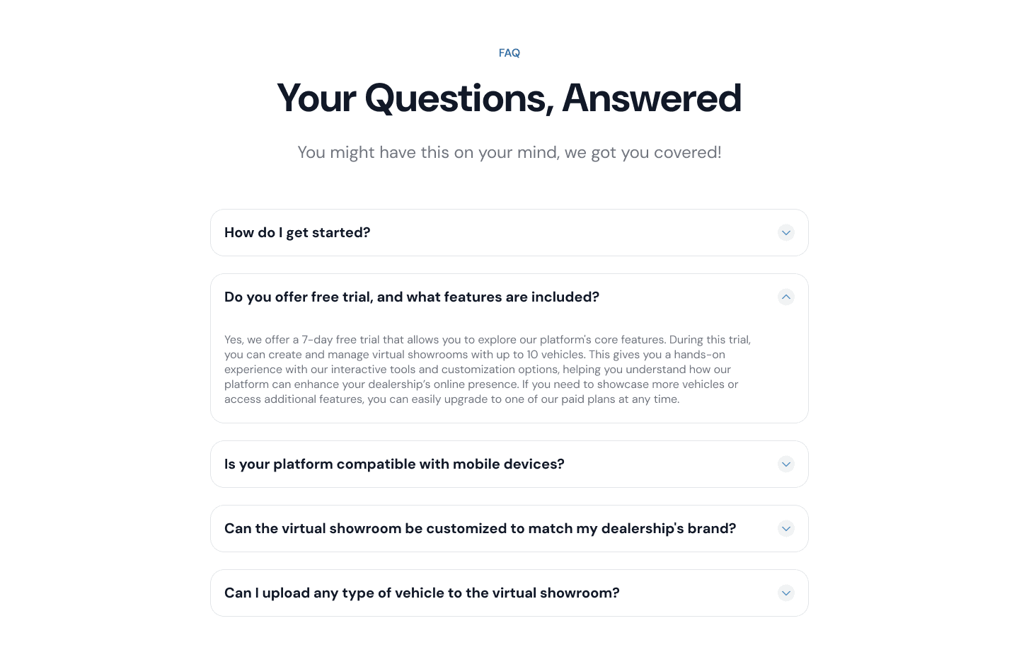
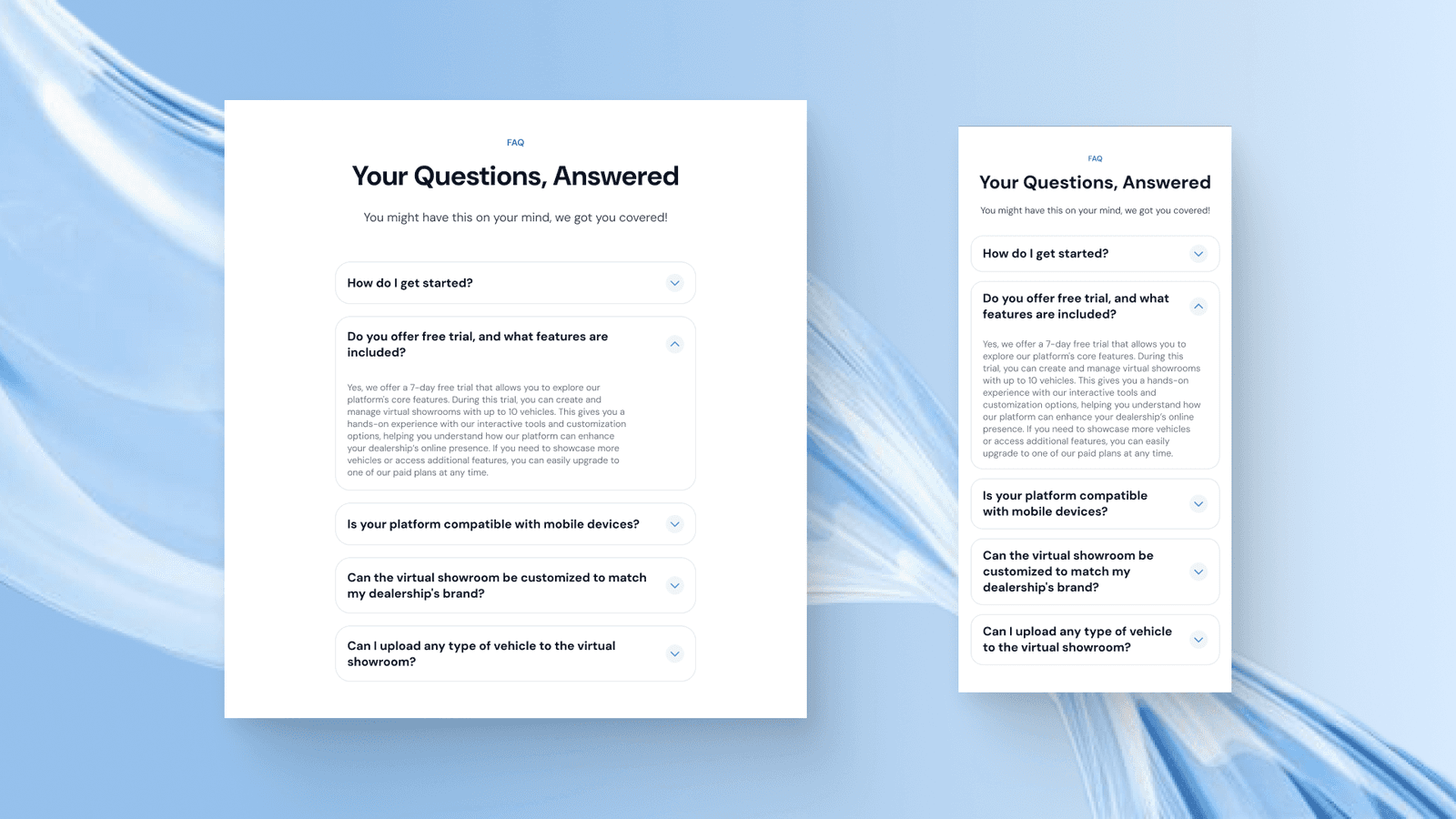
FAQ Section
Then there is this FAQ section that is quite standard pattern using accordions to display the frequently asked questions.
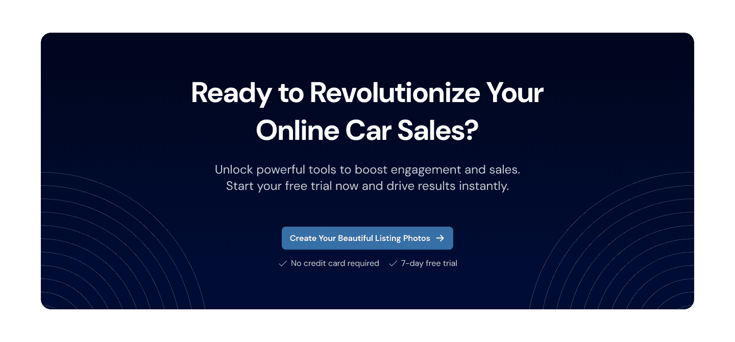
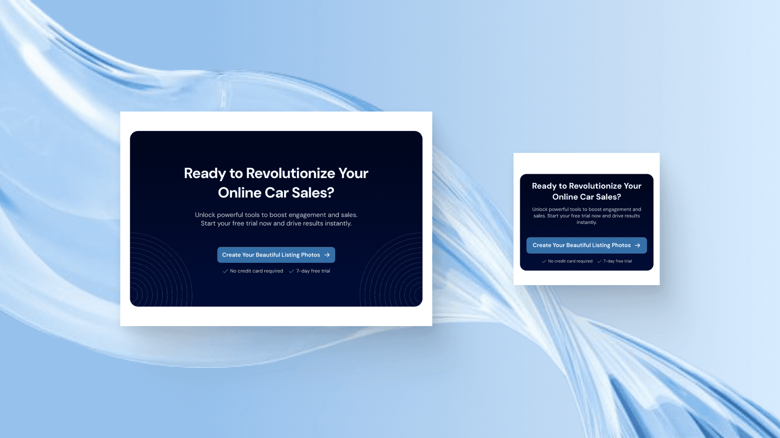
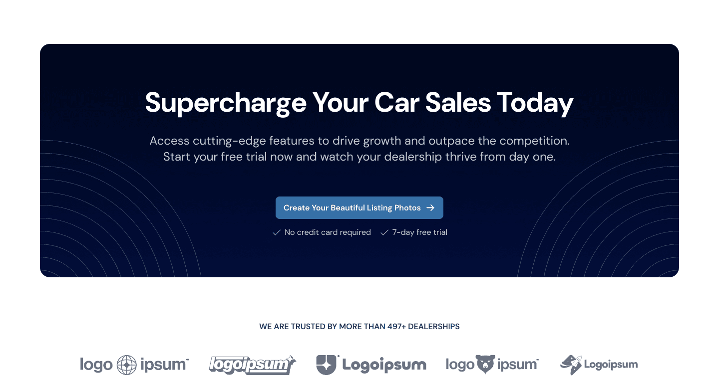
CTA Section
One of the most important sections on each web page is a CTA, CTA is crucial so that users will know what they should do after exploring all the information on the website. We designed the CTA section to meet the style of the hero section because we also want the design to highlight the main text and button in the centre.
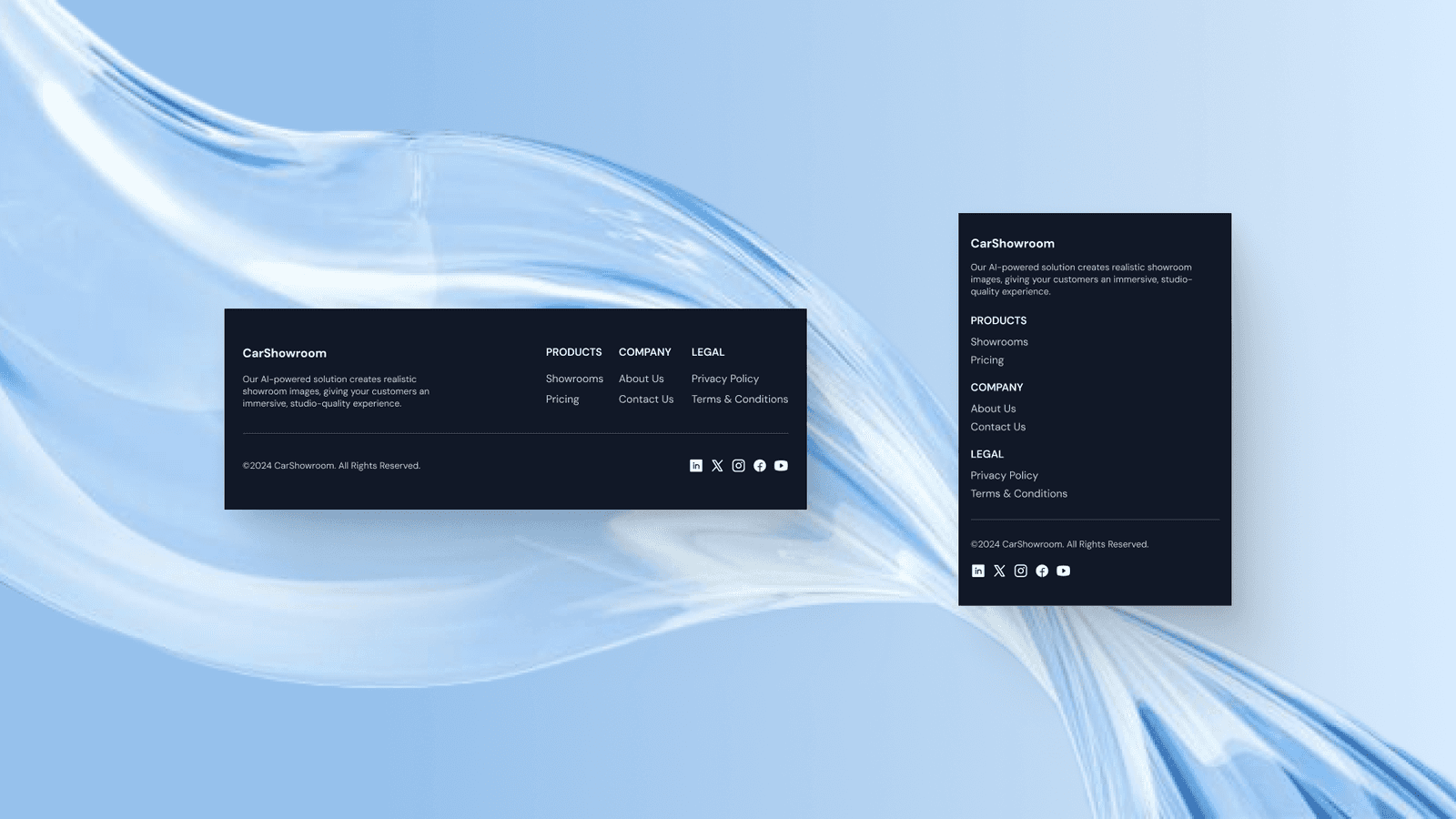
Footer
Here is the footer design that we created for this project. The footer is simple and clean by using a flat dark colour and has just enough information to show.

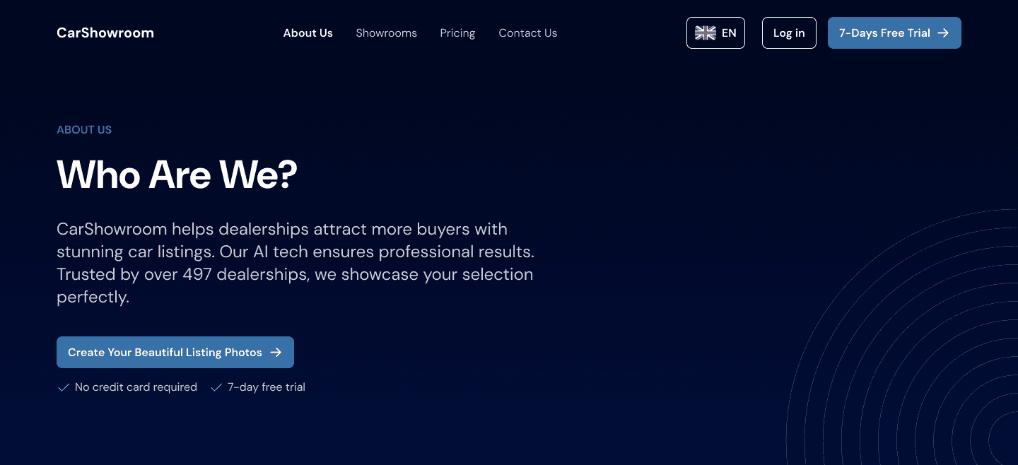
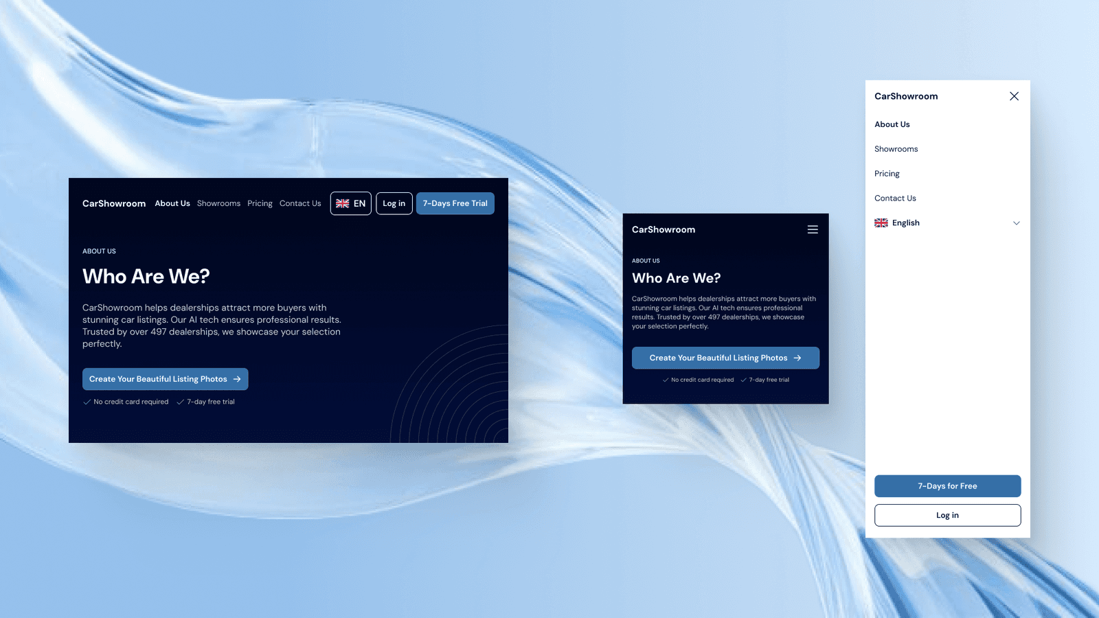
About Us Page
The next page that we’ve created is the About Us page which displays the company information in more detail.
Hero Section
Not the same as the home page on the hero section, the hero section on the other page consists of simple text and subtitles that align on the left. Why it’s created like this because we need to make the hero section more simple than on the home page. The hero section on the other page is just to explain what page users’ are in so we designed it as simple as this.
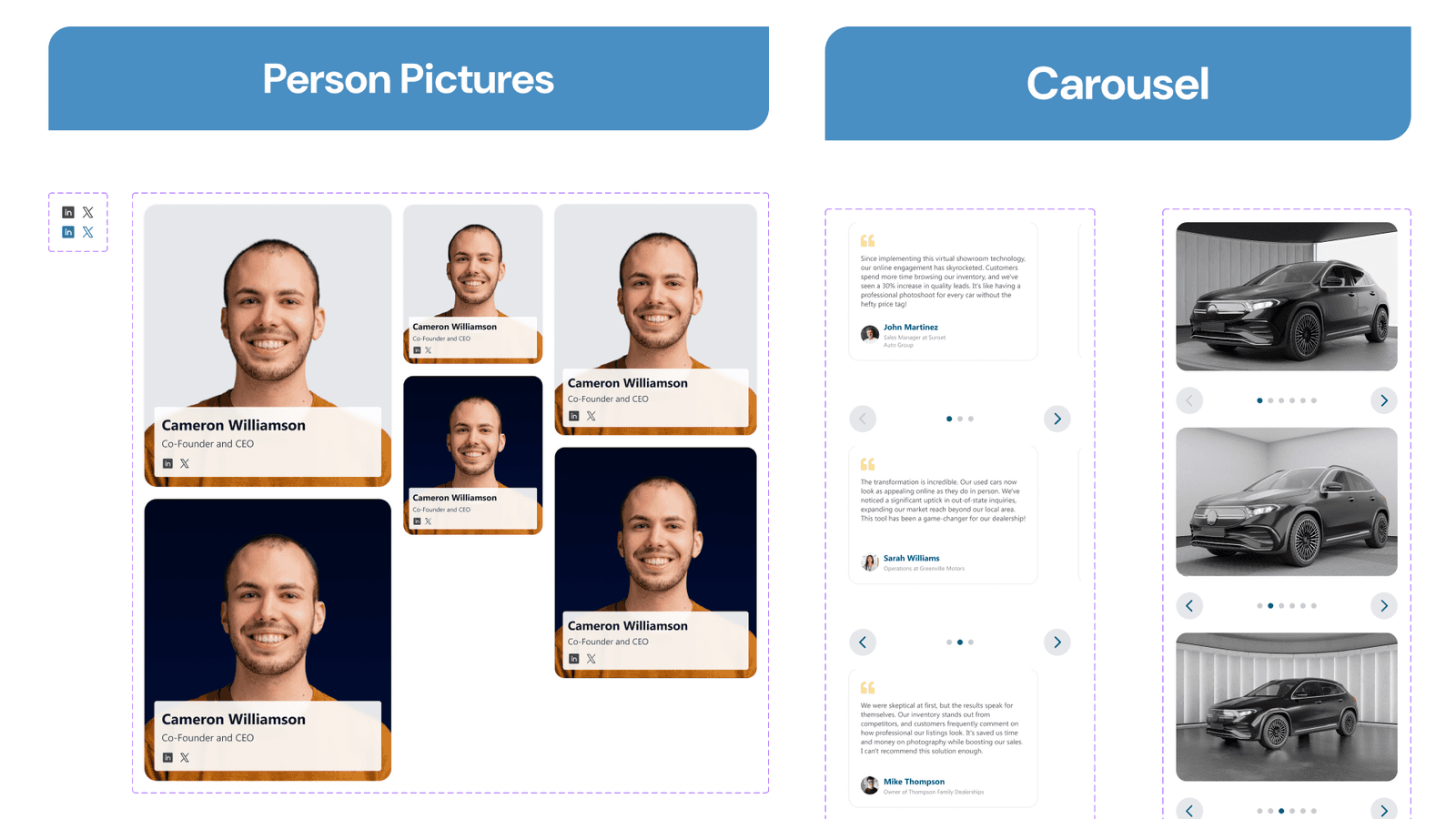
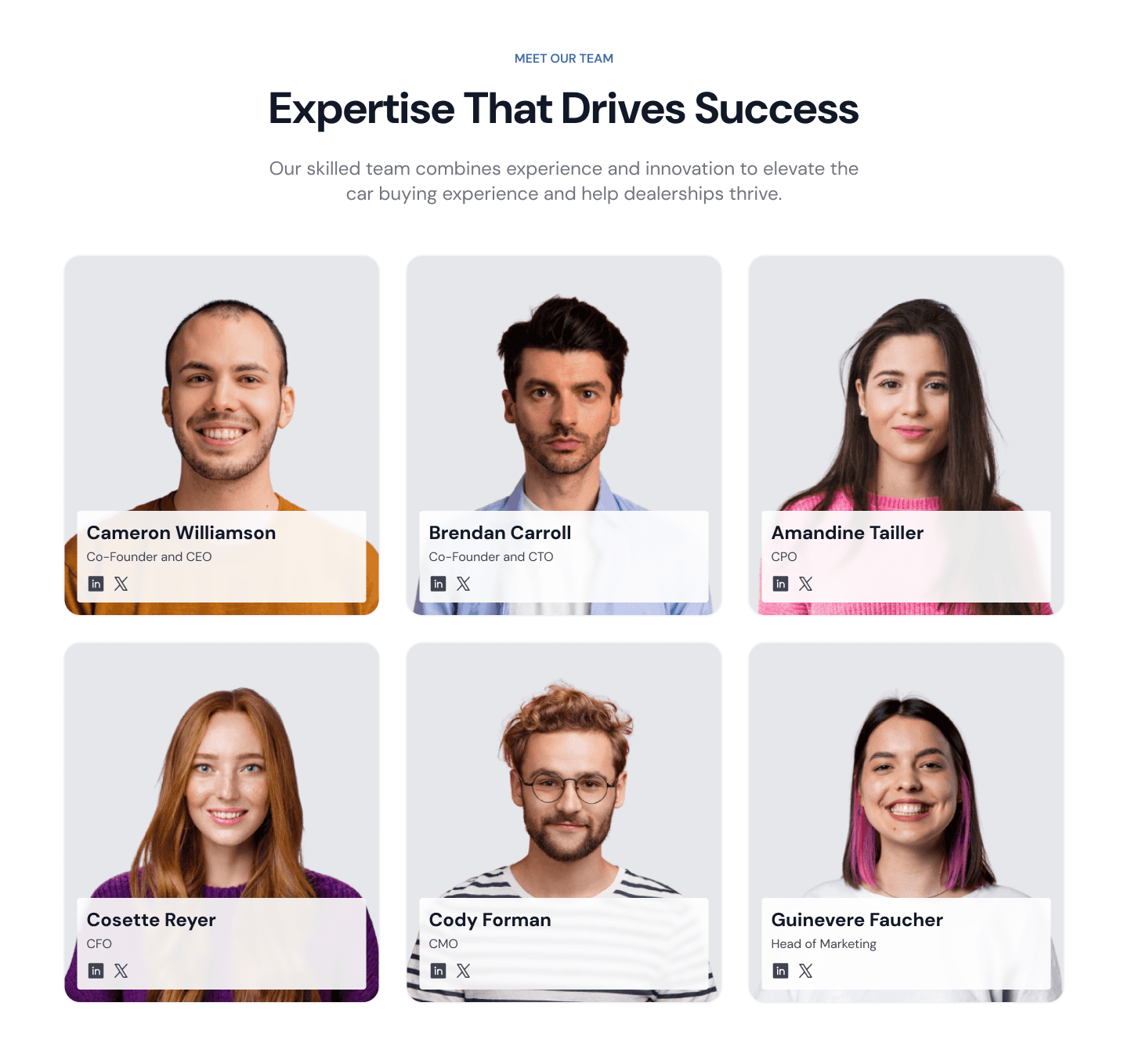
Meet Our Team Section
This section is designed so users can easily view all the company teams and also view their titles and socials. Each team member's card shows their pictures as a background and has a floating text and icon on the bottom centre. Each member’s picture will need to be on the same grey background to make it feel consistent and simple.
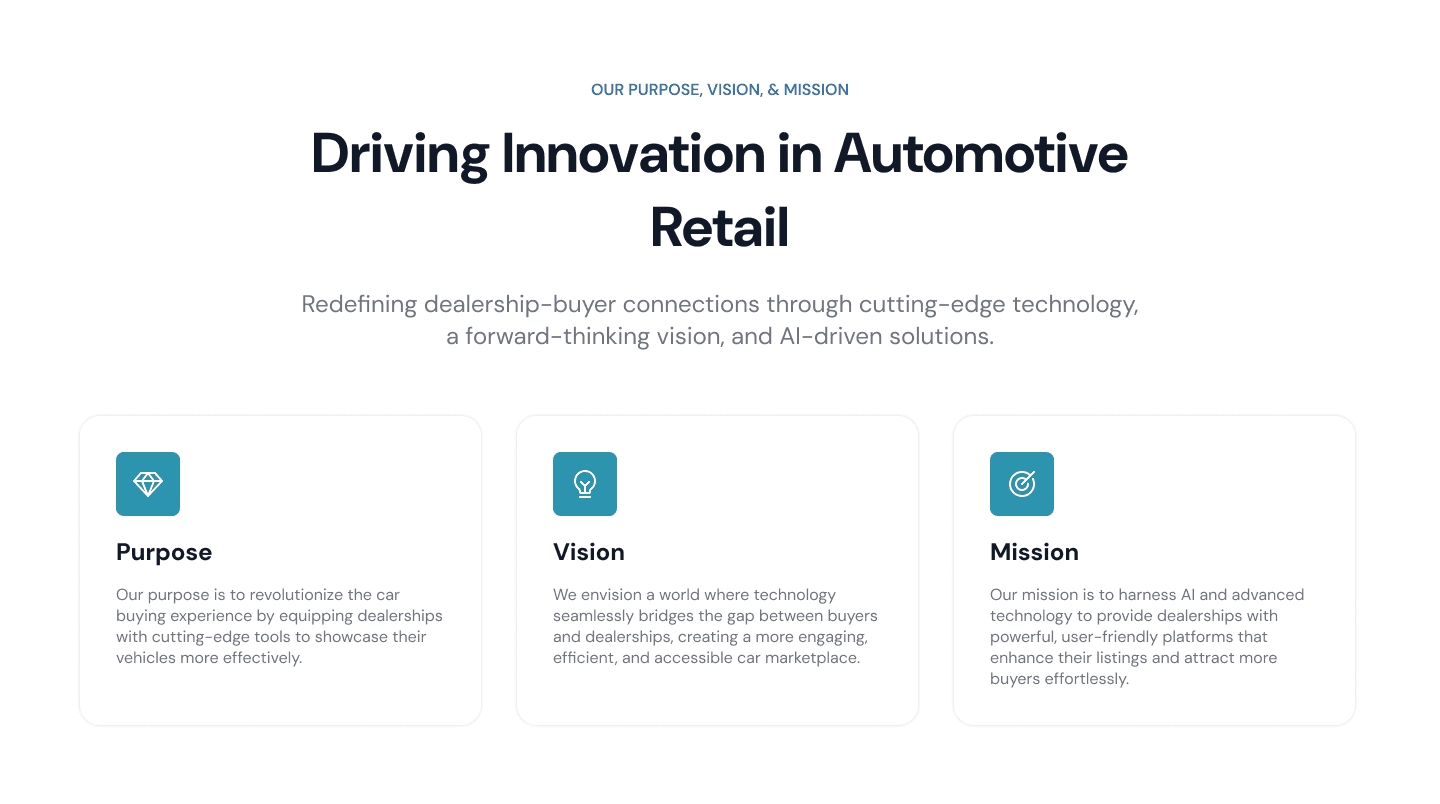
Our Purpose, Vision, & Mission Section
This section contains cards that explain each of the company's purpose, vision, and mission along with their relevant icon. This page is designed to be simple but clear enough so users can know that the company have a strong goal and increasing credibility.

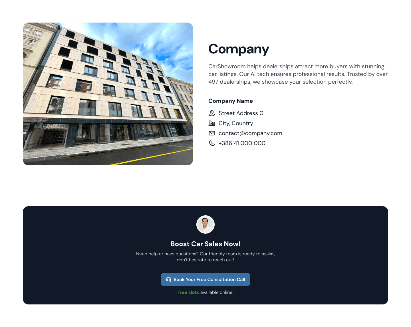
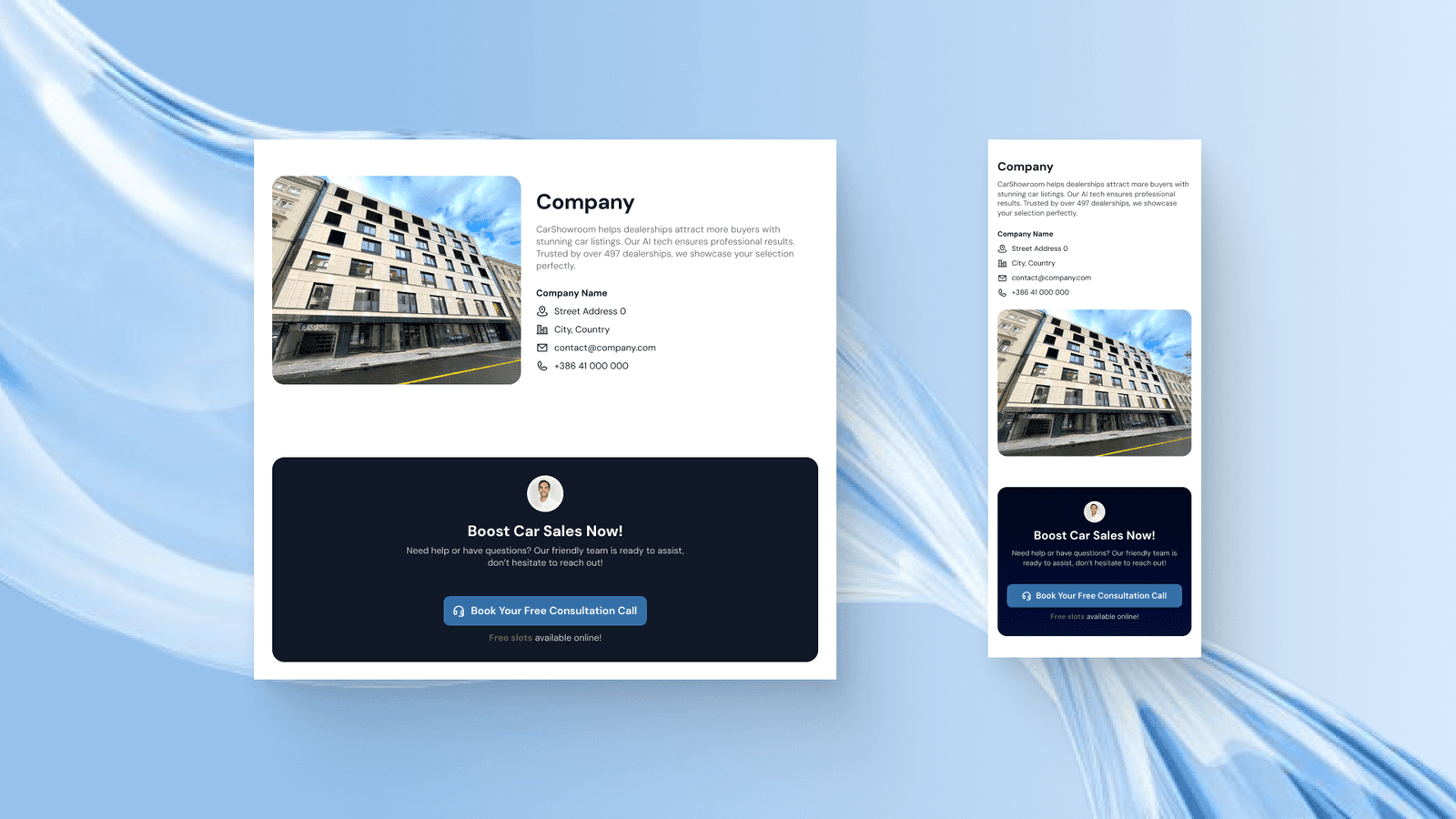
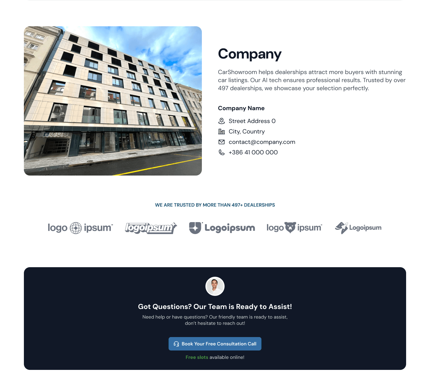
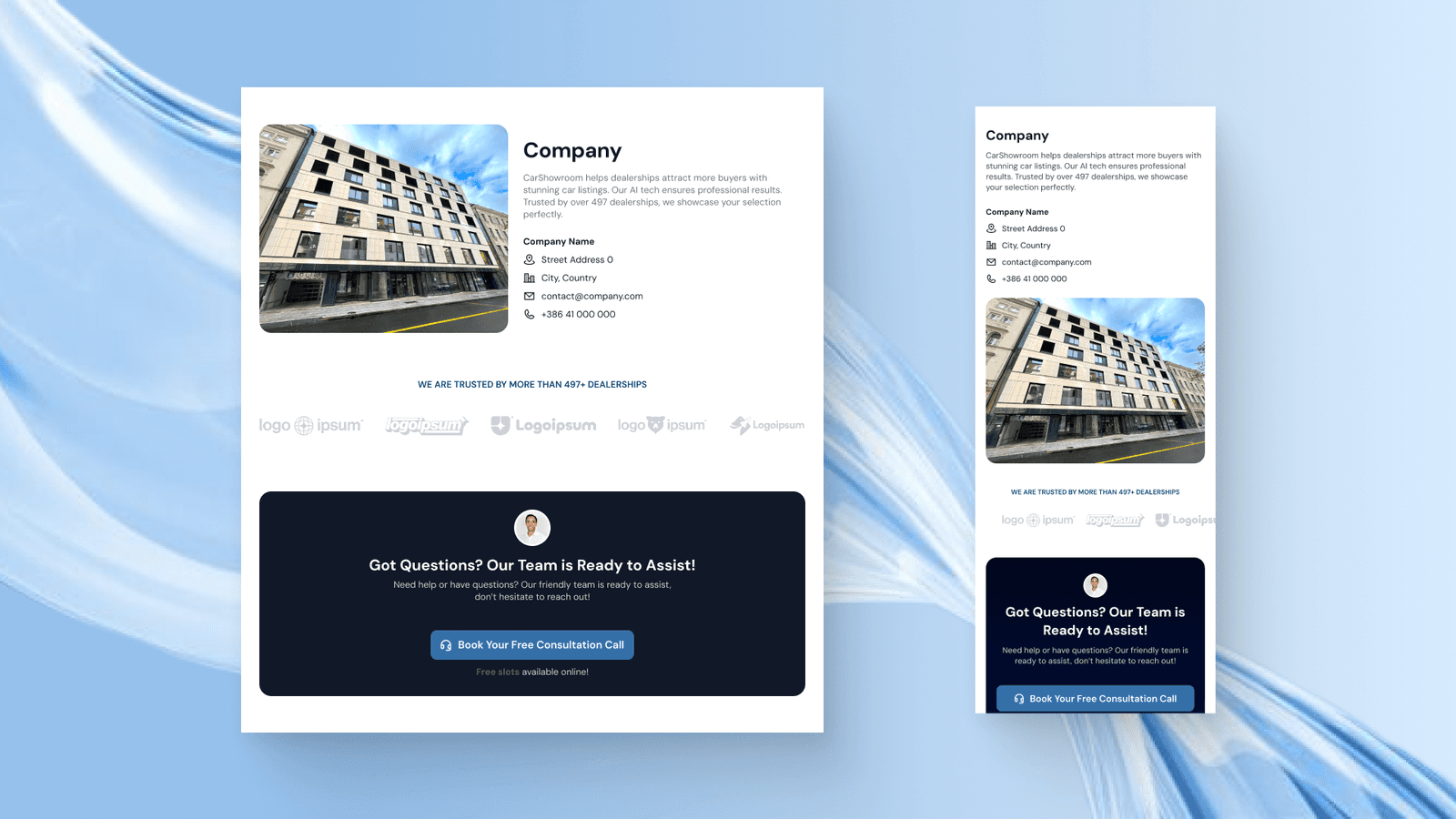
Our Company Section
Then there we have this Our Company section that displays the company information like address and contact. We then added a banner that offers a free consultation call for the users to ask anything they want for free.
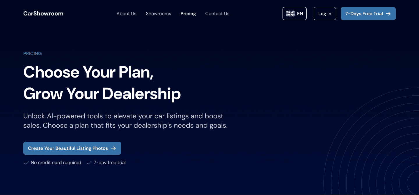
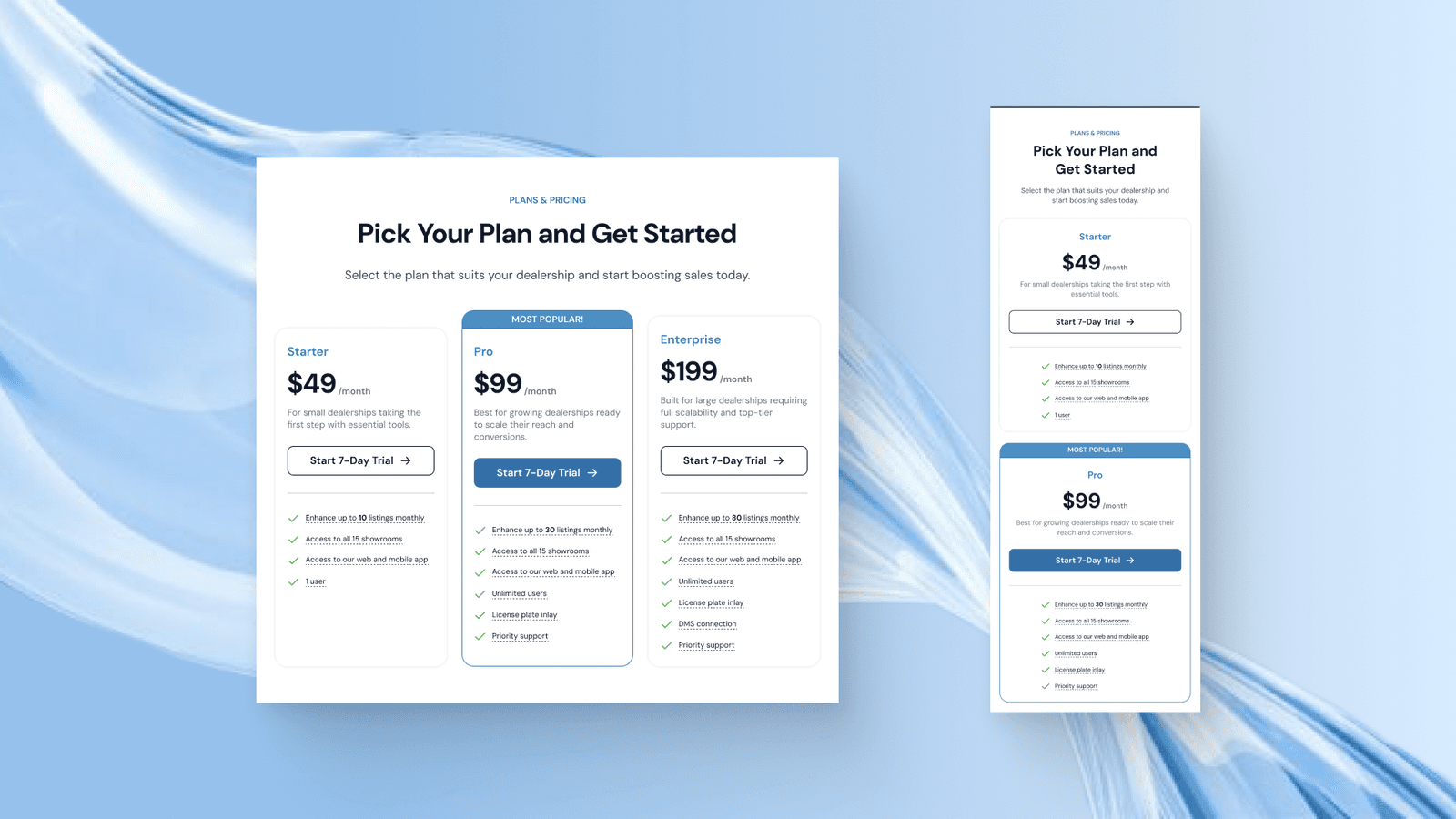
Pricing Page
Another page that is important to have for a SaaS business is the pricing page to let users know how much they charge for the service and compare between plans. Here I also designed the page with a common design pattern for the plan & pricing page.
Hero Section
The hero section is the same as on the About Us page, just have to change the copywiring to match the page goal. The design remains clear and simplicity patten across all sections and pages so it feels good to see and read.
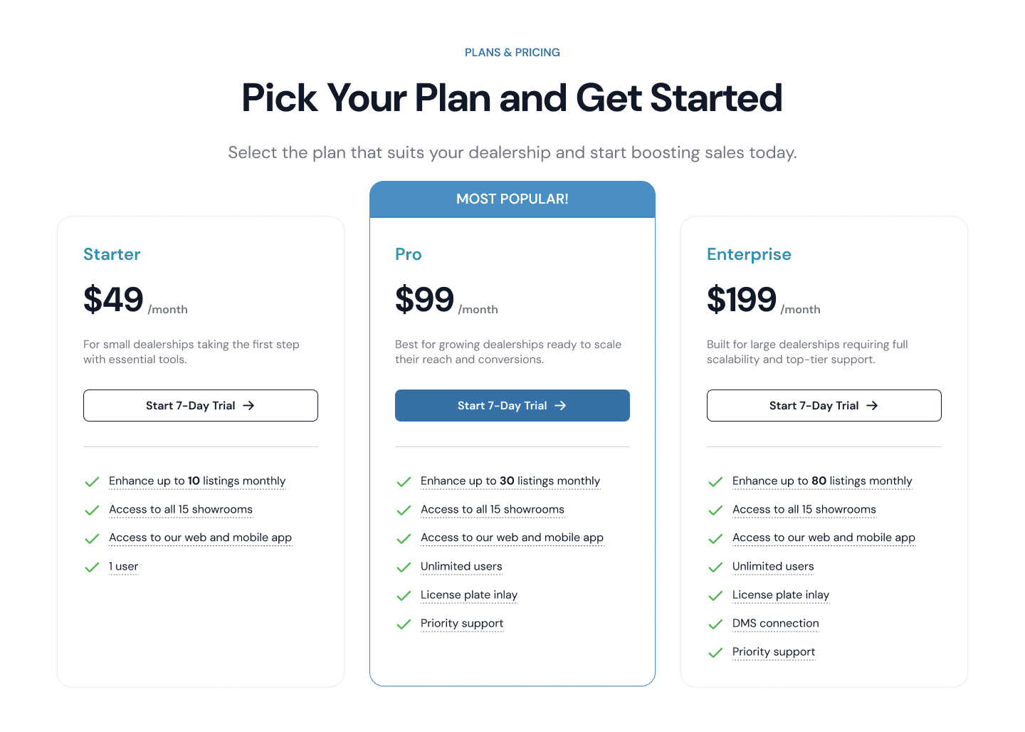
Plan & Pricing Section
Just get to the point, the next section on this page is the plans & pricing section which shows 3 different pricing plans that users can choose based on their needs. The second plan is the highlighted one with the addition of that Most Popular title.
All pricing cards have a list of their features that if hovered, can show a simple tooltip overlay explaining about the feature.
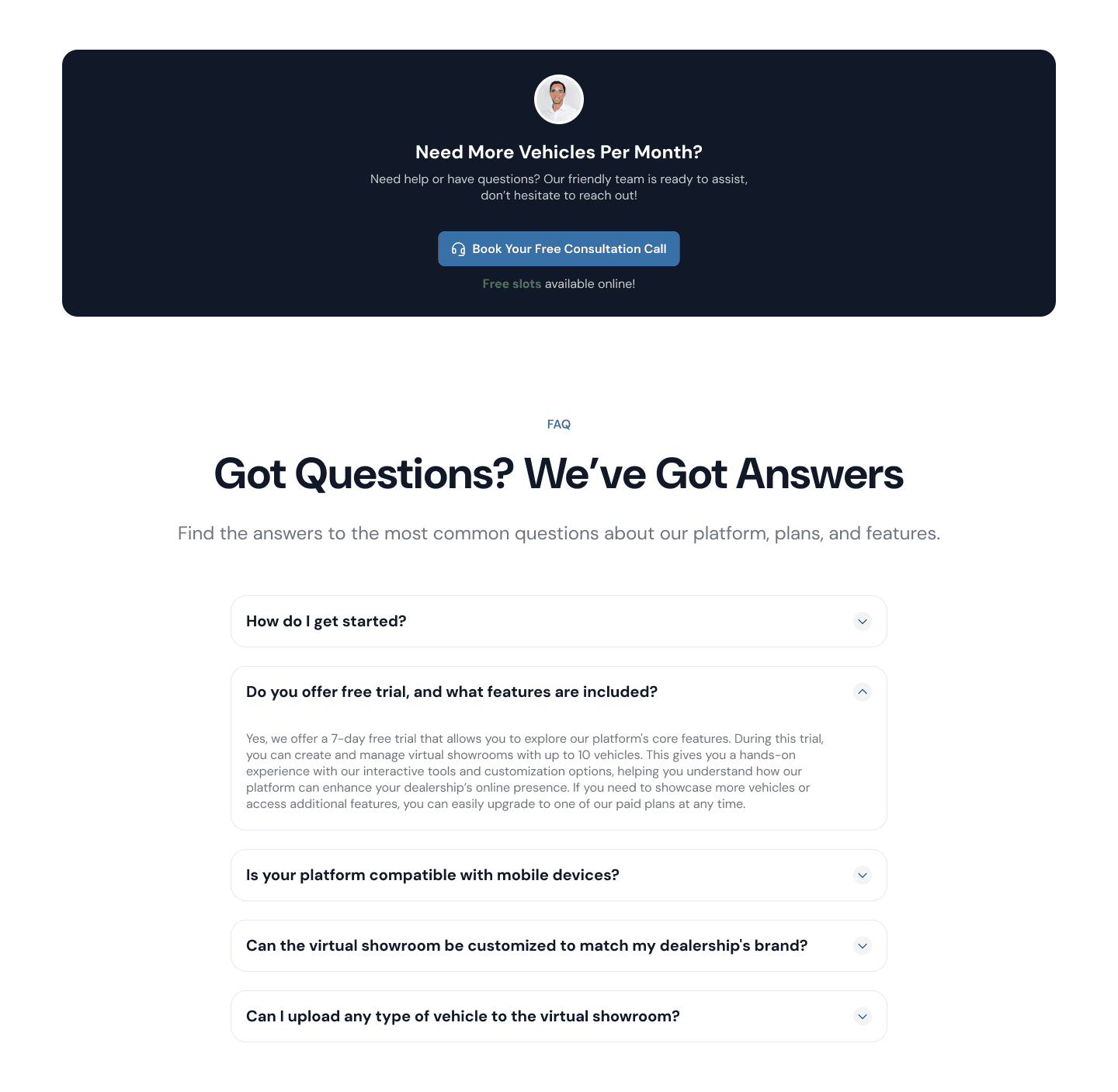
Consultation Banner & FAQ Section
After the pricing section, we added the consultation banner in case users still haven’t decided which plans they should take. We also added the FAQ section below to help users with the common questions they might have in mind.
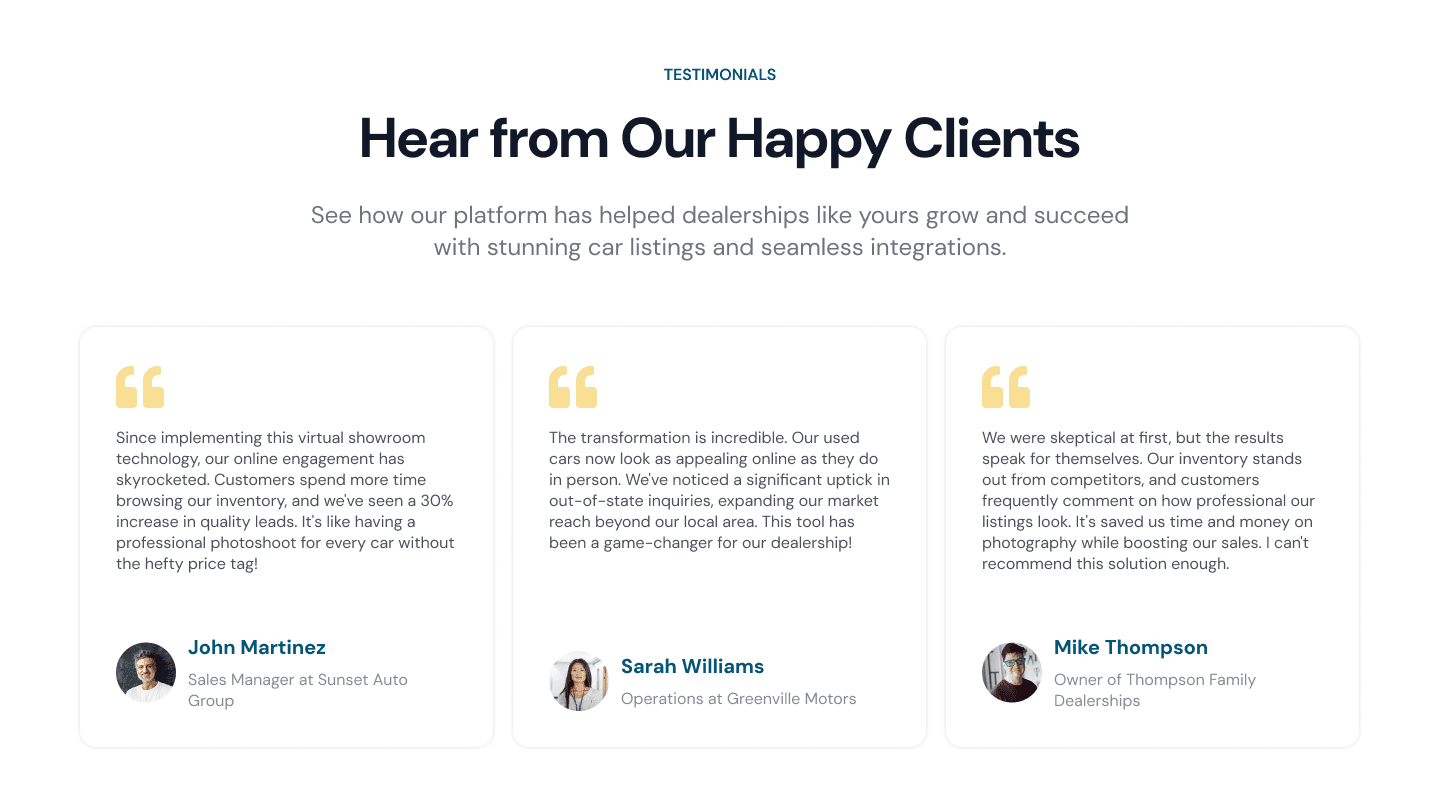
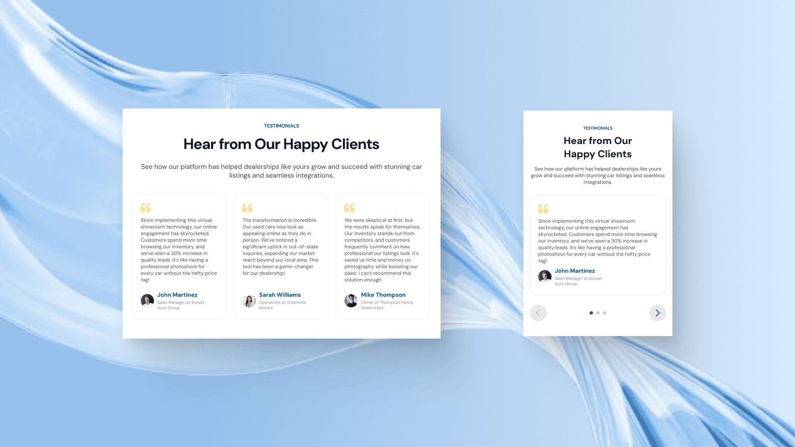
Testimonials Section
To better encourage users to choose a plan and buy the service, we added a testimonials section to bring more trust that the service has helped other businesses too so users don’t need to worry about the worth of using the company service.
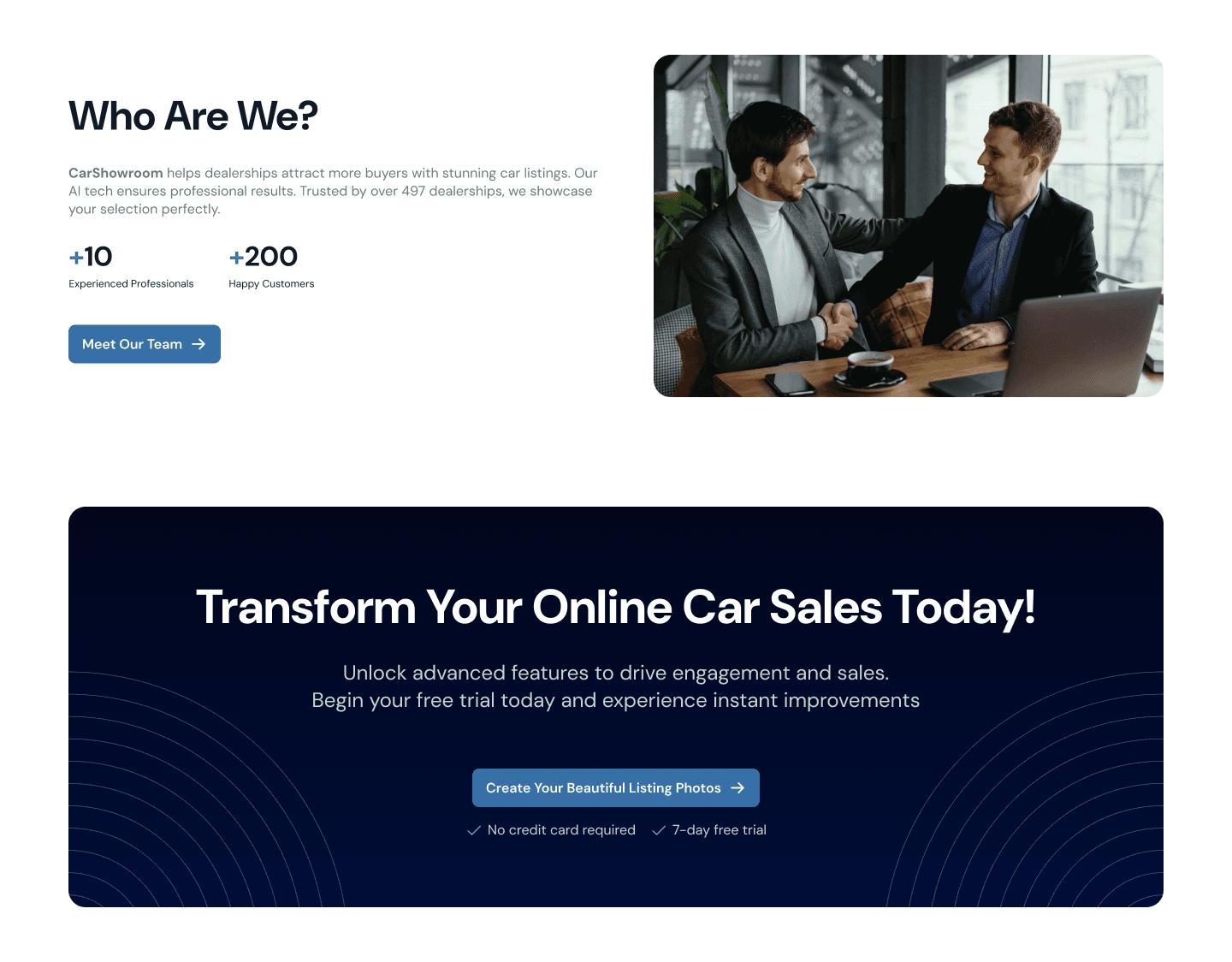
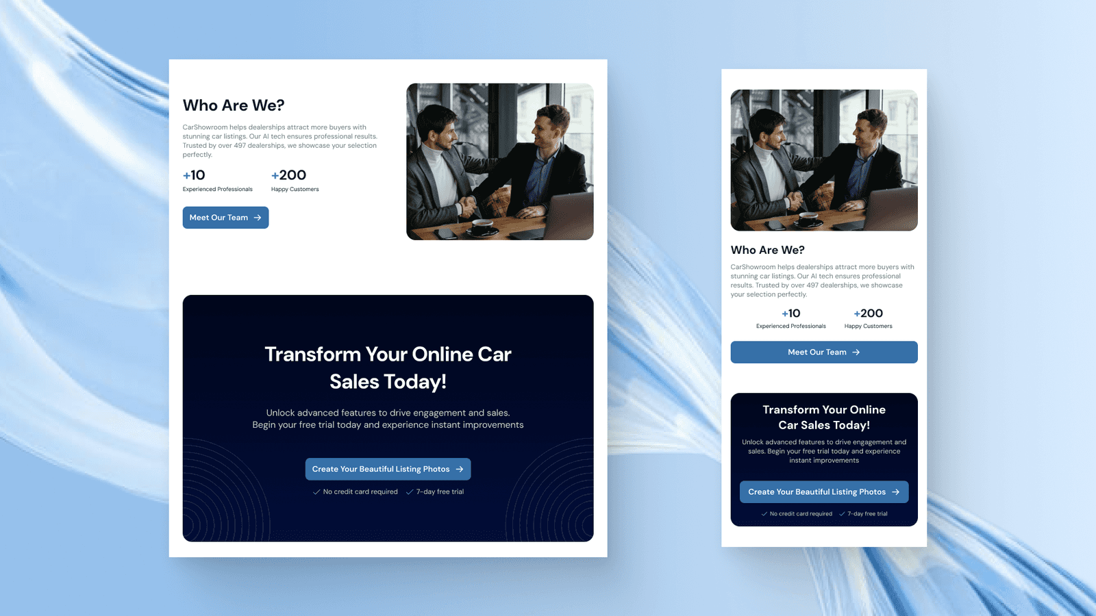
Who Are We Section
On the bottom of the page, we added the Who Are We section to better increase the company's credibility along with its achievements so that it can gain more users’ trust. Finally, we added another main CTA banner to better encourage users to take steps and transform their business at the specific time, today.
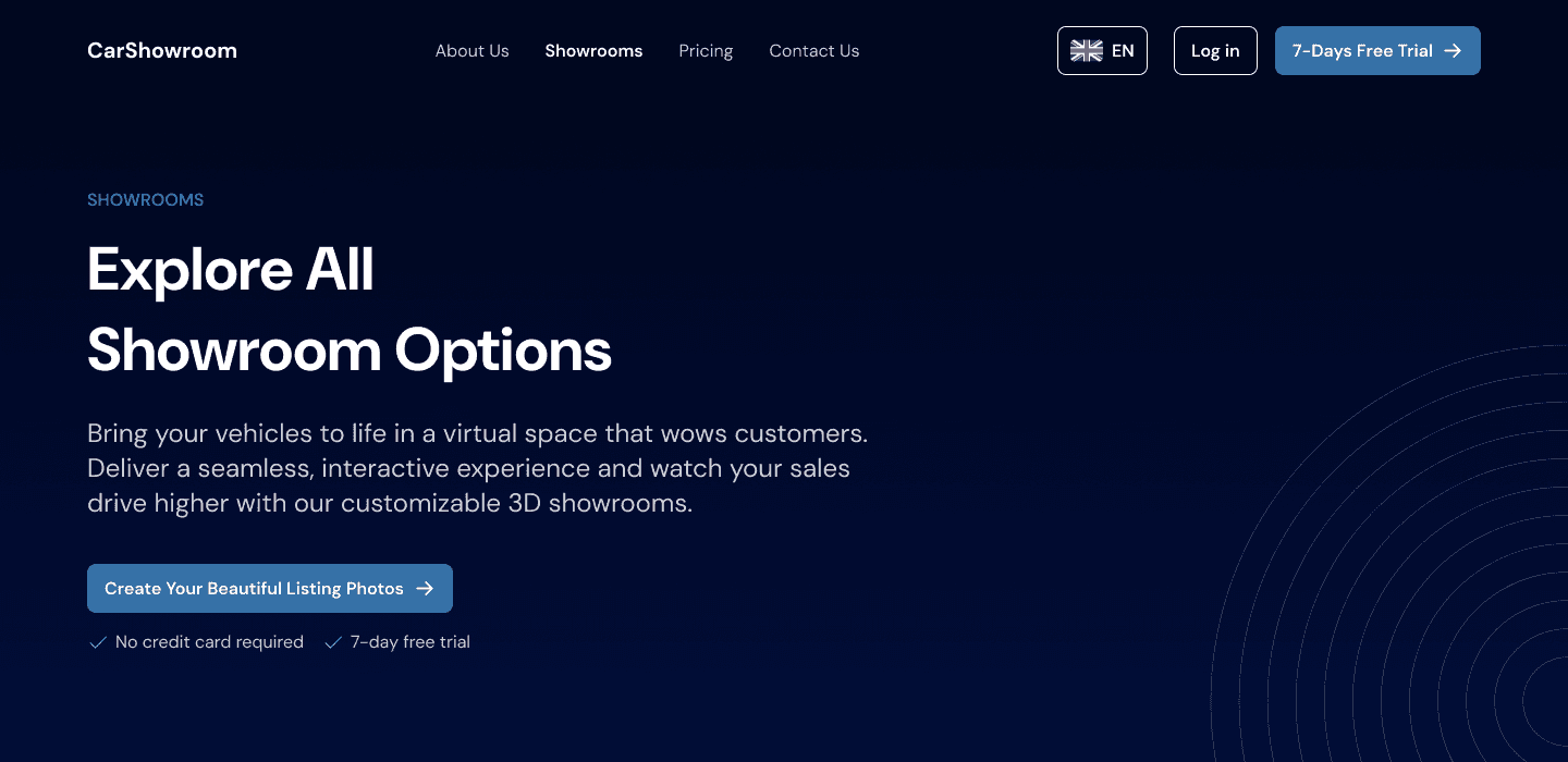
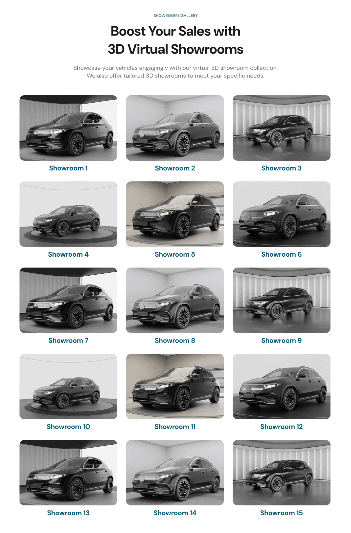
Showrooms Page
As a company that provides showroom backgrounds for vehicles, this page is where they showcase all the available showroom backgrounds so that users can’t wait to try them on their product.
Hero Section
The same hero section style as other pages but with more personalised copywriting on the title and description.

Showrooms Gallery Section
Here is where all the available showroom background is showcased. Carbox has 15 different showroom options to choose from and users can click directly on each image to try on it by signing up for the free trial.
CTA Section
The CTA section here is clear and engages users to start revolutioning the car sales right away. We also added the social proof behind the CTA to increase trustworthiness.
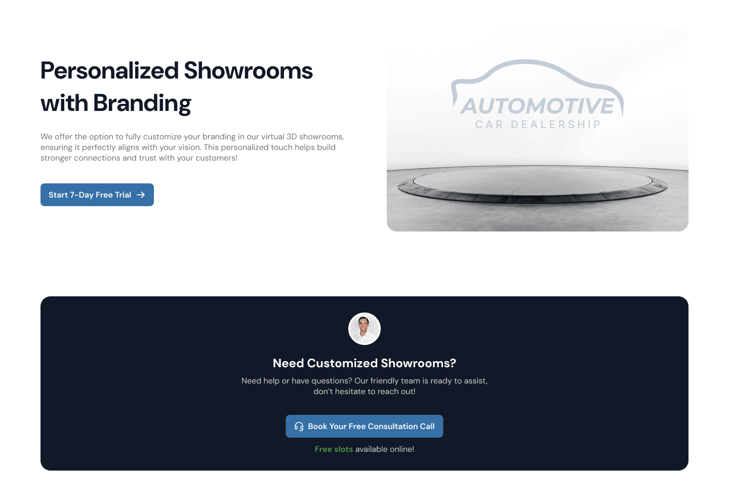
Personalized Showrooms Section
In the last section, we show a special feature where users can personalise their showroom design with branding easily. This is another main feature that can make user can’t wait to try using the service for their dealership products.
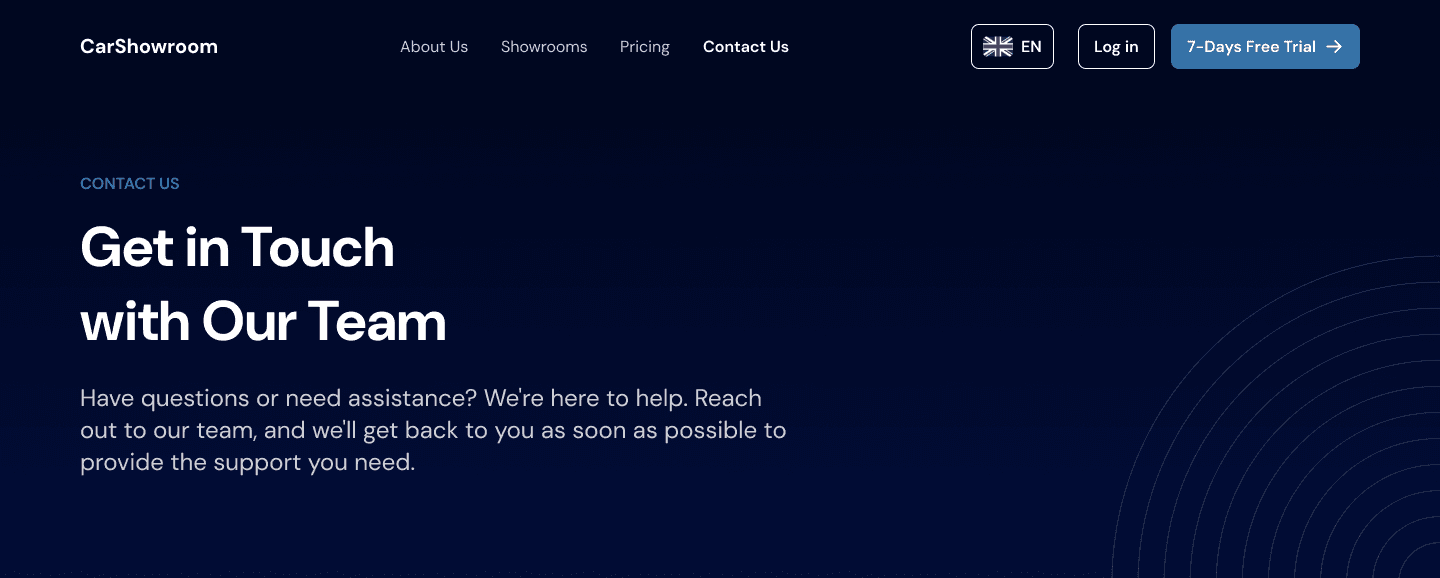
Contact Us Page
Another page that we designed is the Contact Us page which contains a contact form for users to fill out to get in touch with the company.
Hero Section
Hero section with personalised writing to match the page goal.

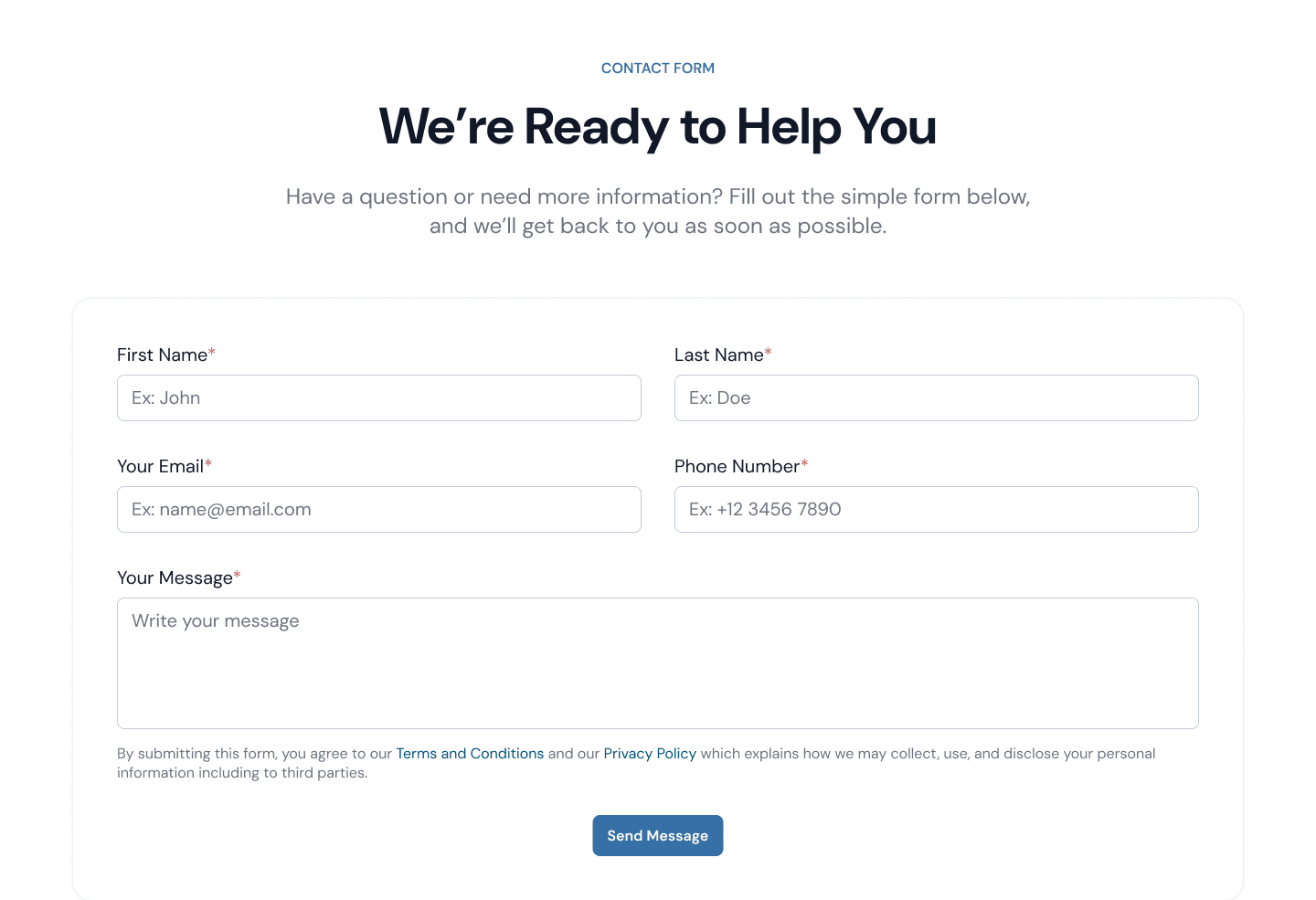
Contact Form Section
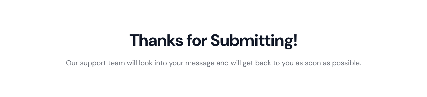
Here is a simple contact form that consists of a basic contact information field and a textarea for users to fill out their message.
After submitting, the section will change to displaying this text:

Our Company Section
Here is another Our Company section to let users know that Carbox is a real company that they can trust to help them increase online car sales.
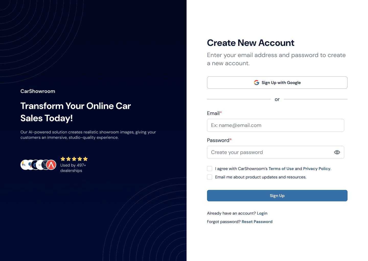
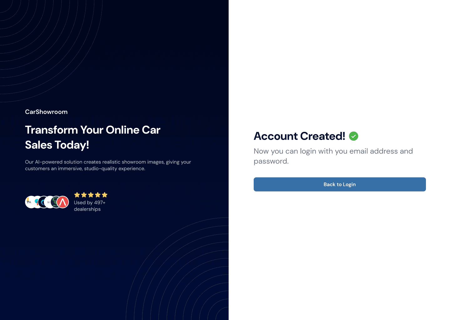
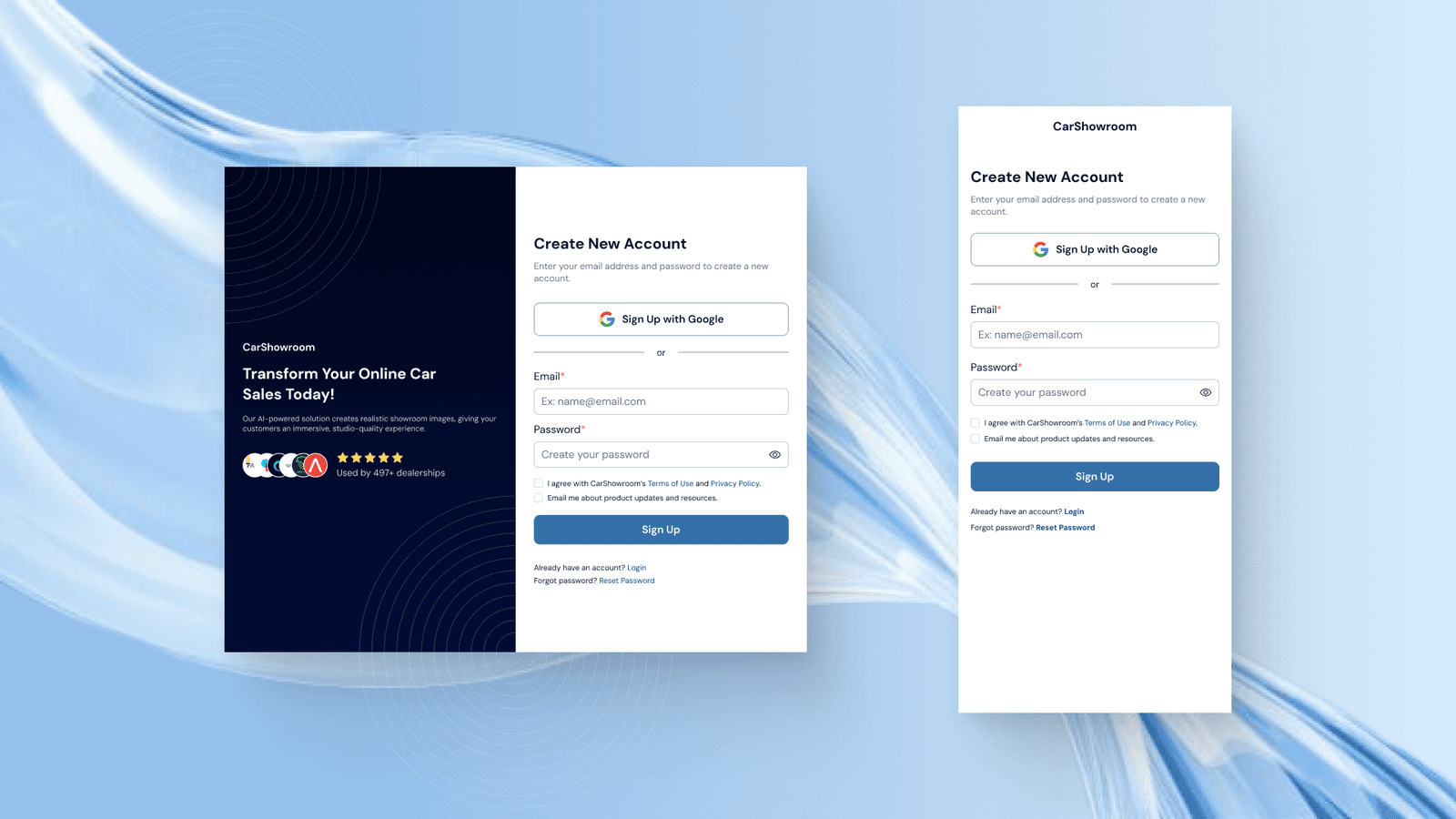
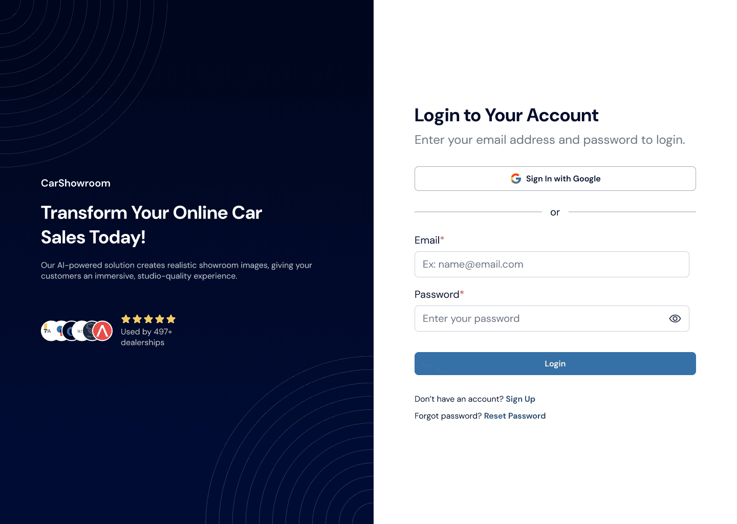
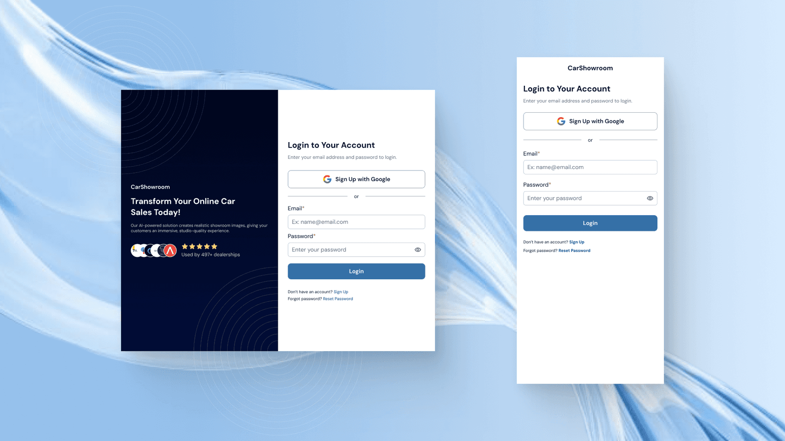
Sign Up Page
We then created a signup and login page which consisted of a login form and some information about Carbox and how they can help users.
Login Page
This is the login page, designed in a simple and clean layout for ease of use.
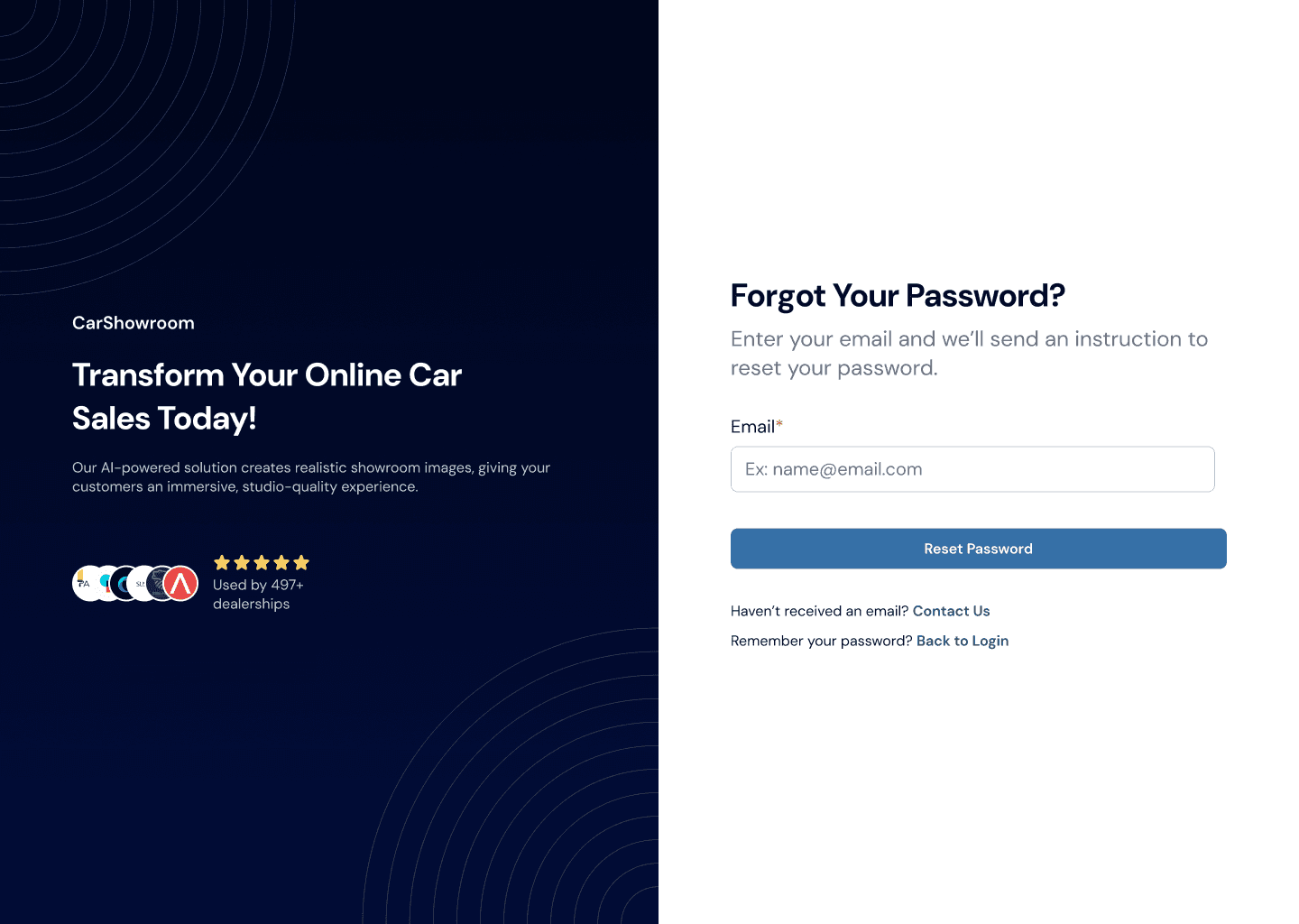
Reset Password Page
Users can also reset their password in case they forget or want to change it.


Prototype
Those are all designs that we created for this project. To understand more about the flow, try this prototype!
Measurable Outcomes
Since Carbox is a startup that moves fast, once the design is complete, they straightly take it away to the development phase, making it no time to conduct any measurable testing like usability testing or so on. However, we did have a landing page audit by one of our client friends to review the design that we’ve made. The audit gives a lot of feedback on all the pages, but after reviewing it with the client, they only want to have some revisions on the home page since it’s the most important page that will take users to learn more about the company's service.
We have come to an iteration on the home page hero section, here are the previous and the revised designs where can be seen that in the revised design, we added a benefit badge, changed the title wording, improved the CTA, added more feature information, and enhancing the layout so that company can gain the users trust in the first view.
We then also revised the benefits section where now the numbers are highlighted and we added more proof about how the service works to again gain more user trust.
In the features section, previously we designed a simple list with icons, then after the audit, we changed that using respective images to illustrate each of the features. We also change the layout to better match the content.
The last revision is in the how it works section where we change the layout of the step-by-step process. Previously, we used icons for each step but for more clarity and simplicity, we changed it into numbers.
Limitations & Lesson Learned
Those are all our scope in this project, quite much but fun to work with. The client is very communicative so we have good regular feedback to improve the design. The only limitation is that we didn’t do any deep research or usability testing to better design the user experience. However, since this is for a startup company that moves fast, we did achieve a lot in completing this project and have produced a design that is approved and impressed the client.