Designing a SaaS platform which consists of various product flows, dashboard page, and responsive screens.
CLIENT
Carbox (Previously CarShowroom)
ROLE
UI/UX Designer
SERVICE
SaaS Website Design
Project Details
Problem
In the era of the internet and social media, utilising a marketplace for online selling is a must-have for all businesses, not excepting dealership businesses to sell their vehicles online. To increase the chance of getting more sales in the crowded sea of the internet, having a professional car image that uses a stunning showroom background can increase the sales potential, but, the showroom cost itself is high and not all dealerships can afford that. That’s why, Carbox (Previously CarShowroom) provided the service to utilise AI to create a professional showroom background for the dealership without the need for an actual showroom and its costly price.
The client already has all the business ideas and requirements, they just asked us to create the most easy way to use that SaaS platform. Previously, we had already designed the landing page so we just needed to use the same style but for the SaaS platform after the user logged in.
Goals
Design the SaaS platform which consists of a flow to change car background, a dashboard page, a showroom page, and other common pages that are usually in a SaaS web app. The design should be responsive and have desktop, tablet, and mobile versions.
The client wants the design to be as easy and simple as possible, so we created an easy-to-use flow so users can use the web app without the need to learn how it works.
Role & Responsibility
My role here is as a UI/UX designer who worked alone on designing the whole website for this client. I collaborated with the company CEO and their development team to discuss the features and information to be added to the site.
My responsibility is to design the requested web pages in high fidelity, create a prototype, create a version for desktop and mobile devices, and create a simple and easy-to-use flow.
Constraints
The design process is going well, the client is very communicative, and the requirements are clear and easy to understand. There is no real constraint that happened in this project, everything is going well until the end when the client is satisfied with the design.
Design Process
This project is a continuation of the previous project, which was when we designed the company’s landing page. This SaaS platform is the main web app which can be accessed after users log in from the landing page site. The client still only needed the high-fidelity design with a prototype so we did not conduct any deep research, and since the company is a startup that moves fast, right after the design is completed, they develop it directly so no time for design validation or usability testing.
Competitor Analysis
After the project is fixed, the client brief us about their competitor, Autofox. We did some walkthroughs on their SaaS platform and from there we ideated on how to design Carbox’s one more easy-to-use than the competitor. Here is a glimpse of the competitor’s web app:
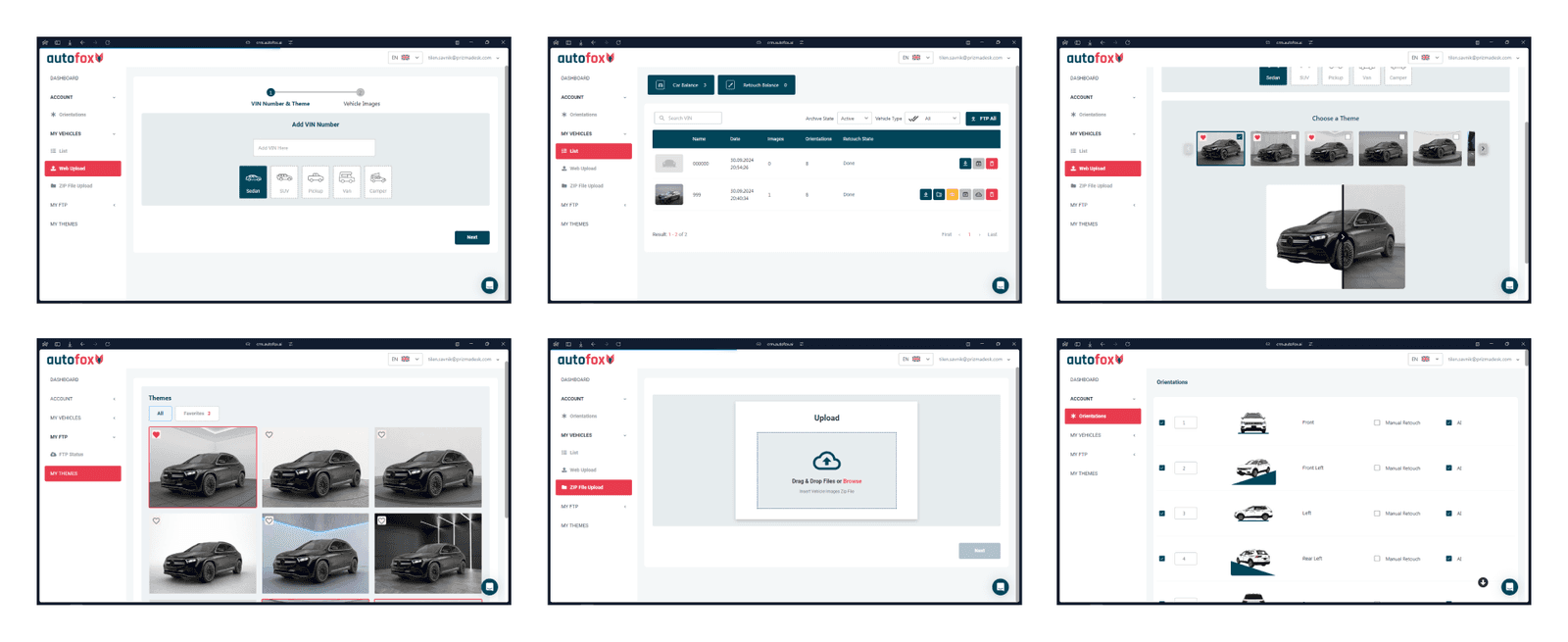
The design of the competitor's website is quite hard to navigate, and the information displayed is not clear enough about how the feature works and so on, why after having a look here, we decided to design a better version of the platform and create the style with Carbox’s one. Note that the client asked us to use imagery from the competitor websites since they didn’t have any at the time and will change them later when available.
User Flow
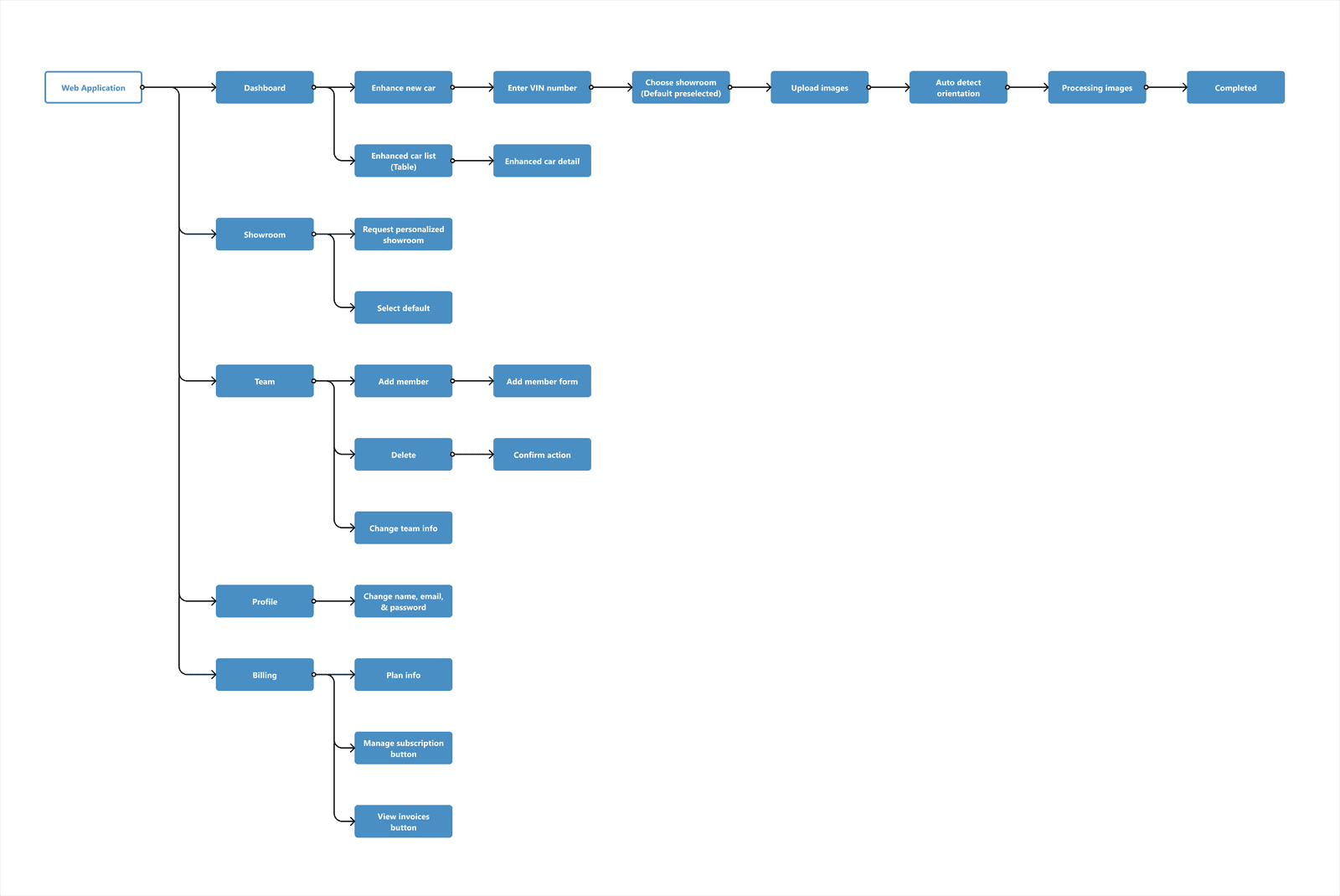
We then created the full user flow of the web app, including the main flow where users can change their car photos into a professional showroom background, and other pages flow. This is quite simple since the main feature on the platform is just that, the zoomable PDF version of the user flow can be accessed here.
Design System
The design system was already created for the previous landing page project, here we reuse it along with adding other components needed.
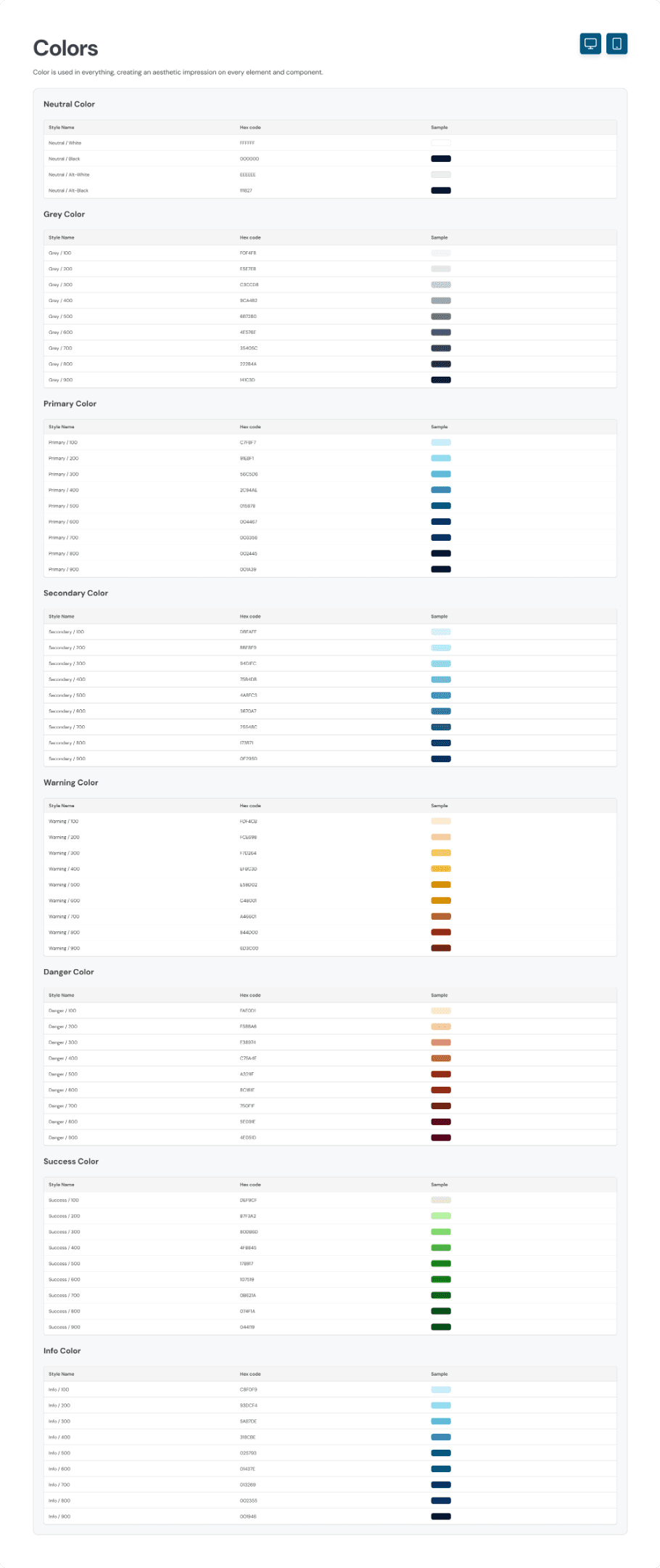
The client only requested that the main colour used should be blue. Other than that, we’re free to explore any design style to match it. Here, we create a design style guide for the colour, typography, and components.
For the colours, we used the blue colour as requested and added a secondary colour which is the lighter shade of cyan. The reason to chose this colour is because the client also gave us some reference on their previous website project and wants to reimplement it on this project too.
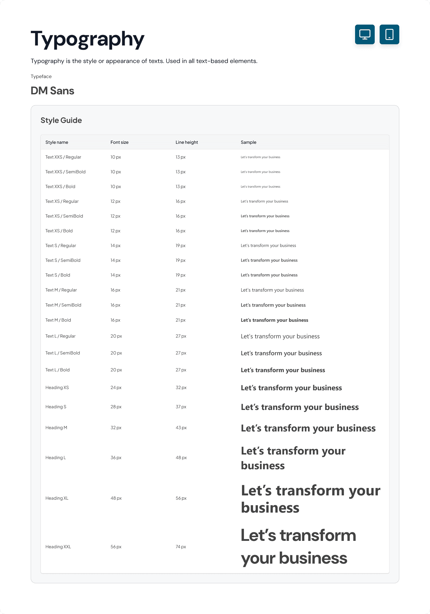
For the typography style, we initially used the Segoe UI typeface as the client referenced, but the developer had trouble installing it so we had to change the typeface with a font that is available on Google Fonts, that’s why we chose to use DM Sans as the main typeface.
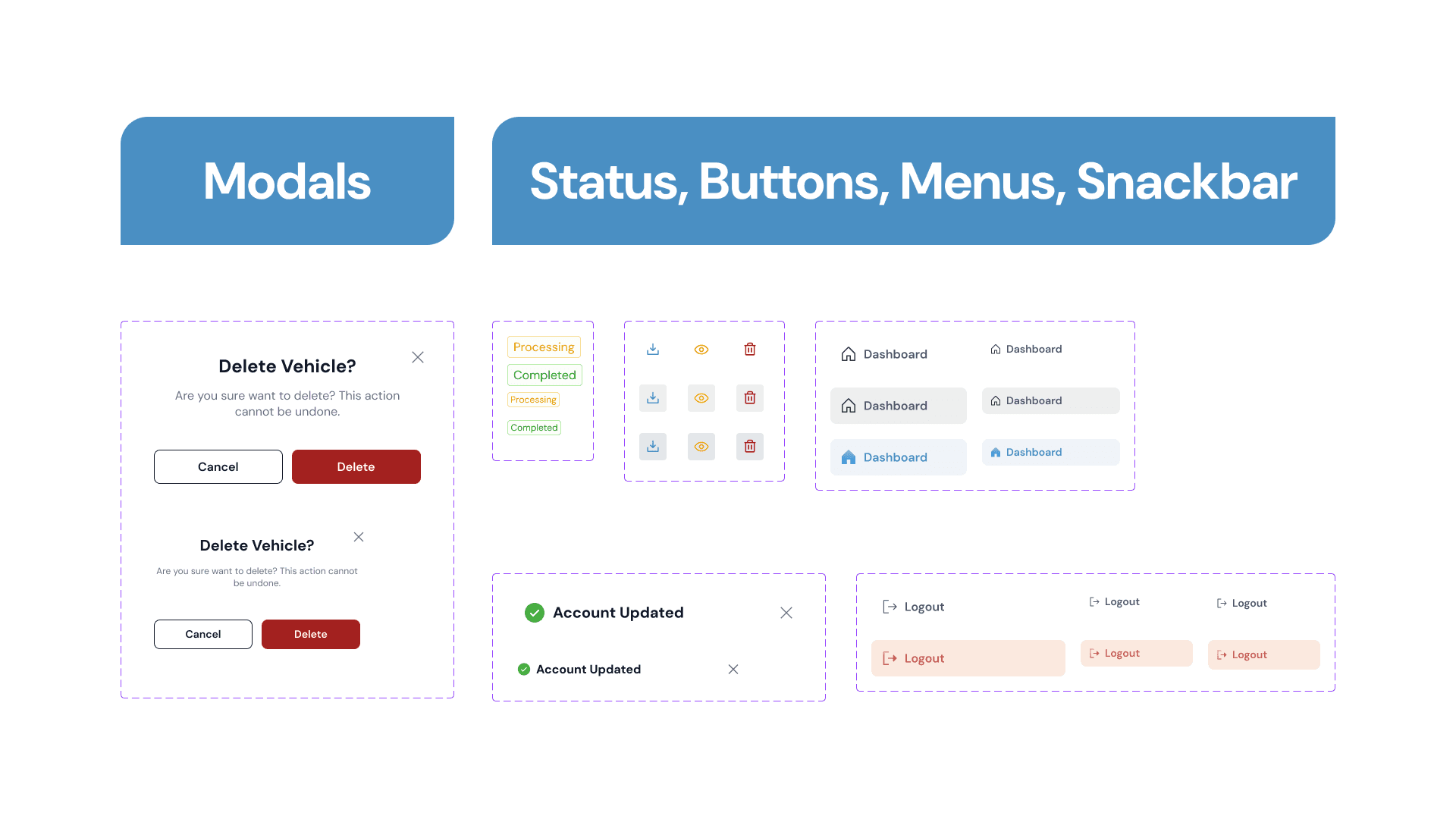
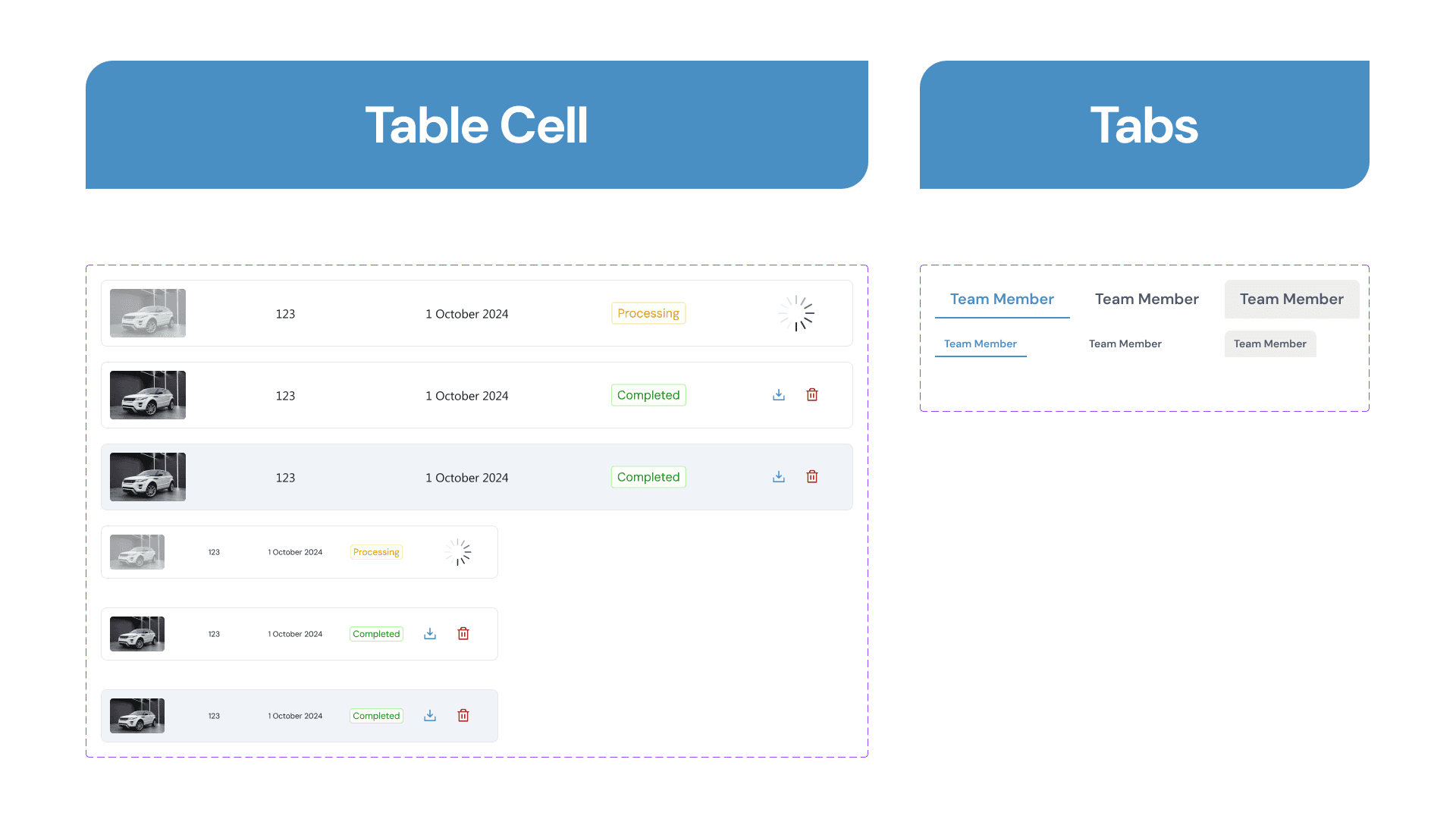
Along with designing the project, we documented various interactive components that we used, here are all of the design style guides and components that we created.
Final Design
With the available reference from the competitor, we started to design the Carbox SaaS website directly based on the requirements the client had sent us. We jump directly in designing the high-fidelity design following the limited timeline and as requested by the client to have deliverables in the form of high-fidelity responsive design with prototype.
First Page
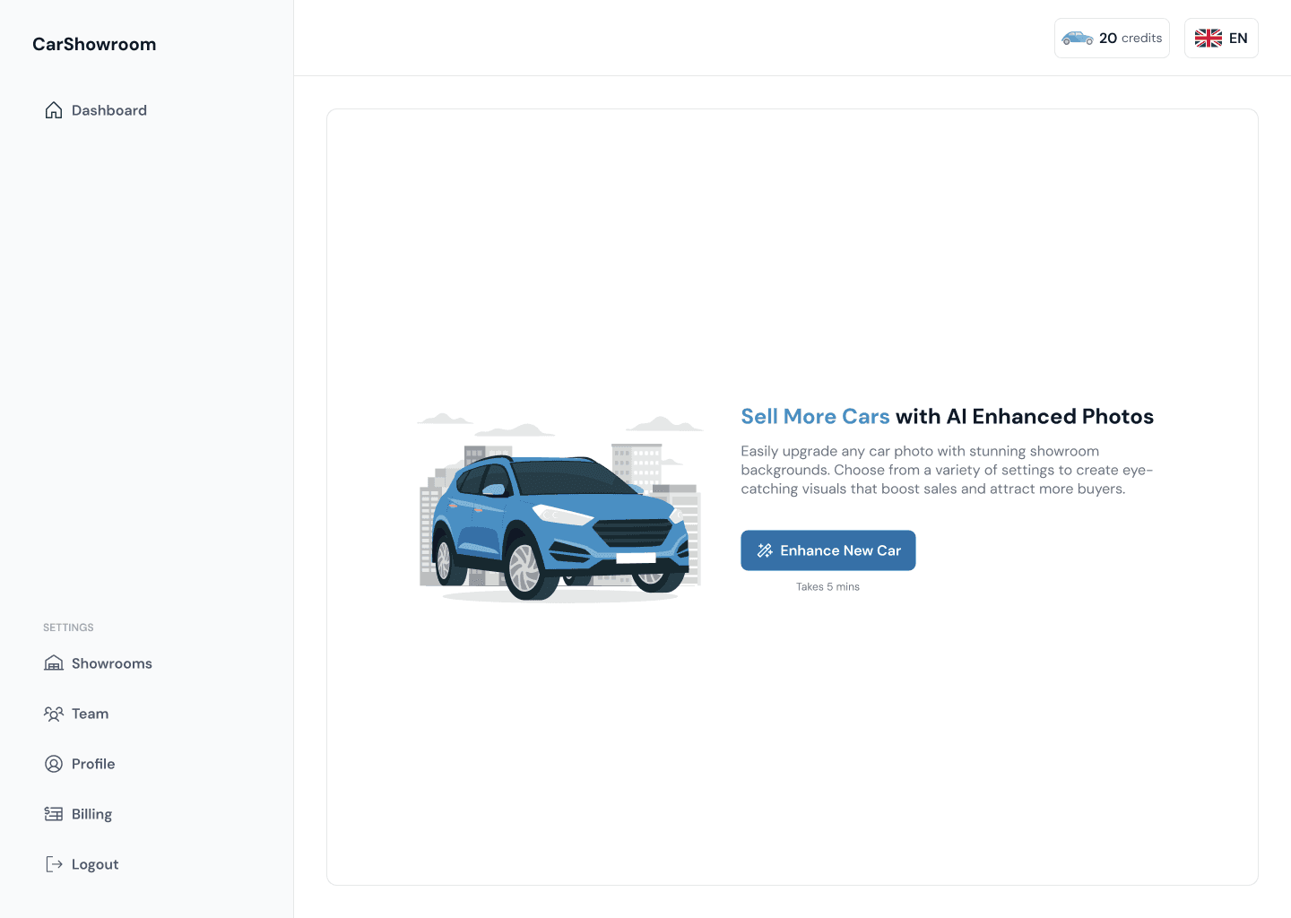
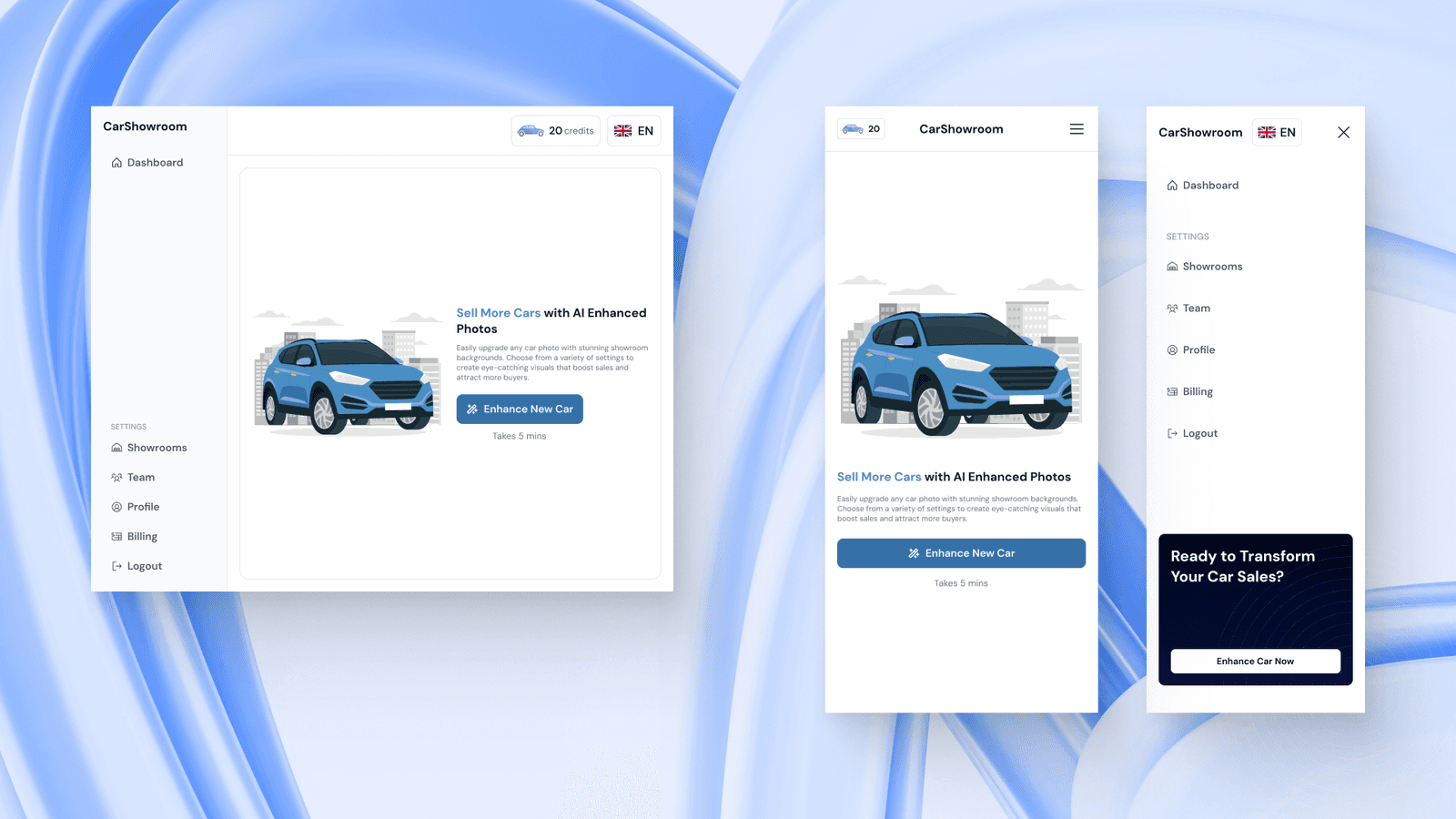
After users log in to the platform, they will land on this first page, which is a dashboard empty state. From here, users can explore the site or click the blue button to change their car image background.
The design of the platform itself is dominant with white colour as the background since we want to make the design as clean as possible to create an easy-to-use user experience, thus making the interface clear, simple, and not complicated. We use the primary blue colour on various core elements like CTA and illustration.
On each page, we have a sidebar on the left side with a few menus which are dashboard, showrooms, team, profile, billing, and a logout button. On the top bar, we have an information of how much credit or token users’ had on their account. This credit will be used to turn one card image into a showroom background. The amount of available credit varies depending on the plan users subscribe to. The is also a language selector button on the top right of the header.
On this first page, we show information about what is the benefit of using the platform. We add a simple car illustration to highlight the platform feature. We also encourage users to try enhancing their car right away with the main CTA. We also added an estimated time which only takes 5 mins to turn their dealership's business into success.
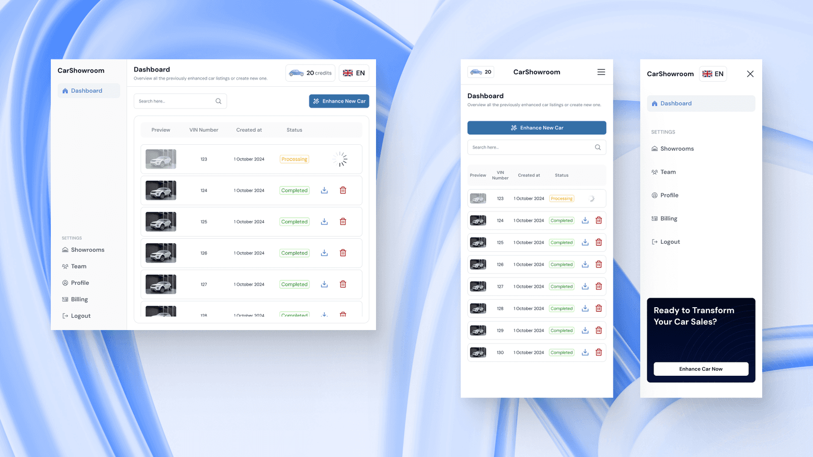
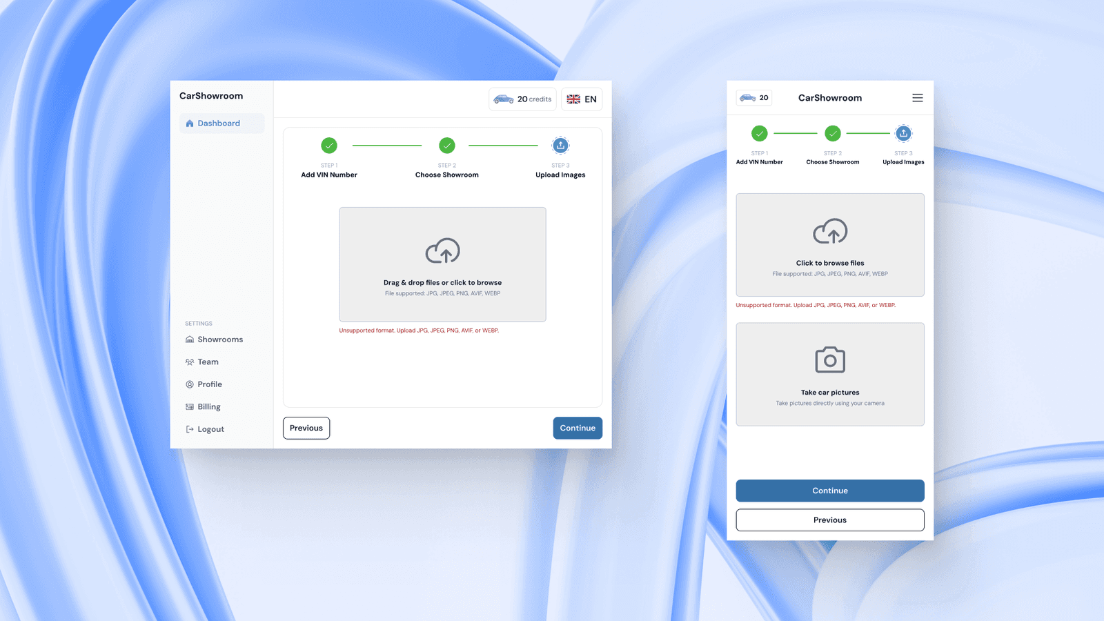
For all the designs, we also created the tablet and mobile phone versions. The tablet design is similar to the desktop version, the mobile phone version is more compact and the sidebar is not moved to the right since many users will use their phone using their main hand which is the right one. The credit information is now on the left side of the header to let users know how much they can use it. On the bottom side of the sidebar, we added a CTA to let users access the main feature easily no matter what page they are on.
The client specifically requested the grouped sidebar menus as a Setting group since they want the main feature to be accessed only from the dashboard and everything else is just a supporting feature. This will make it easier for users who are unfamiliar with the platform.
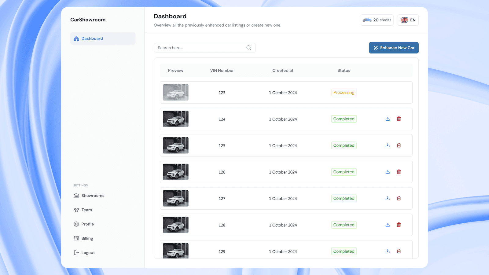
Dashboard
This is the design when the dashboard page is filled with several processed images. On the header, we have a title of the page along with a short description, then there is a search bar to search for processed images using the VIN, then finally the main button to access the feature is on the top right of the table which states Enhance New Car. This is the button to go to the main flow which turns users' car images into a showroom background.
The main content of this page is a table showing all the processed images with information like result preview, VIN, created date, status, and action. Vehicle Identification Number (VIN) is used to identify the cars that are processed, the client said that this is common in the dealerships industry that use VIN instead of the car models.
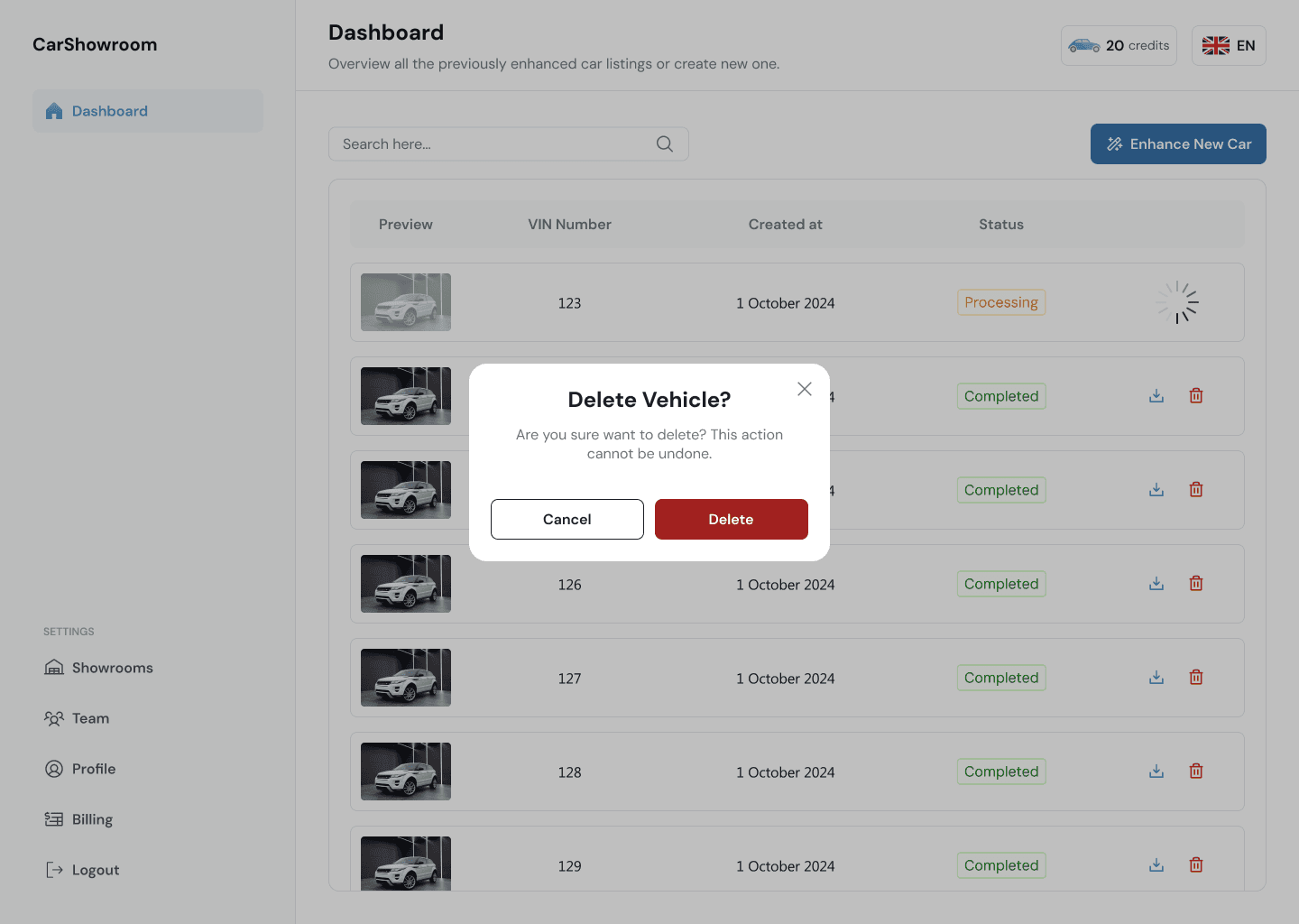
When the image is still processing, the status will show that it’s still processing and the whole row will be greyed out, there is also a circle loader on the action column to show that the image is still processed. After done, then the action will show the option to download and delete the processed image.
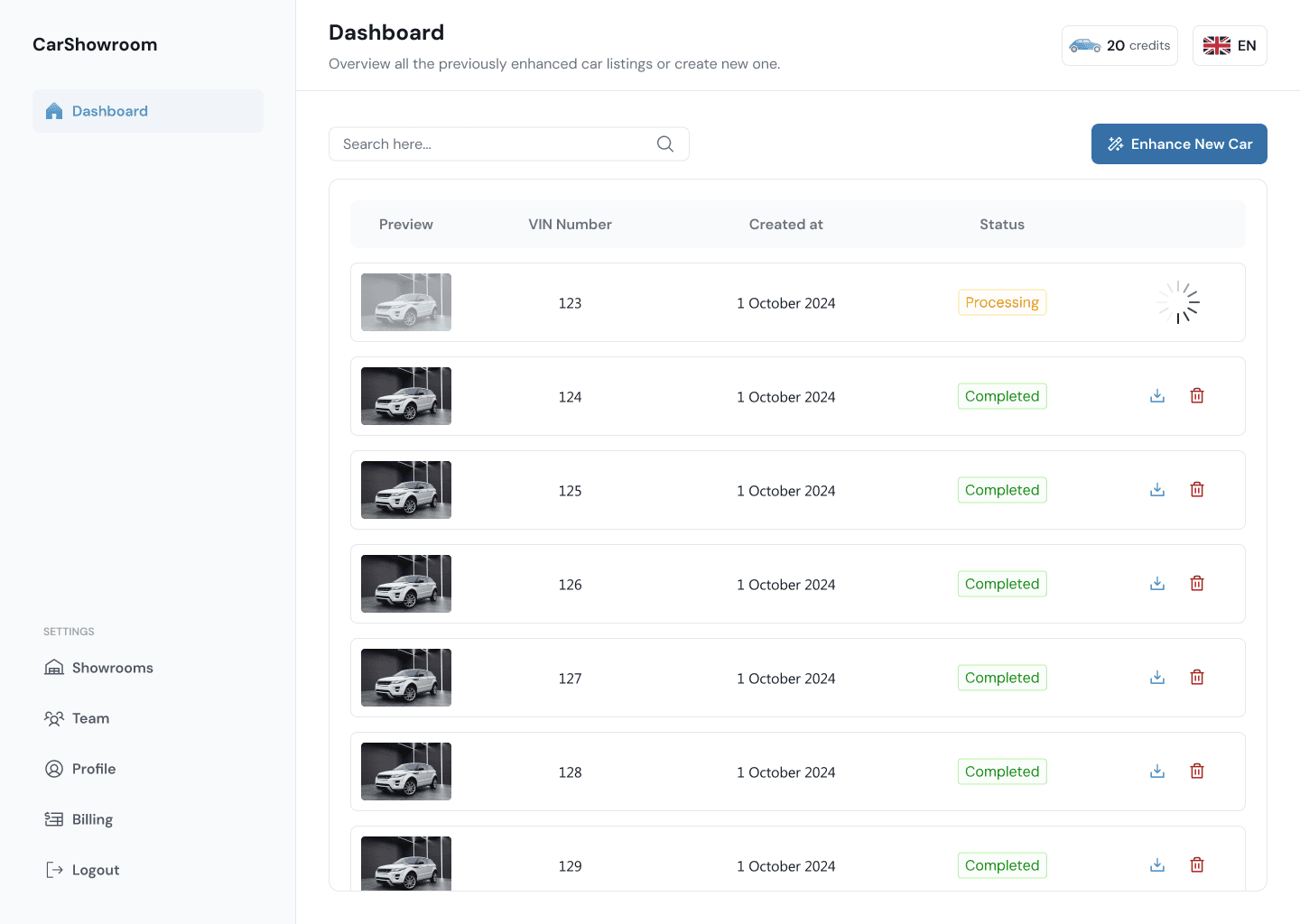
We created modals, snackbars, and various interactive components to make the experience as informative as possible.
Here is the design version on the mobile devices. Looks much the same but with some layout optimization.
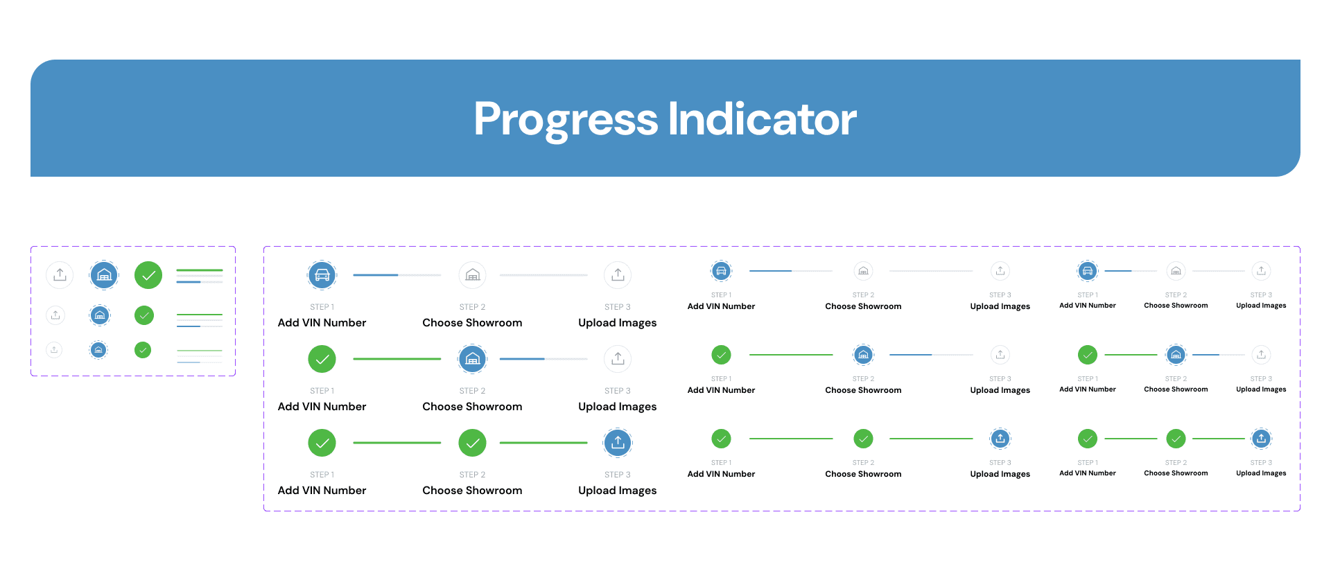
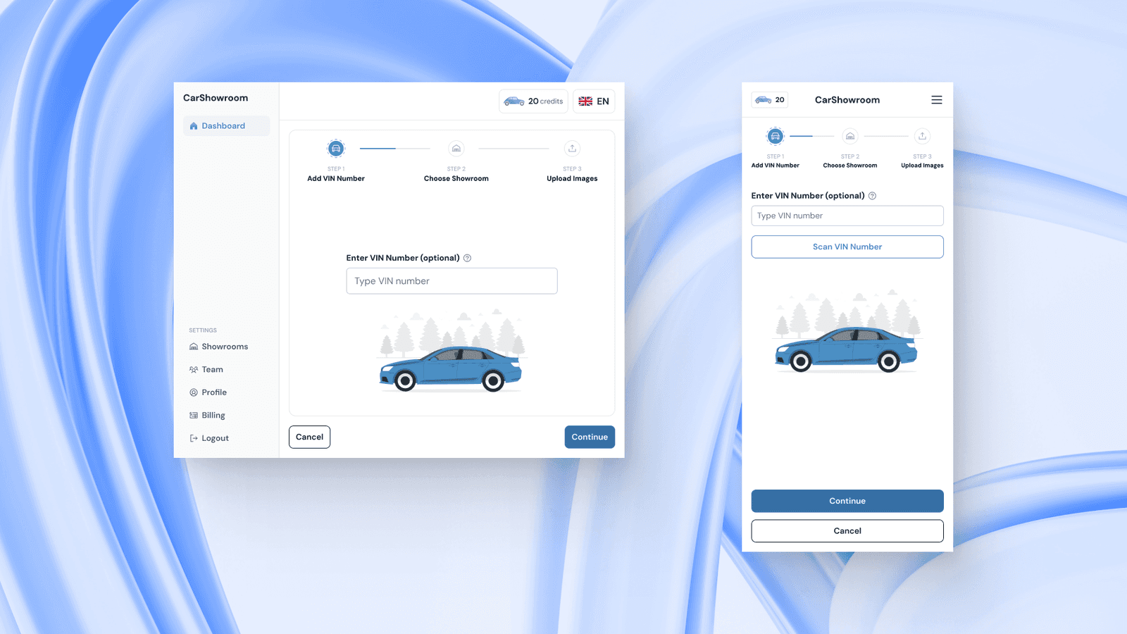
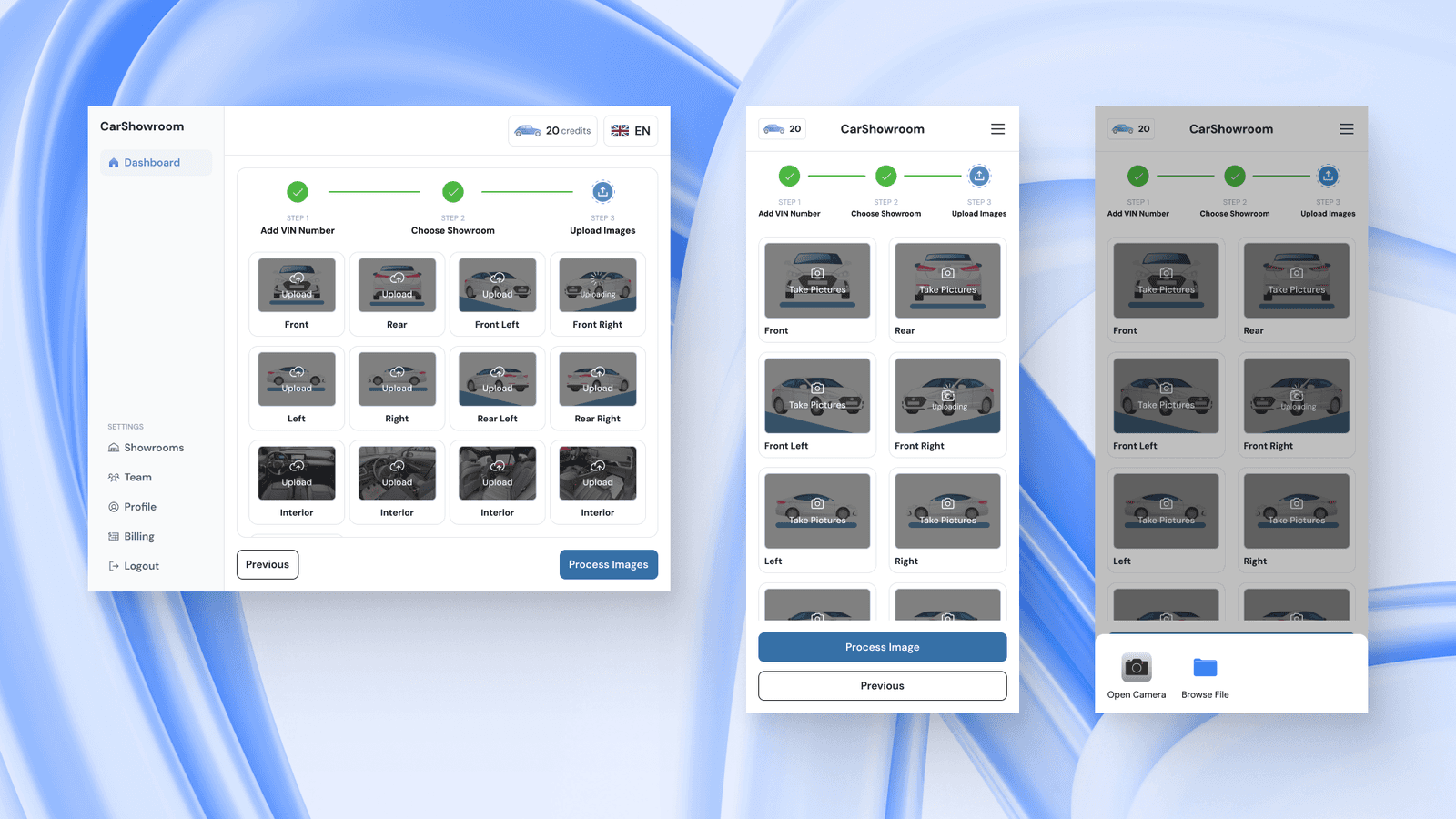
Enter VIN Number
Now we will guide you through the main flow which is turning users’ car images into professional showroom backgrounds using the Carbox SaaS platform. So, after clicking on the main CTA on the previous page, users will be directed into this flow with 3 easy steps; add VIN, choose showroom, and upload images.
Entering the VIN is optional but it’s important to identify what images are currently processed and to make it easier to find the processed image in the platform. Users can just type their VIN on the field and click continue. The design of this page is clear and simple with just one input field with a tooltip and a car illustration.
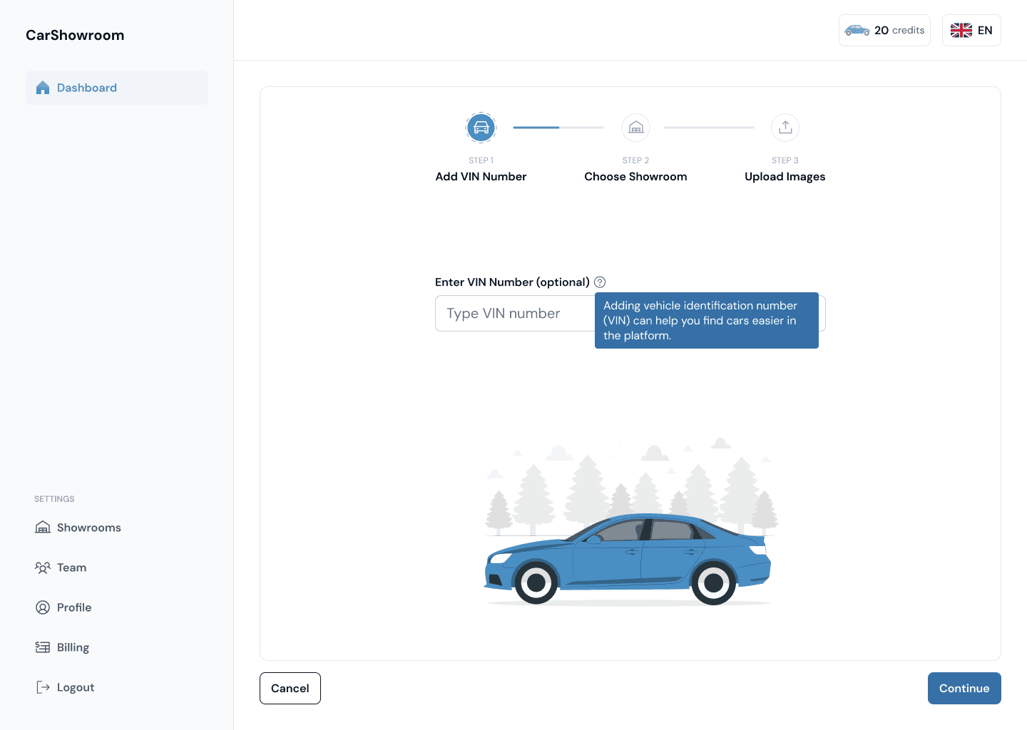
On the mobile phone version, there is an option to scan the VIN, this allows users to open their phone camera to scan for the VIN on their car and go through a separate flow. This will be explained in the Mobile Camera section.
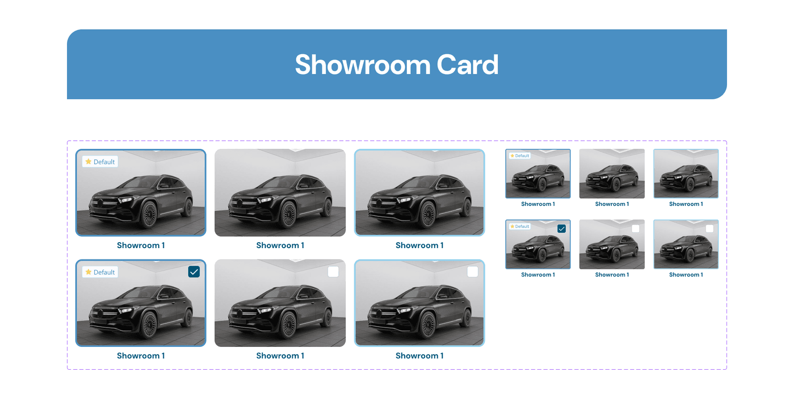
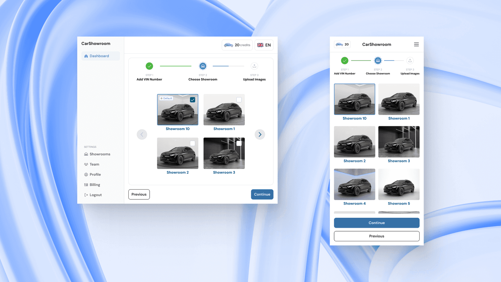
Choose Showroom
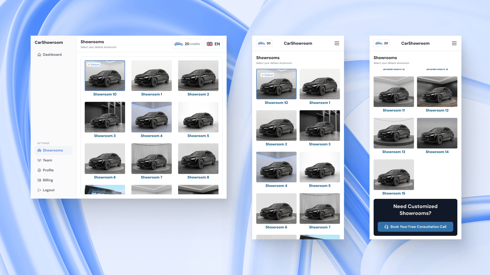
After entering the VIN, users can choose which showroom background they want to use. They can choose from more than 15 different showroom backgrounds to make their car have professional-looking showroom looks easily. The default showroom option will be automatically selected since one dealership might only use one showroom background for all their vehicles. They can set the default background from the Showrooms page.
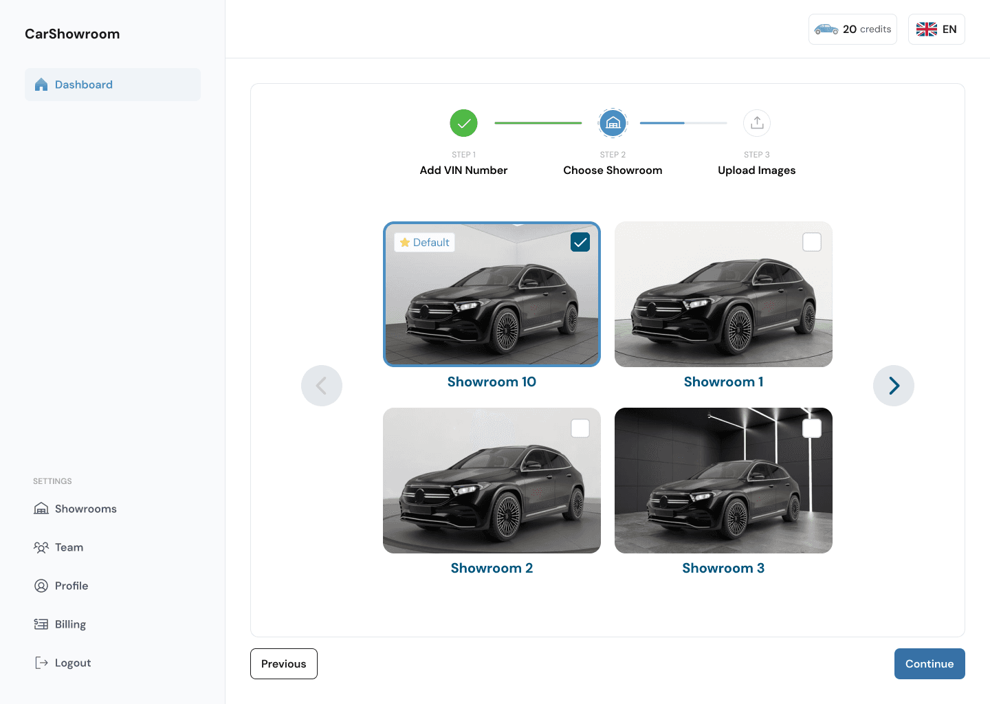
Users can swipe horizontally on desktop and tablet versions to see other showroom options, but on mobile phones, they can scroll vertically.
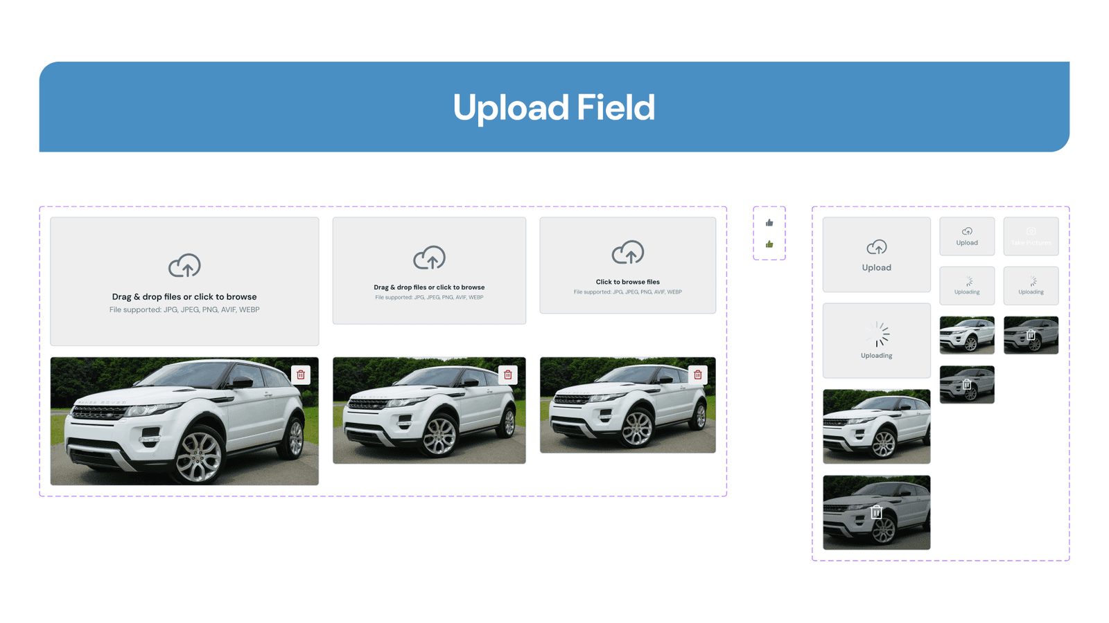
Upload Images
After choosing a showroom background, users will need to upload their car images. They can upload just one angle or bulk upload of various angles and the platform will automatically detect which angle it is. They can only upload image files, so anything else will make the interface display an error message saying unsupported format.
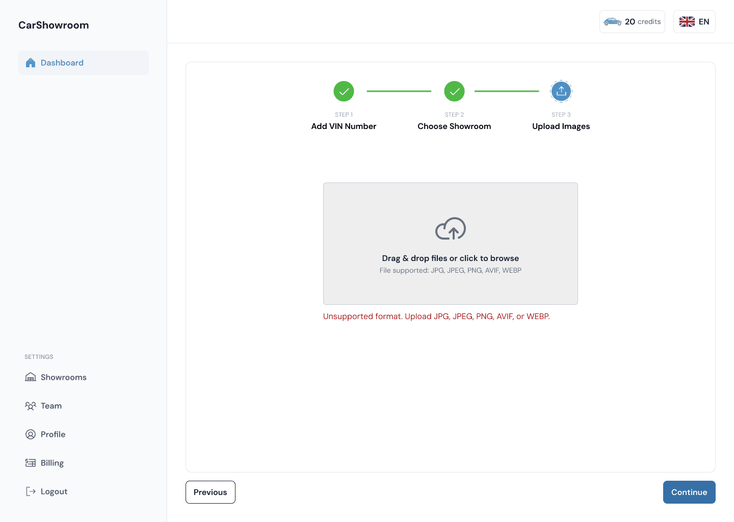
On the mobile phone version, users can take their car images directly to use the mobile camera feature.
Mobile Camera
This is a special feature that is available on the mobile phone version and is planned to be adopted into the mobile app version later on. The main function of this feature is that it allows users to scan VIN and take their car images directly using their phone camera. Users can access this feature from the Scan VIN page and the Upload Images page, if users already inputted their VIN, then they just need to take the car picture.
The scan VIN process is simple, users just need to scan it and the numbers will be automatically inputted in the form. In case of an error, they can just enter it manually.
After having the VIN entered, users need to choose their car shape, this will later used to create a skeleton guide of the car when taking pictures.
On the camera feature, there will be a skeleton guide of the chosen car with default orientation (45° or front left) which they can change from the orientations menu on the bottom right. On the left side, there is a flash feature and a zoom level option, users can swipe up and down to adjust the zoom level. On the upper side is a degree indicator that will change depending on how the users point their camera, users will need to adjust their camera to a certain degree to get the best result on taking the picture. On the bottom and right centre, there is a gyroscope indicator that will automatically match users’ cameras to the car they’re pointing. This is one of the AI features where the camera will show an automatic indicator to help users take their pictures. Then on the right are the shutter button and the change orientations menu.
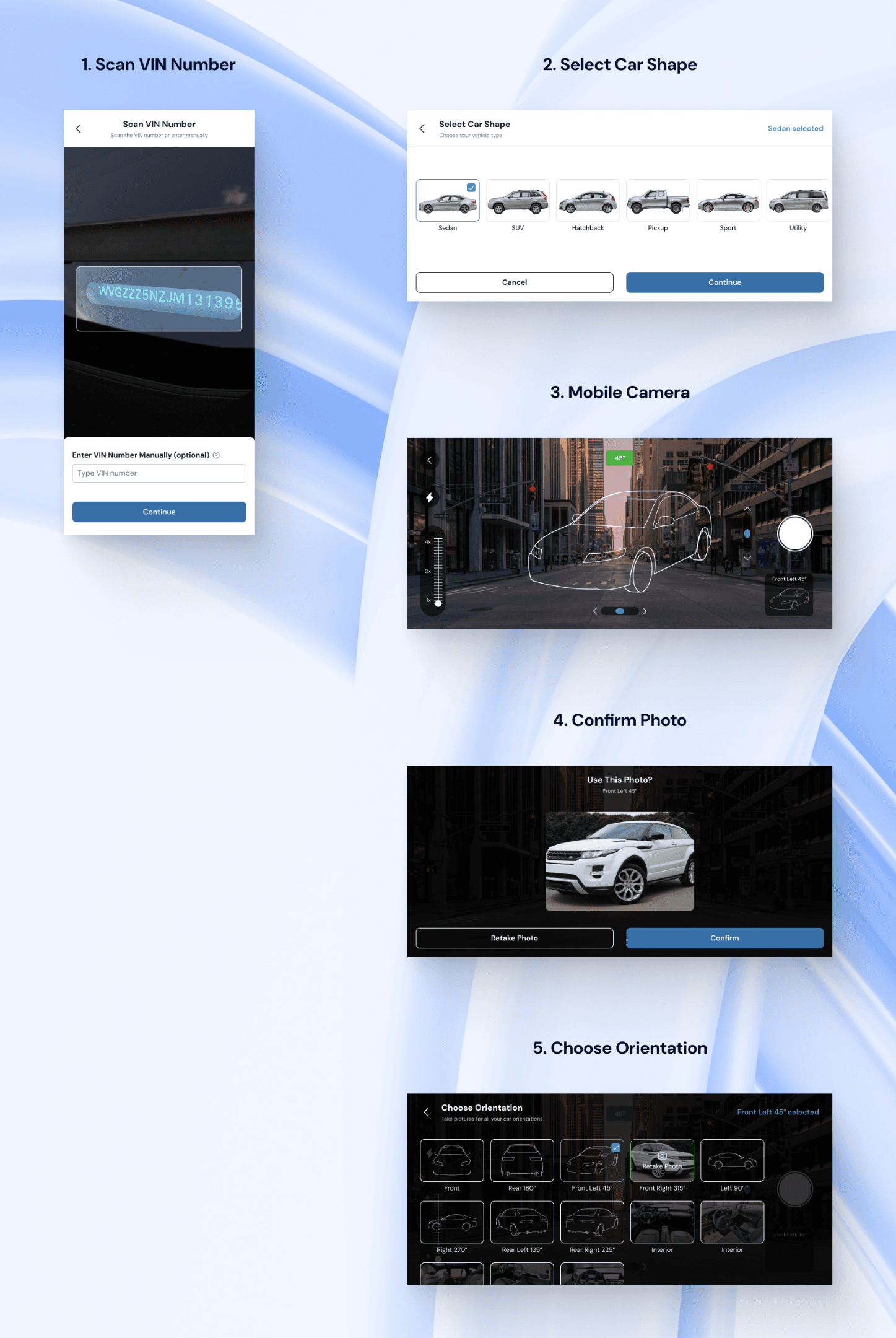
Users can choose between various car orientations and a few interior options. Every orientation will add an outline skeleton guide to the camera feature. After taking a picture, users have the option to confirm the photo or retake it.
Image Orientations
After uploading an image or taking it on a mobile phone, the image will be automatically detected in its respective orientation. Users can delete the uploaded image and upload other orientation images on this page or just continue to process the images. Users can change just one image background or bulk changing all the orientations and the interiors all at once.
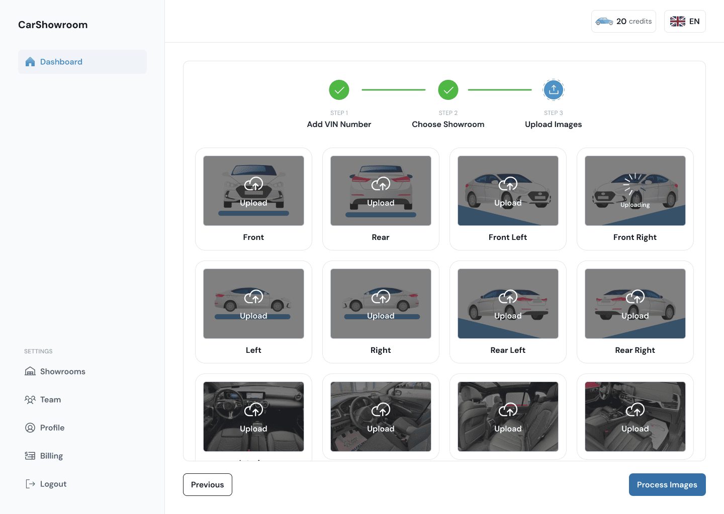
On the mobile phone version, users can choose between taking a new picture or browsing their files.
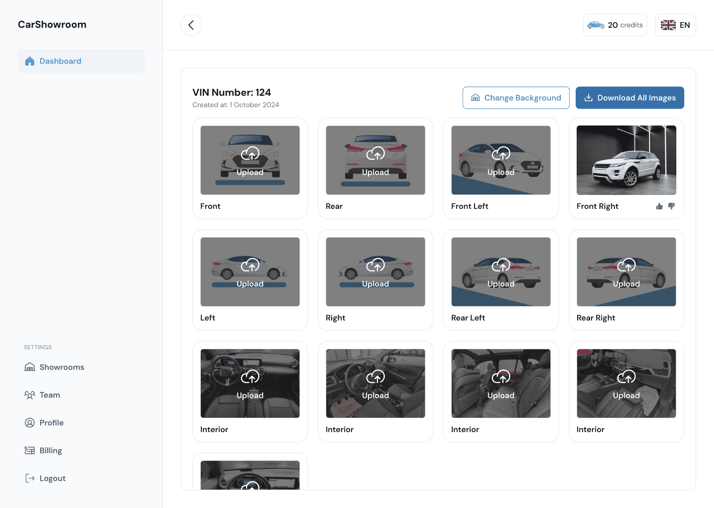
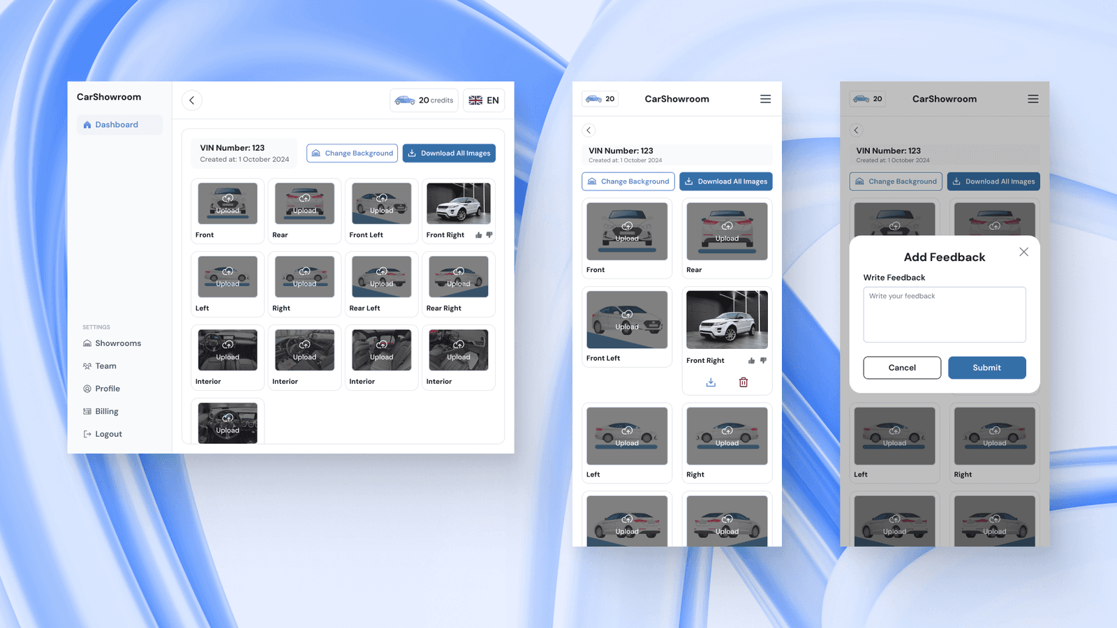
Processed Images
The image processing time takes only a minute or less and after that, users will be directed to the processed image page, this page can also be accessed from the dashboard. Here, users can download the image results that have been changed using the showroom background, users can download all the images all at once or choose their desired orientation.
Users can upload another orientation from this page or change all the showroom backgrounds and it will processed directly without having to go through the flow again.
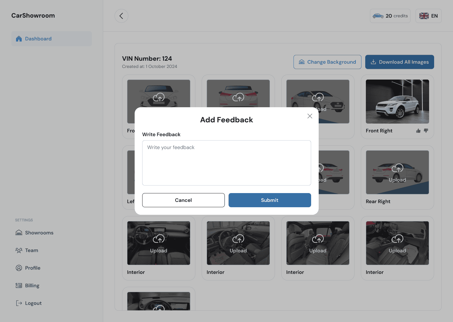
On each orientation card, when hovered, users can have the option to download or delete the image. There is also an option to submit feedback regarding the results.
The Add Feedback modal will only displayed when users click on the thumb-down icon on each result card. If users click on the thumb-up icon, the icon will turn green meaning that the result is perfect.
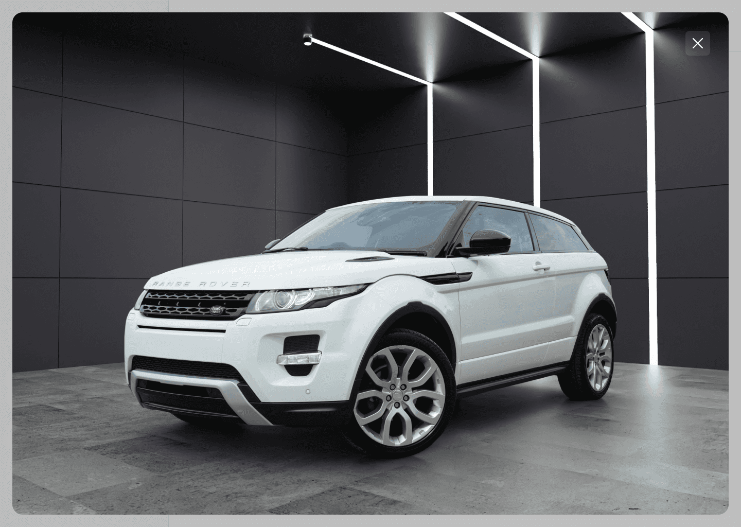
When clicking on an image, they can view the enlarged image. They can download the image directly from here using the right-click and save image option.
On the mobile version, the download and delete button is displayed on the bottom of each processed image card, while on the desktop version, users will need to hover on the card first.
This page is the last step of the main flow. The overall flow is simple and consists of only several steps to complete. The client approved this flow and loved how the design was simple and clean.
Showrooms Page
Aside from the main flow, another feature of this web app is the showroom gallery. Here, users can view all available showroom backgrounds and choose their default ones. The default background will automatically be chosen whenever users trying to change their car background.
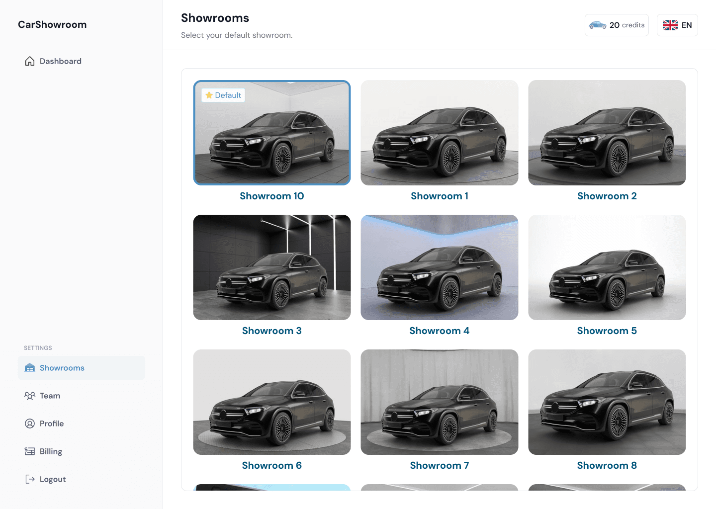
At the bottom of the page after scrolling through all the available showroom backgrounds, there will be a banner that answers users' questions if they want to have a customized showroom background with their branding. The banner will have a CTA that encourages users to book a free consultation call with the Carbox team. The reason why this banner is located at the bottom of the page isthate the client wants users to explore the available background first and then provide the option to customise it.
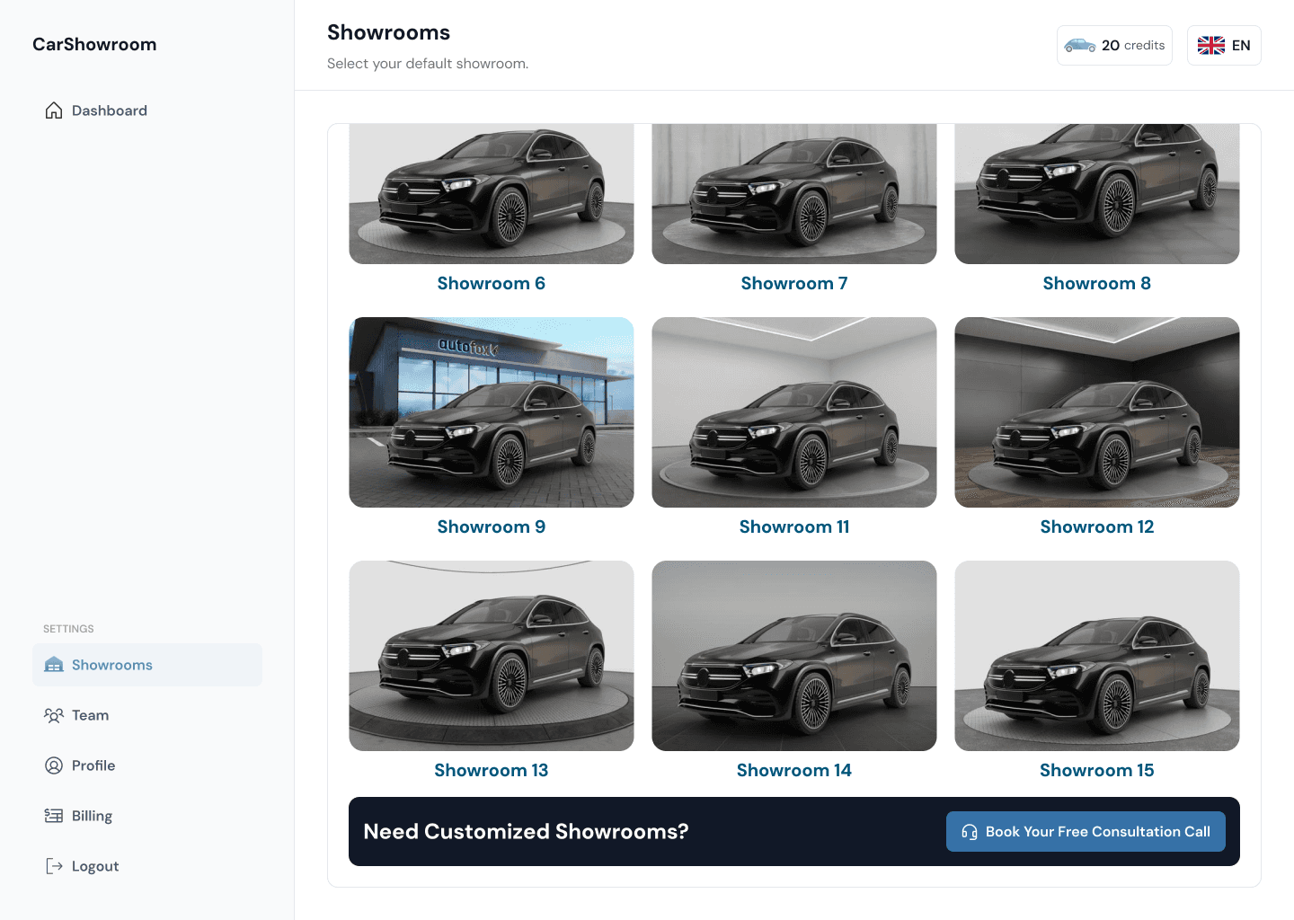
Here is the mobile version of the page:Here is the mobile version of the page:
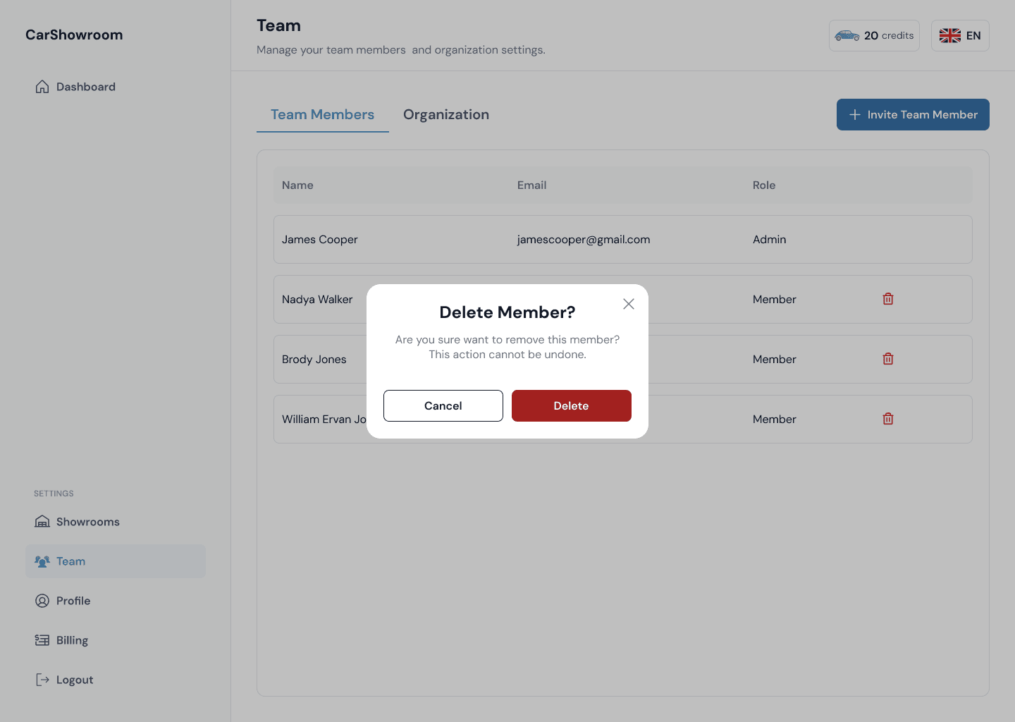
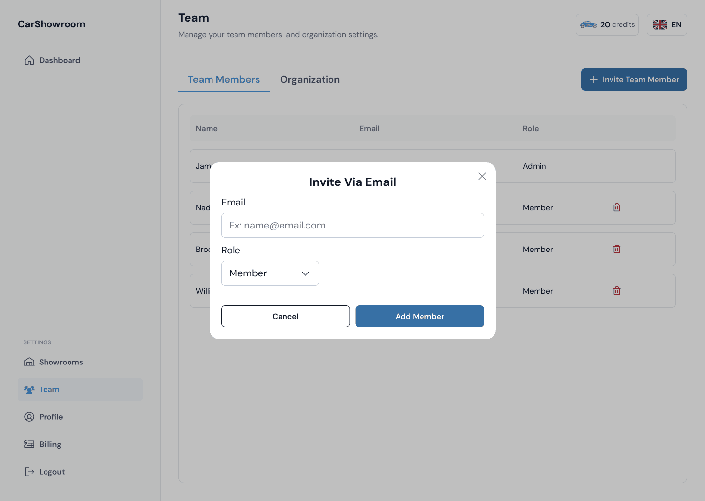
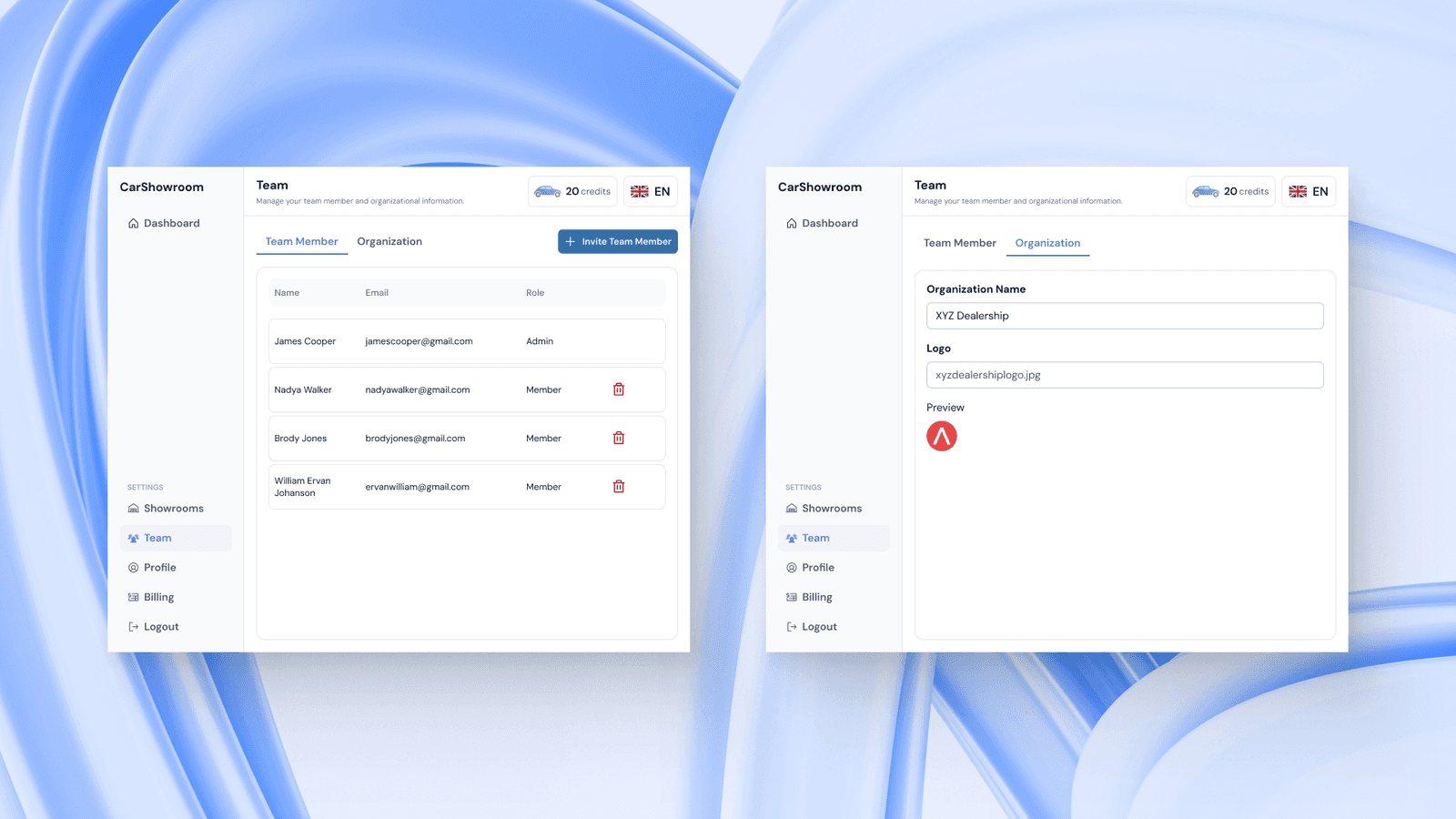
Team Page | Member
As a common B2B SaaS platform, the web app can be used by a few people as a team. Depending on the plan subscribed, Carbox lets users invite their team to access the platform together. Here users can invite their team members, change their roles, or remove them.
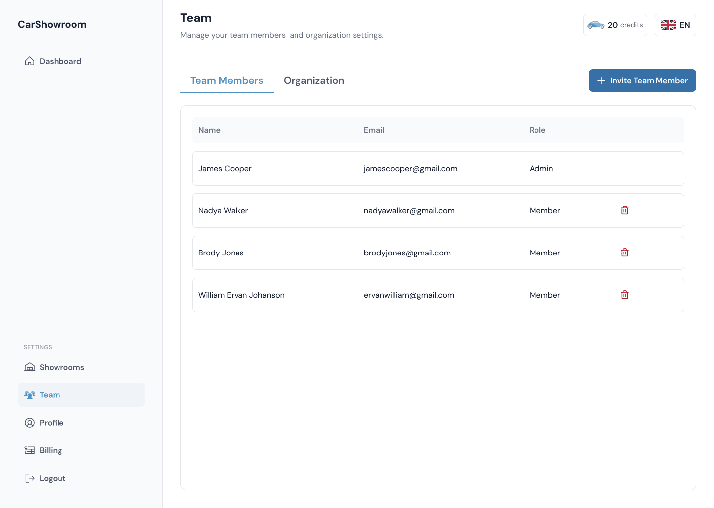
The team admin can remove any team member by clicking on the trash icon.
Admin also can invite their team by entering their email and choosing their role (admin or member).
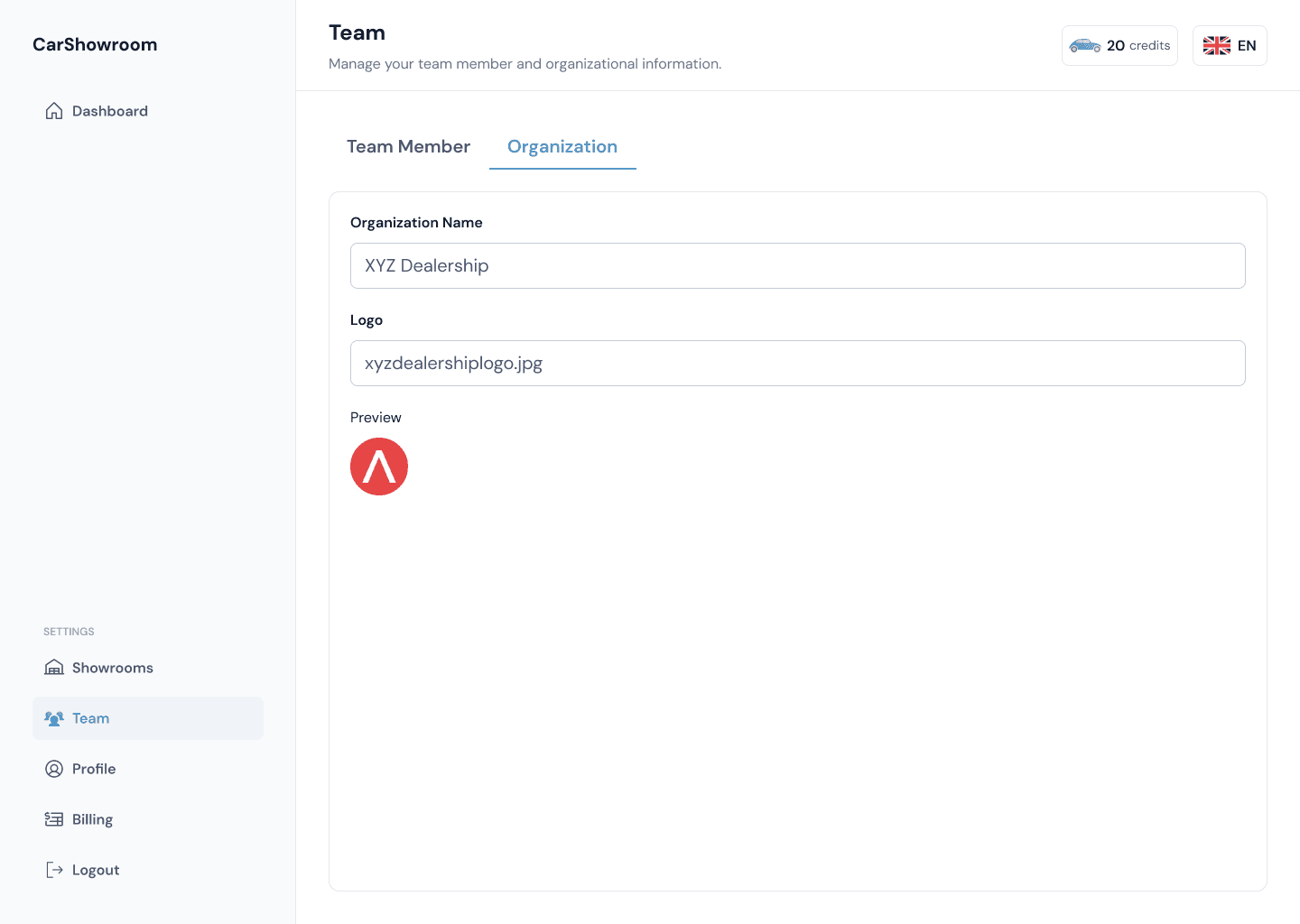
Team Page | Organization
The team page has two tabs, the first is to manage the team member, and the other one is to manage the team information. Here, users can change their organization name and logo to add more personalization to their team.
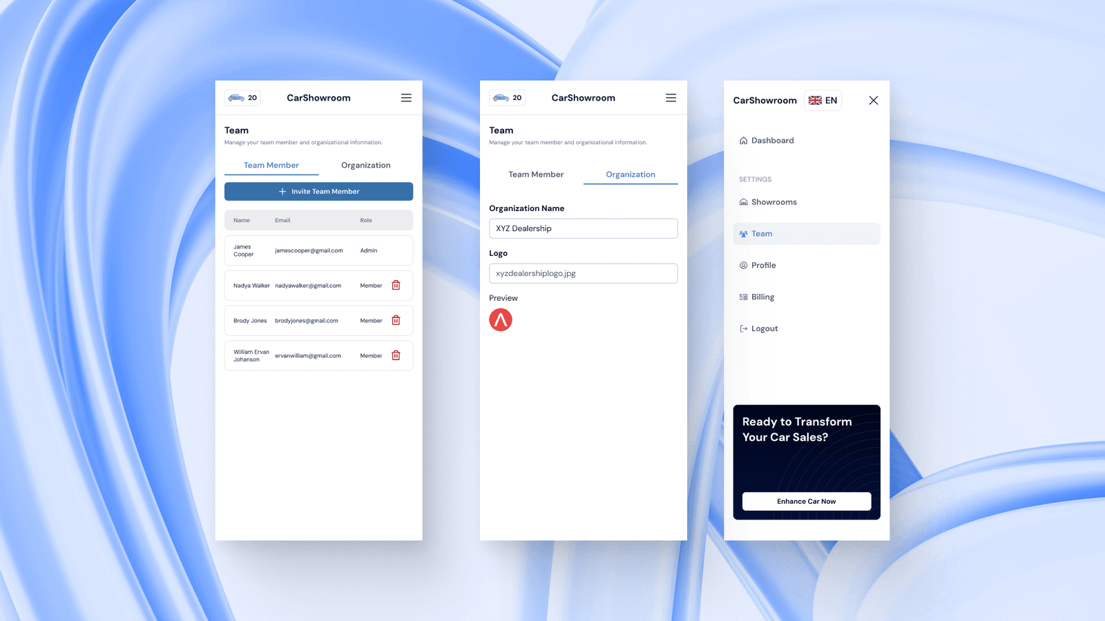
Here is the tablet version of the team page:
Here is the mobile phone version of the team page:
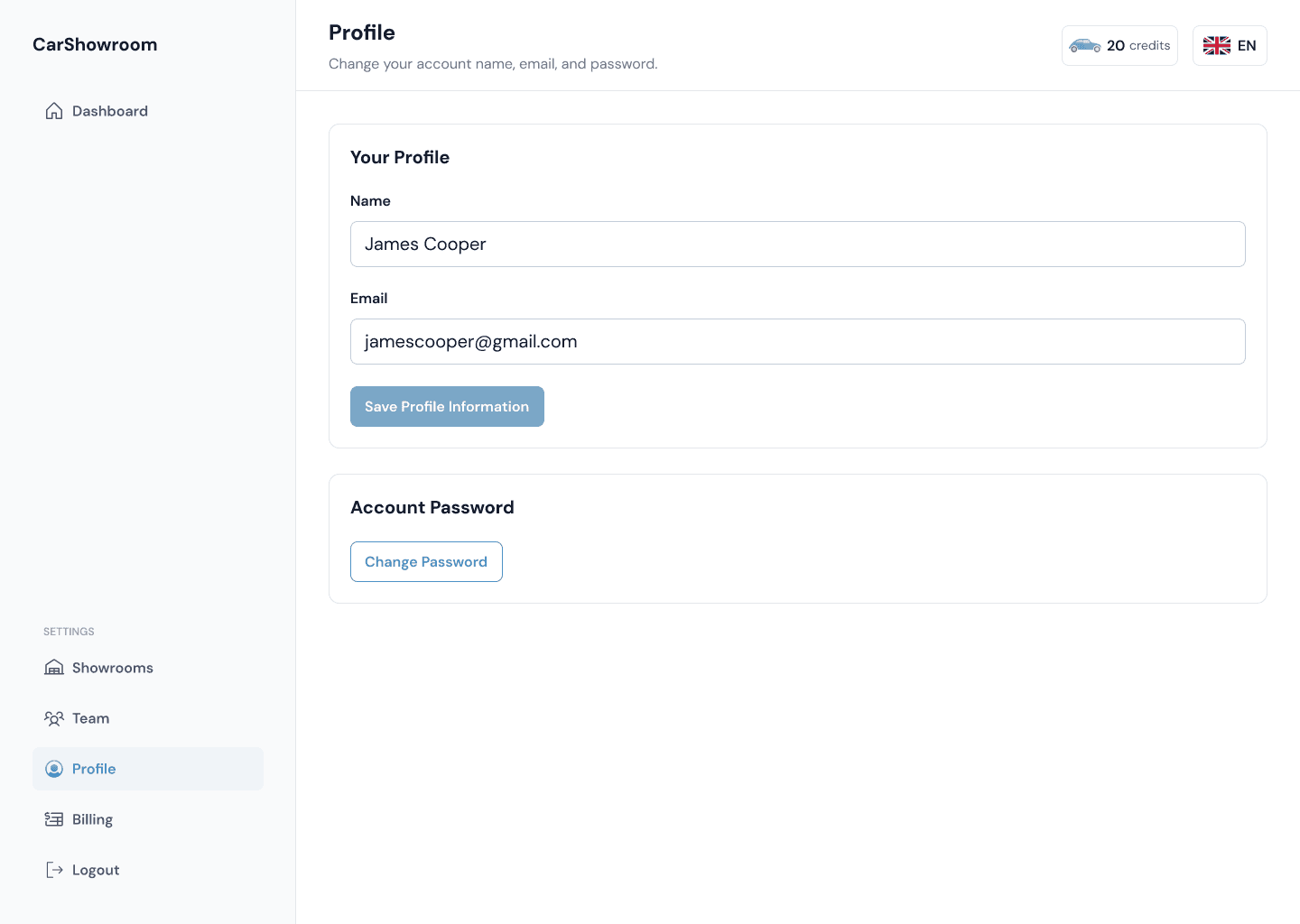
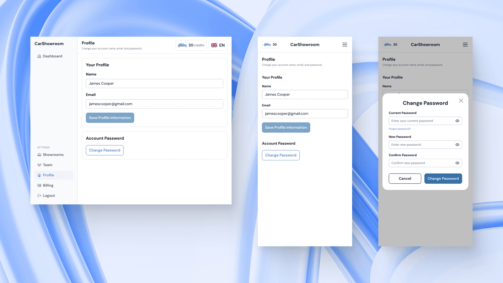
Profile Page
Next is the profile page, here, users can change their personal information like name, email, and account password. The design is very simple since the client wants the platform to be as easy to use as possible and cut the unimportant information.
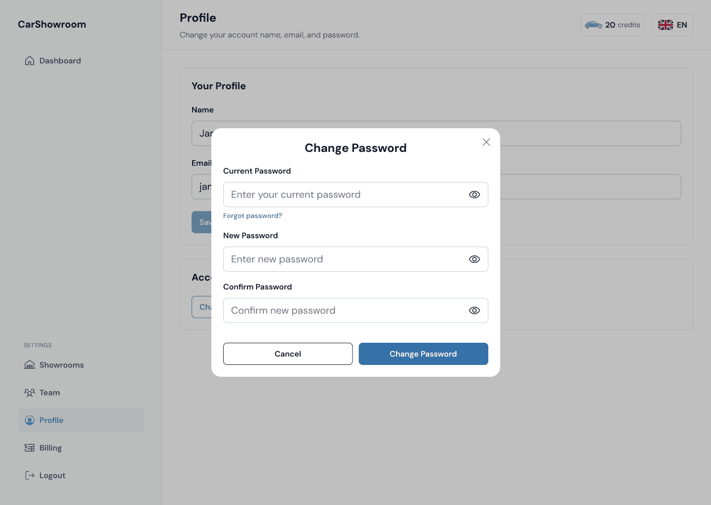
When clicking on the change password button, there will be a modal to let users change their password. Currently, the client doesn’t want to add a verification flow so we just designed as simple as this.
Here is the tablet and the mobile version of the design.
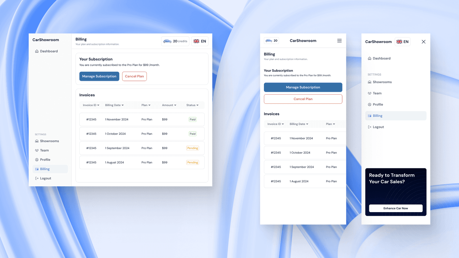
Billing Page
The last page we designed is the billing page. Here, users can manage their subscriptions and view their past invoices. This page displays what plan users are on along with showing the past billing history and its status.
The blue, Manage Subscription button will guide users to their payment method (Stripe), while the red, Cancel Plan button will cancel their subscription.
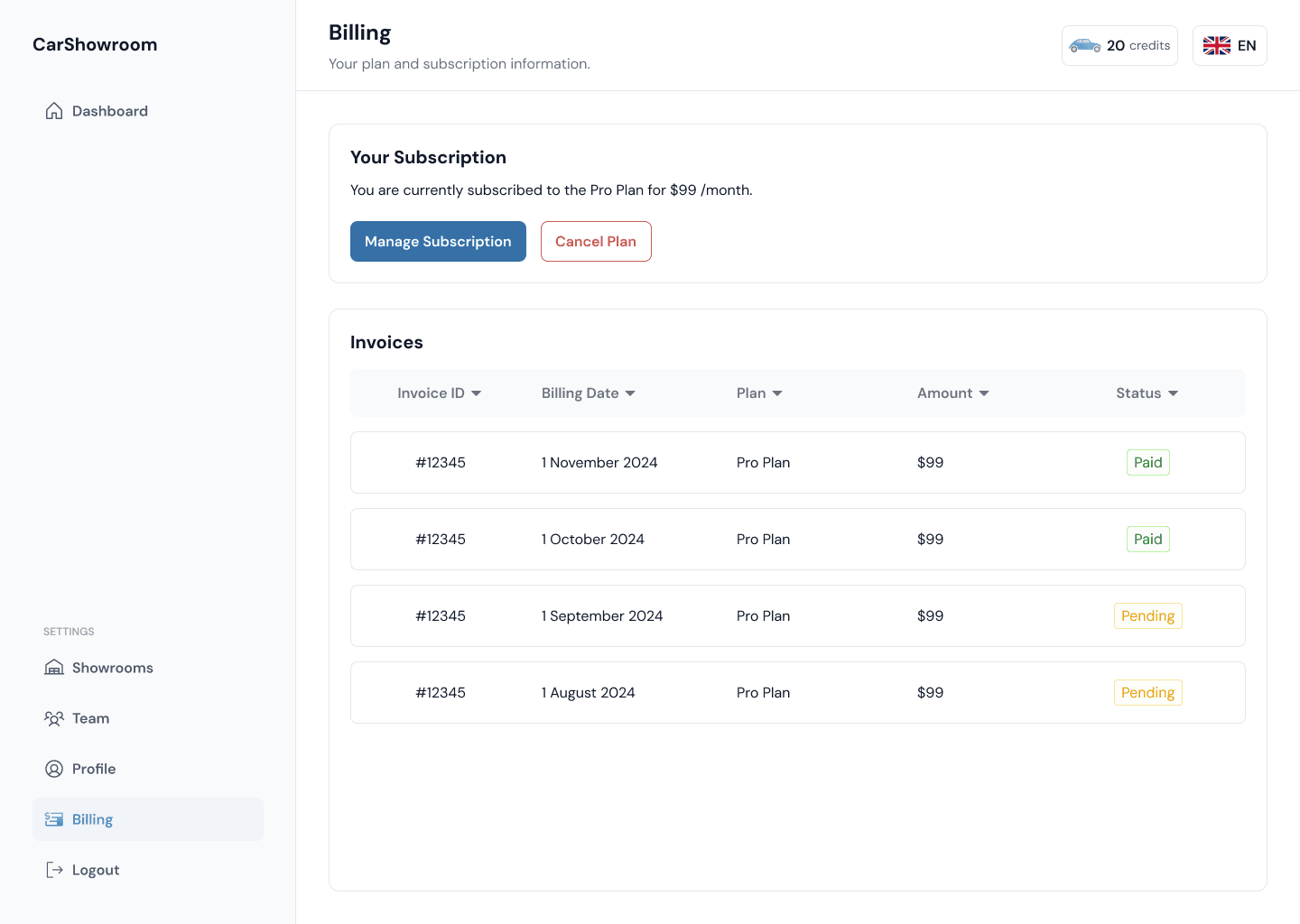
The invoices table on the mobile phone version is scrollable horizontally to make the design clean and not filled with too much information.
Prototype
This is the prototype of the design on Figma.
Measurable Outcomes
Since the client is a fast-moving startup, right after the design is completed, they take it directly to the development phase, meaning that we don’t have any time to validate the designed solution or conduct usability testing. However, based on the client’s feedback to us, they are satisfied with the result and commend our design process that are very communicative and great for collaborating.
Limitations & Lesson Learned
This project is a UI design that only delivers the final high-fidelity design without the need to conduct deep user research and usability testing. We enjoyed our time in completing this project and there was no real limitation on this. The client provides clear requirements we are free to explore what is best to make this SaaS platform easy for any user to use.