A web UI/UX Design for an internal web app for company staffs to fill out daily reports.
CLIENT
Candidate College
ROLE
Head of Web Design
SERVICE
Product Design (Web App)

Project Details
Problem
The previous process of staff reporting is my filling out Google Spreadsheets daily and the supervisors and stakeholders will need to check it manually. Considering there are so many company staff, there is a need to create a system so that staff can fill out their report easily and let their supervisors view them without much hassle. This can be done by creating a specific platform for staff and stakeholders to fill out and check daily reports and give monthly feedback based on that.
Goals
Design a new web app product called CC Weekly Report. The website will have various features depending on each use case.
For staff flow, they will need to be able to fill out their weekly report and receive monthly performance feedback.
For head & co-head flow, they will need to be able to fill out their weekly report, view their staff's reports, and give monthly feedback.
For C-level flow, they will need to be able to view all their subordinate reports, give head & co-head monthly feedback, viewing all division progress.
Role & Responsibility
My role here is as a Head of Web Design, the division itself is still new so the members are just me alone without any co-head or staff. I was responsible for designing the whole website in a strict timeline and defining the best way to make an easy-to-use design flow.
Constraints
Since the timeline is just 3 days, this is quite a lot for designing a multiple-flow website, my superior also suggested I create a low-fidelity design, which is daunting since the timeline won’t be feasible to design such many pages with a long design process.
My approach here is to just design the website in high fidelity and not create wireframes or other stuff. I also only designed it in a desktop view considering the strict timeline, but in the end, I was able to complete it and the design was approved. About another design view (mobile view) will be created at a later time.
Design Process
The design process only consists of defining user flow and jumping directly to high-fidelity design. I had no time to do other processes and decided to prioritise what matters the most from the given task.
User Flow
After getting the design brief, I started defining the user flow to map all the screens I needed to create within each use case. The flow itself is not that complicated but has various versions for every kind of user (staff, head & co-head, and C-level), here you can view the pdf file on this link.
Components Used
For the design style, the company already has a design system that follows its brand colours and has been implicated by the previous designers on many projects. Here I just use the same style as already established and proceed forward using the design system. For components that are not available in the design system, I created them as local components, you can view more details about every component that I made here. All components that I made are interactive so it’s indeed designed to be played on the prototype and make it as real product as possible.
For some information, the Candidate College brand colours are yellow and deep blue. From my point of view, it’s not bad but when applied on the website or digital product, it would be not very good and considered weird. What you’re about to see down below is a design style that has been used by a previous designer and so that’s why my superior also referenced these styles to be used on this project. So, yeah, the colour scheme can be improved.


Final Design
After fixing the user flow, I jump directly to design the high-fidelity design. I used all available resources like design systems and company design references to set up my way to complete this project. Here I will explain in detail everything that I designed.
Design Preview
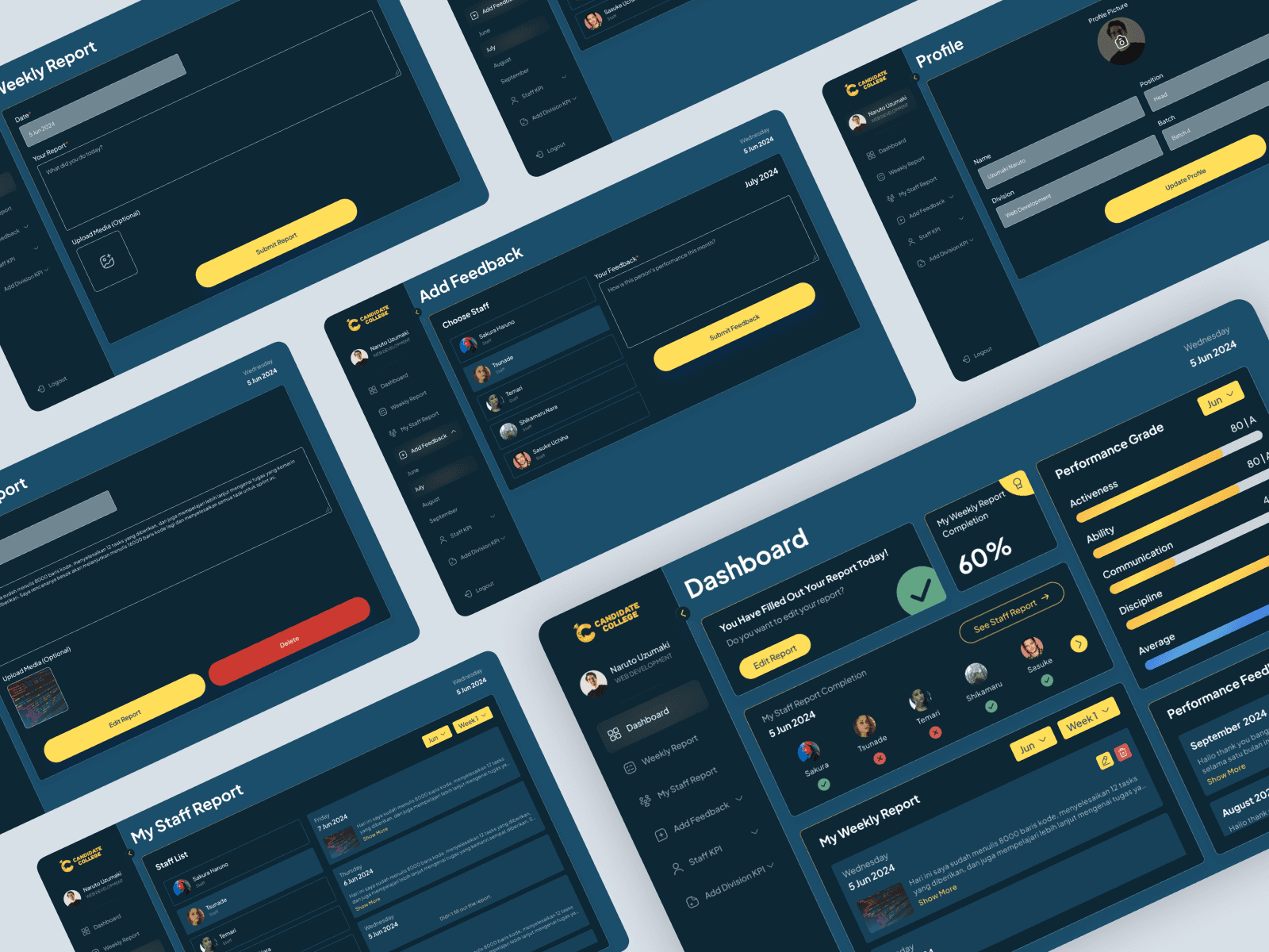
I only designed the desktop view due to the limited time frame, and because it’s desktop, I implemented a sidebar on each page for easy navigation. The sidebar can be collapsed and expanded, here is the preview.

Staff Flow
This project will have 3 use cases which are for staff, head & co-head of divisions, and C-levels. On every use case, there is a special flow with respective features that are not available on other flows. Here is the first flow which is for staff. The functionality here is just a basic dashboard to track staff’s weekly report progress, view performance grades and feedback, and fill out their report.
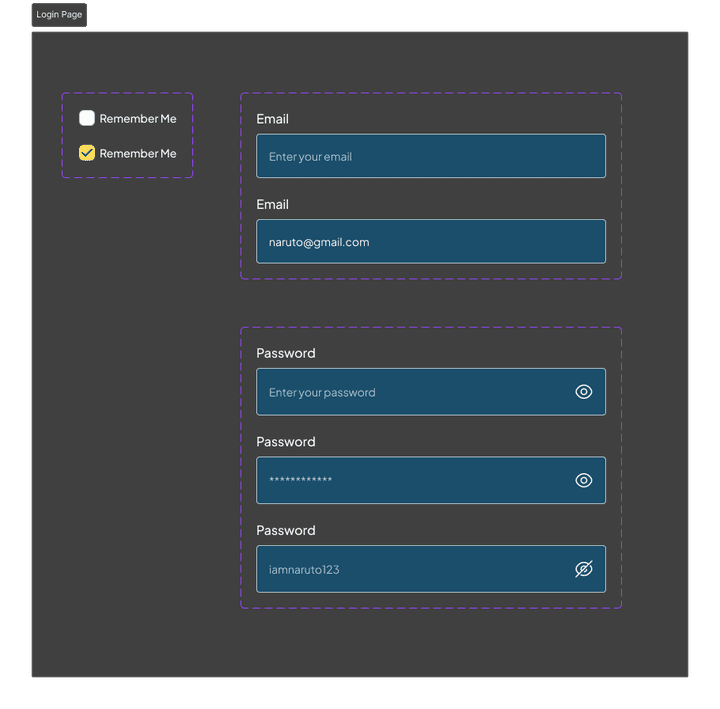
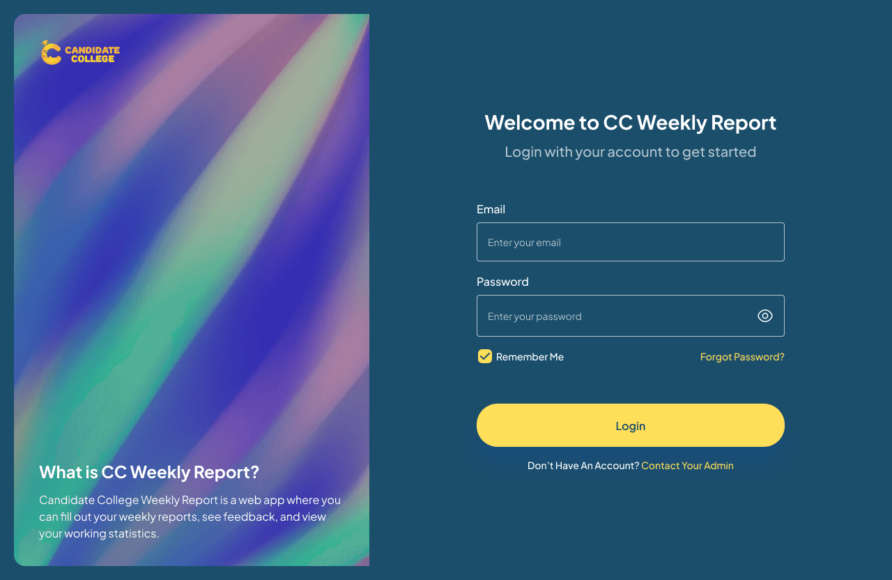
Login Page
Despite the 3 use cases, the login page is the same. They will have to enter their email and password (how they create an account will be explained in this section), and the system will automatically match their role based on the database. If users forget their password, they can reset it directly from the Forgot Password button.
The design here is quite common in the pattern of login page design with an animated illustration on the left side that also explains what CC Weekly Report, is and the login form on the right side. For the colour scheme, as I said already, this colour style was already established with other previous CC products so I had to follow it even though it was not really good. And yes, the concept of this website is dark mode so the colours are kind of deep and dark.
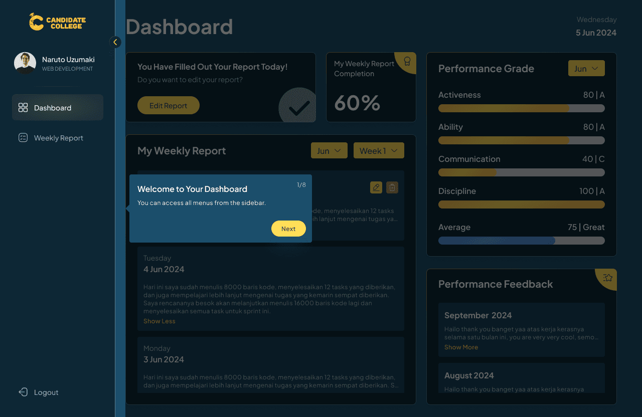
Guides
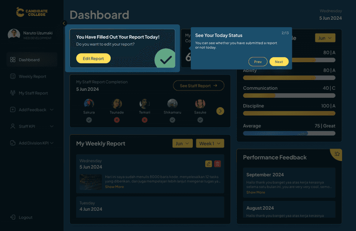
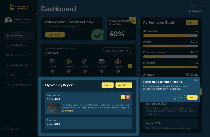
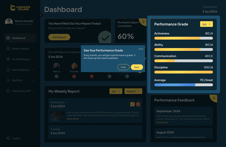
On a user's first-time login, there will be guides that show detailed information and features of the website to let users know how to use it. The guides are unskippable because they will only show on first-time login. The CTO want this to be a special feature on the website that won’t show anytime else other than the first time users log in to their account. Here I designed the guides as a coachmark that explains all the features on the website.

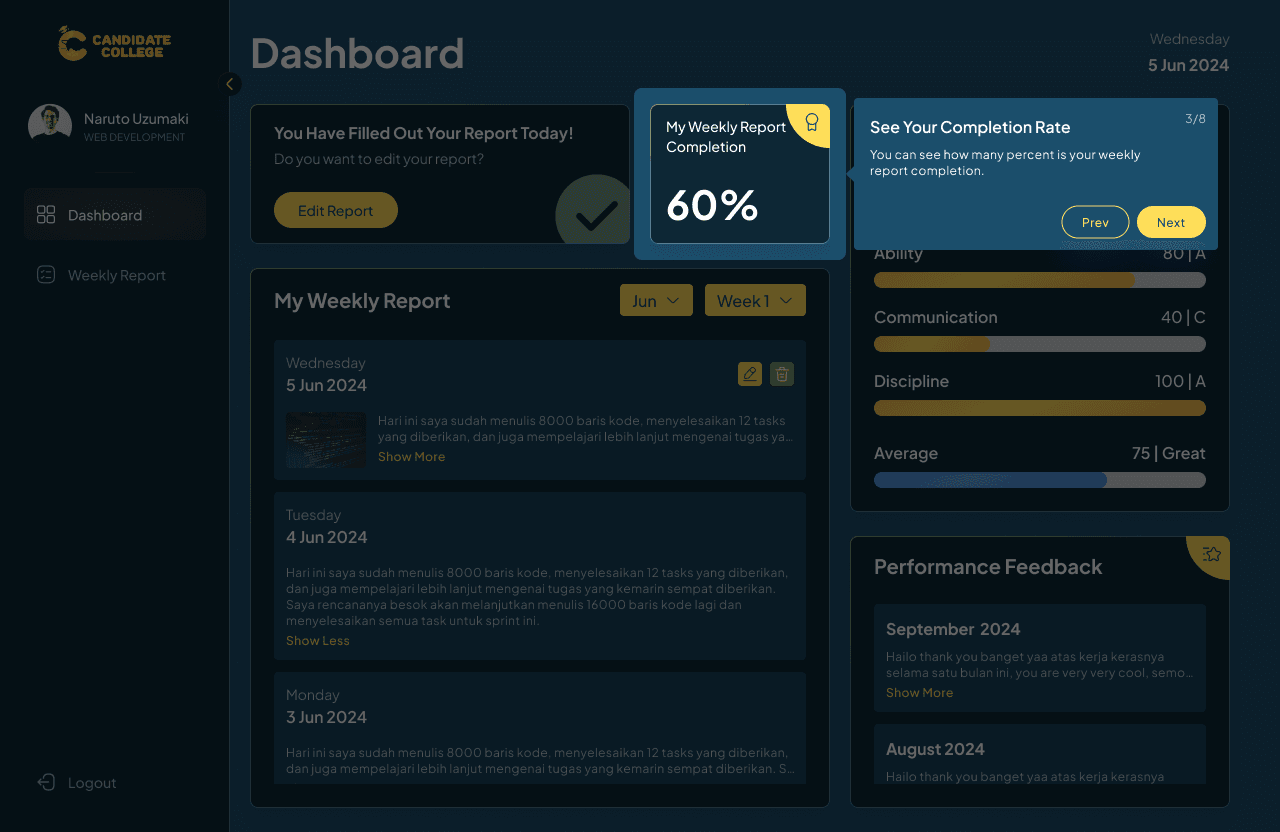
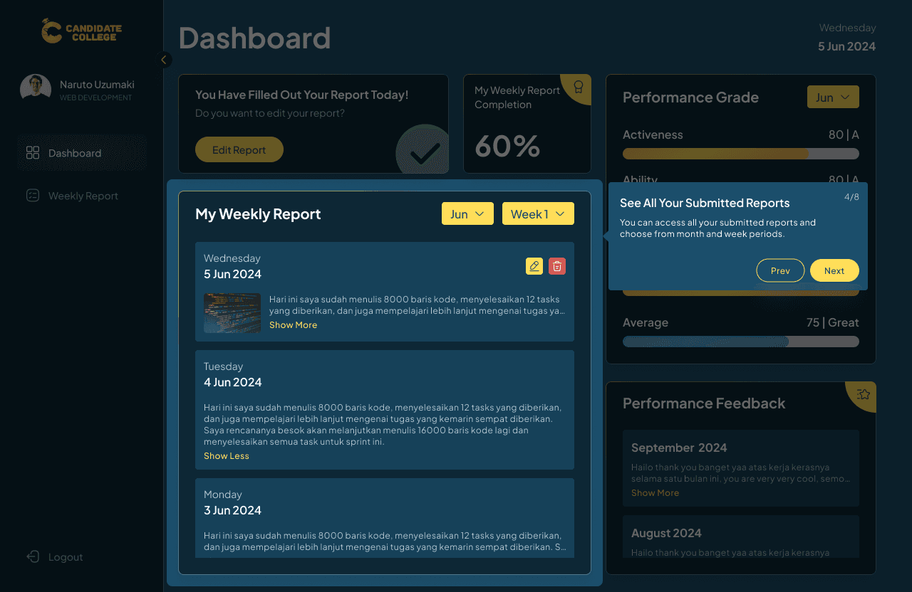
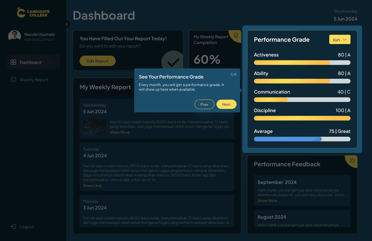
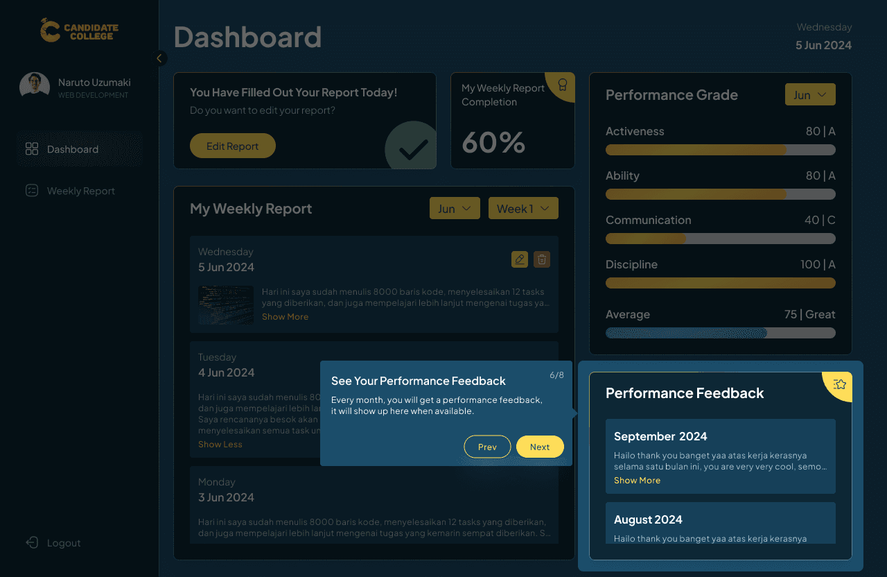


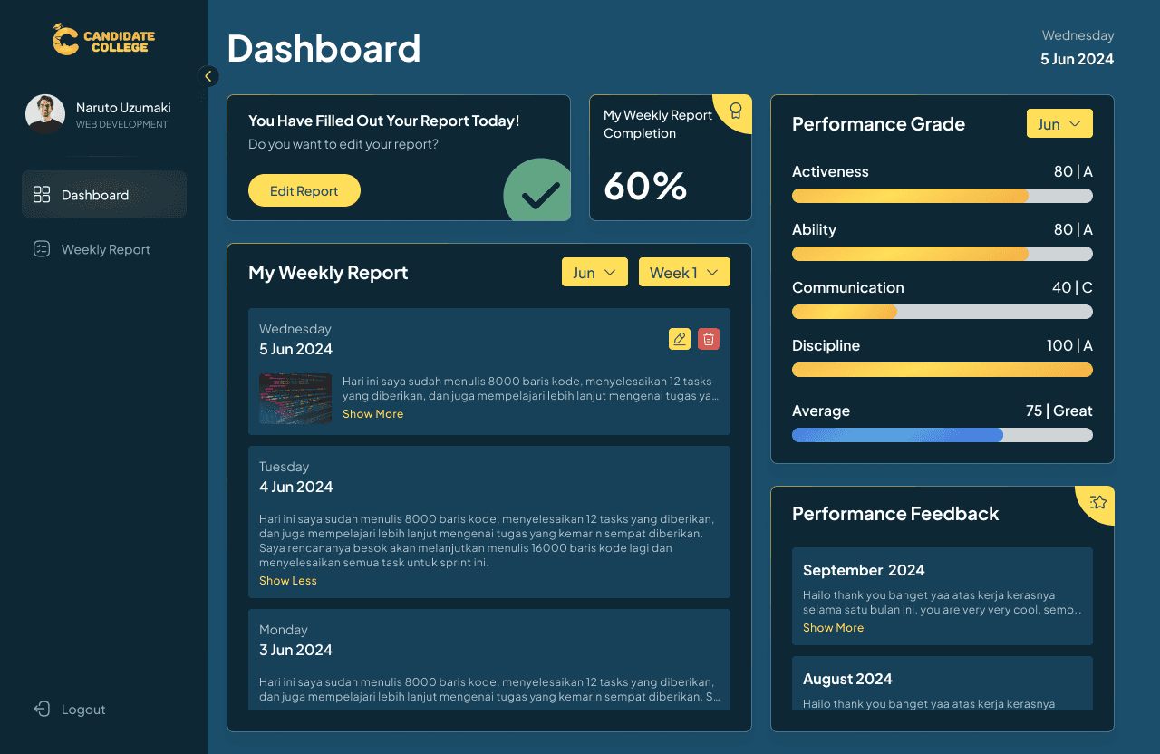
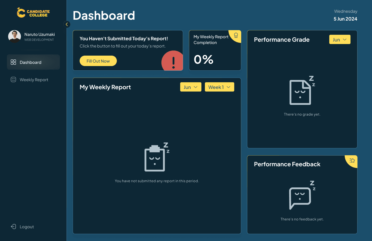
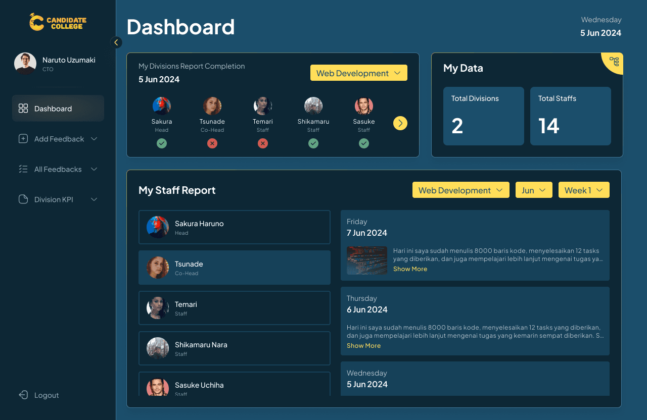
Dashboard
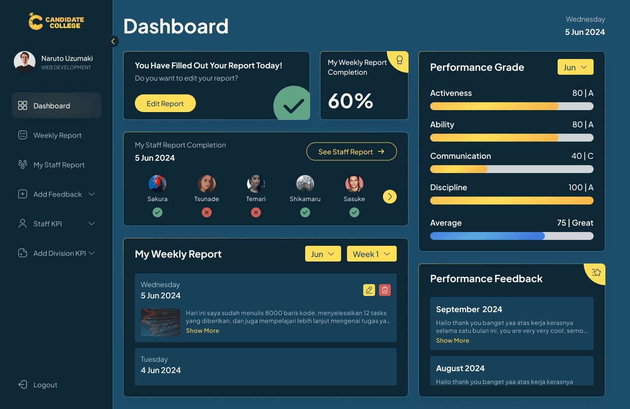
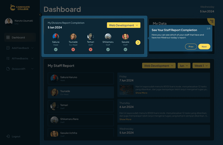
The main feature on the web is the dashboard which shows all information regarding the staff’s weekly report status, progression, monthly performance grade, and performance feedback. Users can know whether they have filled out today’s weekly report or not and see the percentage of this week's report.
On the right side, there are the user’s performance grades and feedback that will be given monthly by their superiors. In the My Weekly Report section, users can view their past reports and edit or delete today’s report. The design here is compact but simple with all the main information placed together so users don’t have to go to lots of pages to check all this information. This page is designed to let the user know their report status, there will be a different banner that displays whether the user has already filled out today’s report or no.

This is the page empty condition and when users have not filled out their report.
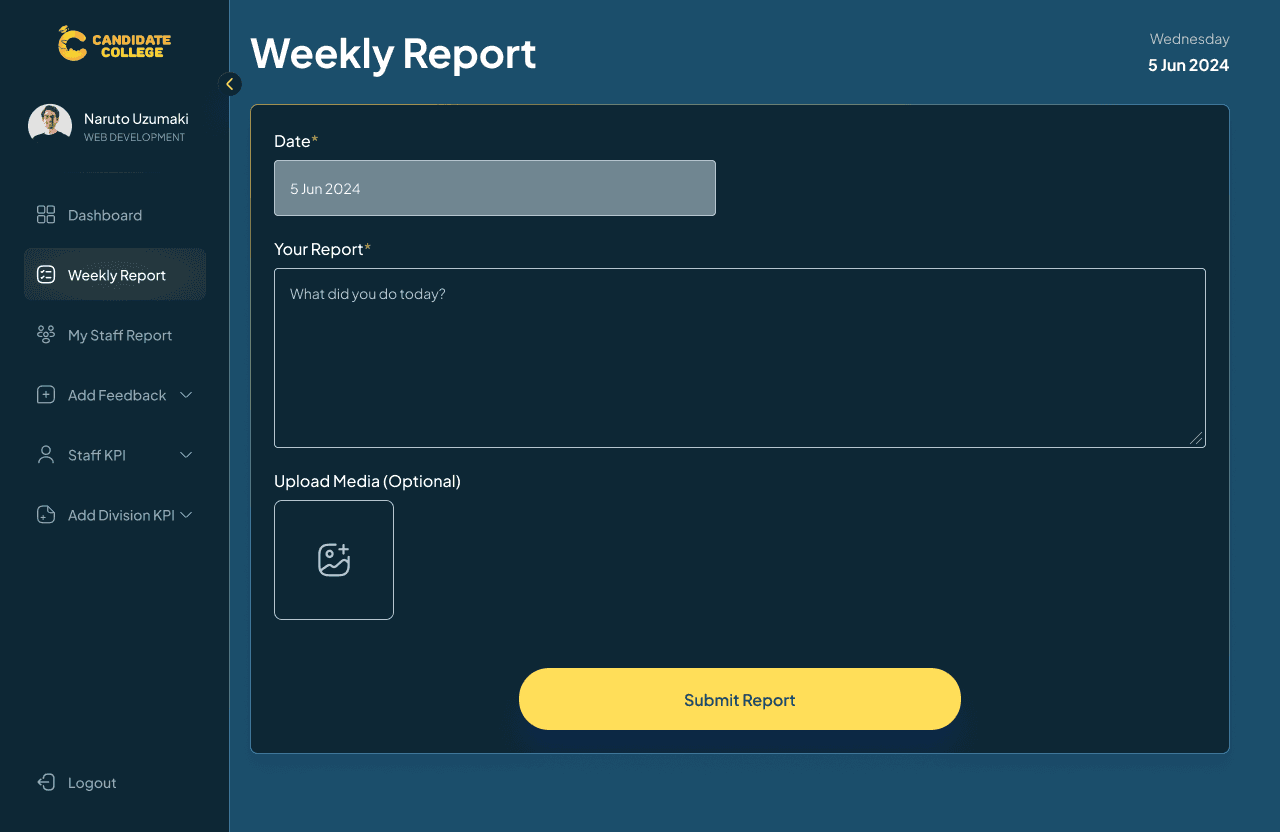
Fill Weekly Report
Another main feature is the page to fill out the report itself. Users won’t be able to choose what date they want to fill which means that this report should be filled daily and when they don’t, they can’t get back to fill it. This was the request from the CTO but later revised so that users can choose a date on that week so as long as the week hasn’t ended, they can still fill report on the missing days.
Users can write their report as text and add pictures, they can also update or edit it after submitting. The main thing here is just the same as feeling a report on Spreadsheets, simply write and submit it. On the right side of the screen, any page will display today’s date so users can track the date they saw the report.

This is the condition when users have submitted their report, there will be an option to edit and delete it.

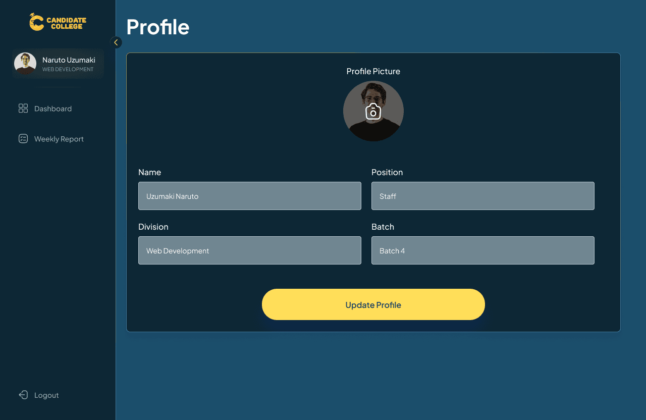
Profile Page
On the profile page, users can’t change anything besides their profile pictures, this due to their data is already fixed on the database and changing it would not be possible.
The staff flow has just the simple and basic things of a weekly report website, with this design, I hope that it’s clear enough and functions as straight as possible so users don’t waste their time getting to understand the flow.
Head & Co-Head Flow
For the head & co-head of divisions, the feature is the same as the staff version but with some additions like displaying which of their staff have and haven’t filled out today’s report along with adding monthly performance feedback for their staff.
Guides
Just like the staff version, there will be guides on the first-time user’s log-in that explain all the features on the website.


Dashboard
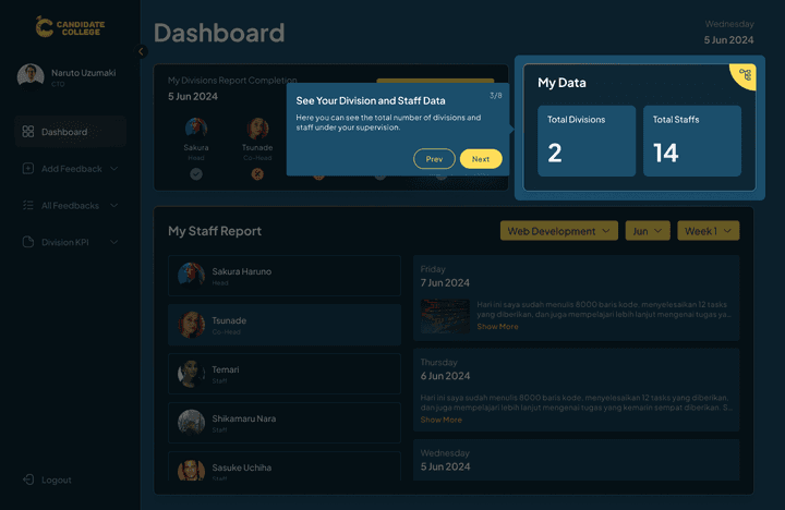
The dashboard design is the same as the staff version but with an extra section of My Staff Report Completion that shows whether their staff’ already filled out today’s report or not. Even though they can see which of their staff haven’t filed a report, there is no option yet to remind their staff or send some kind of information, just display it. From this section also, users can directly go to the Staff Report page to view all their staff reports.
For the performance grade and feedback, the head & co-head are graded by C-levels meanwhile staff are graded by both the head & co-head.
Fill Weekly Report
The Head & co-head also need to fill their weekly report, the flow is the same as on the staff version, the only difference is that the head & co-head's report will be graded by C-level, their superior.

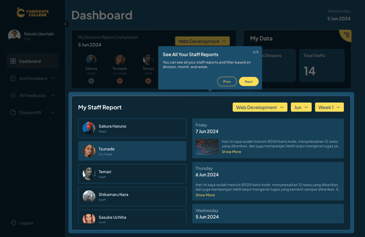
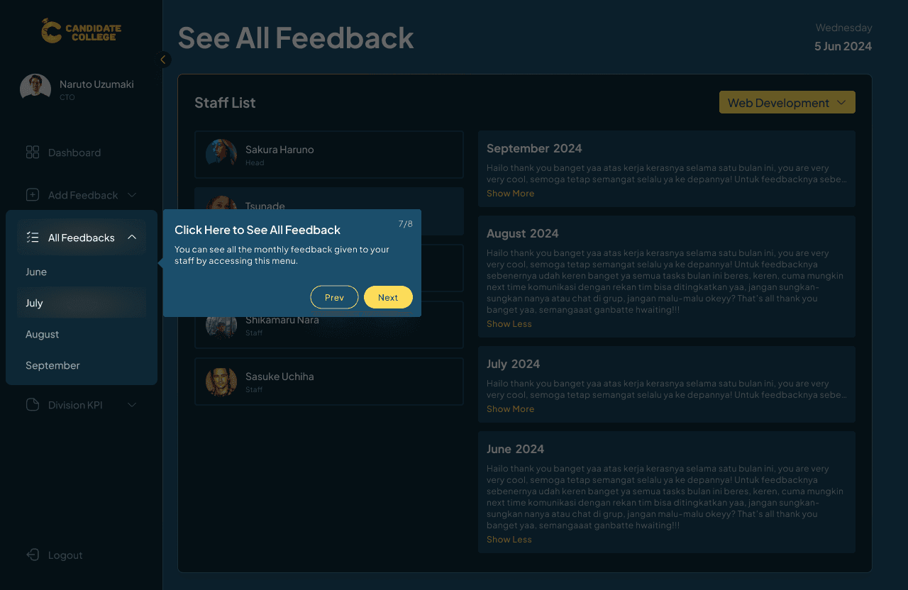
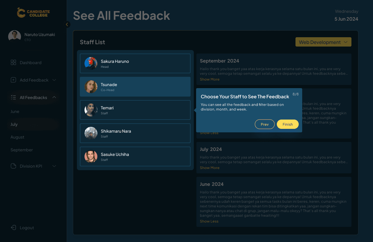
My Staff Report
Both the head & co-head can view all their staff report by easily going to the My Staff Report page, choosing the staff name, and filtering it based on month and weeks. The interaction here is just to view, they can’t edit delete, or do anything other than just to see it all.

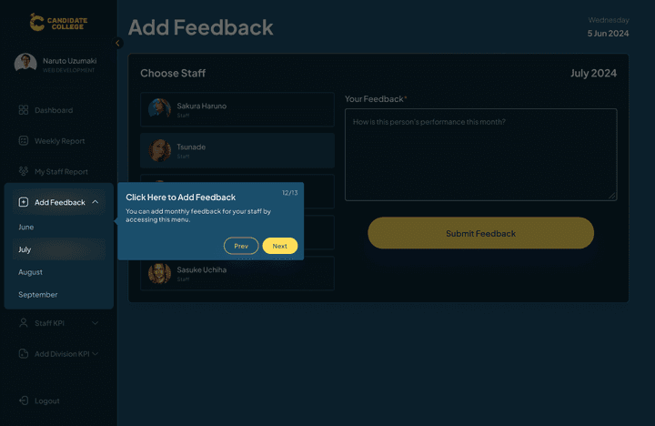
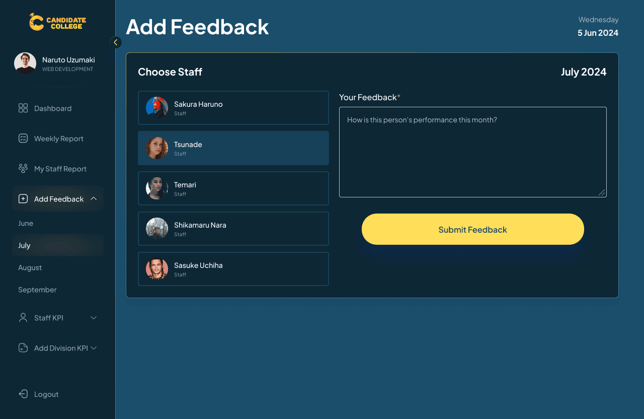
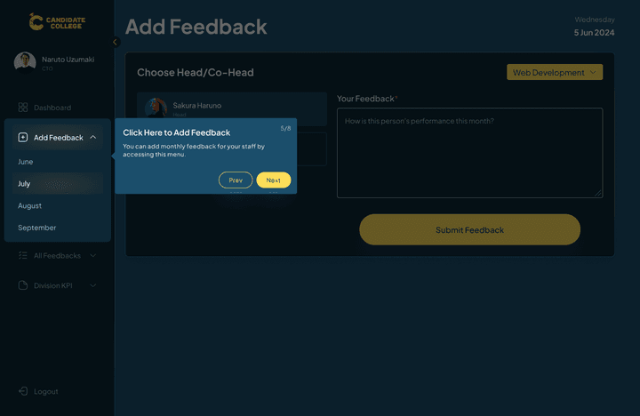
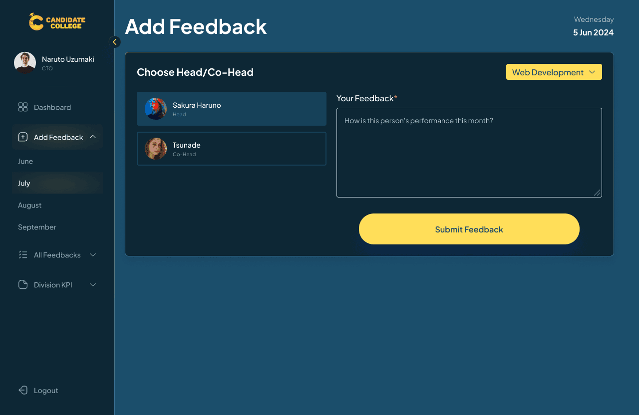
Add Feedback
Aside from viewing the staff report, the head & co-head are also able to give each of their staff monthly feedback. This feature will only be active on a certain date of the month and not accessible at any other time. To enter this feature, users need to click on the dropdown on the sidebar and choose a month. This design decision is directly from the CTO themself even though I have provided them with another option which is to use a month dropdown on the main page, but they still prefer it to be on the sidebar.
The feedback that can be given to staff is just in a text format and can’t be edited. This is due to the limited time frame for giving performance feedback to staff, but there will be a confirmation dialog before submitting.

The first version of the website just contains those features, any other features that you can see on the sidebar are added later as a revision.
C-Level Flow
If the head & co-head versions are the same as staff but with a few additions, the C-level version is much different since they don’t have to fill reports and are just able to view their subordinate reports.
Guides
Same as before, there will be guides for the first-time users to log in.

Dashboard
The C-level dashboard is much simpler and has less information rather than the other version. Here users can view their subordinate reports, know who has and hasn’t filled today’s report, and view their division data (total divisions and total staff including heads and co-heads). When viewing staff’s report, they can also filter it based on the division since each C-level can supervise more than one division.
Add Feedback
If the head & co-head can give their staff monthly performance feedback, then the C-level is the one who will give them performance feedback. The page design is the same as the one in the head & co-head version but with the addition to choose division.

See All Feedback
C-level is also able to view all the monthly feedback that they or their head & co-head give to staff. In the simple language, C-level can view all feedback that is written on the division that they envisioned.

Those concluded the first version of the design that was done in just 3 days. All the main features are set up and have a clear overview of how to use the web app. After this stage, the design will straight go to the development phase since the superior wants this website to launch and can be used as soon as possible.
Design Addition
A few times after completing the first version, the CTO gave me another design addition to be added to the flow, including the forgot password flow and new member registration flow. Differing from before, now I worked on this project with my co-head while doing our regular work managing the division and our staff.
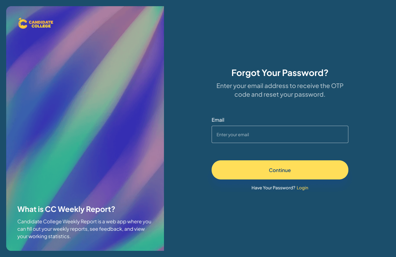
Forgot Password Page
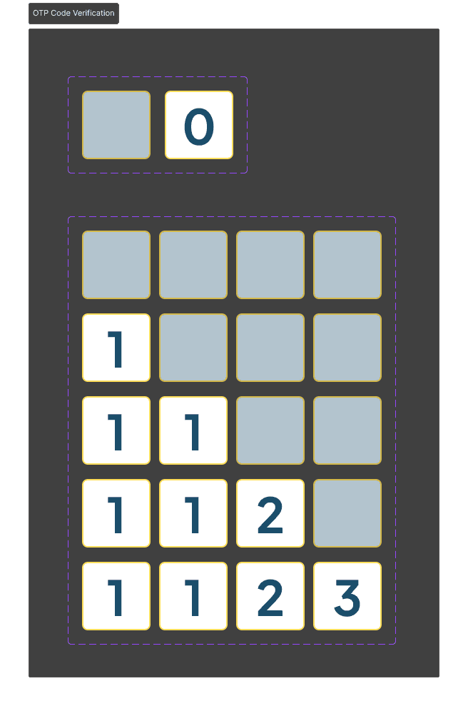
The previous flow didn’t include the forgot password flow so I had to create it. It’s simple, if forget their password, users just need to enter their email and get an OTP code to verify and reset their password.
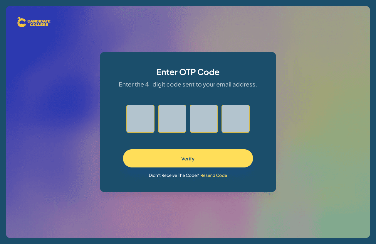
Verification Page
This is the verification page where users will input the OTP code they received from email. After entering the code and correcting it, they will receive a random password that they will need to save to log in to CC Weekly Report. Why random? Because the CTO want to build some kind of Single Sign On (SSO) system users will only need one account to access any internal CC sites, and to simplify it, they don’t want to build a create password feature just yet and just give users random passwords.
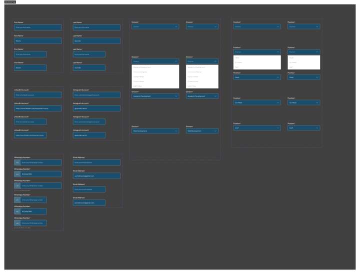
New Member Flow
Another addition is a register flow for new members. So, for staff to be able to get an account to log into any CC products, they need to go through this flow to create an account and get their data inside the CC database. Here is the wireflow, you can view the pdf file here.
In summary, the flow is that users will need to fill out a new member form, then they will get a verification code on their email, input it on the verification page, and receive a random password to log in to the CC website.

The first step is filling out this add member form which consists of personal data, social media, and contact. Why the design is different from the previous Weekly Report page is that this form previously belonged to the flow of CC's main website. The previous flow is member filling out this form and their profile will be available to view on the division page of the website, some kind of our team page. But now, other than just showing it on the division page, the CTO also want this form to be in a flow to create an account to access all CC websites. With all the contact information needed in this flow, it’s possible to create an account just by using this information.

After filling out the form, users will get an OTP code on their email and they need to input it in the verification page to receive a random password to log in to CC websites like CC Weekly Report.
C-Level Flow, Asses Division KPI
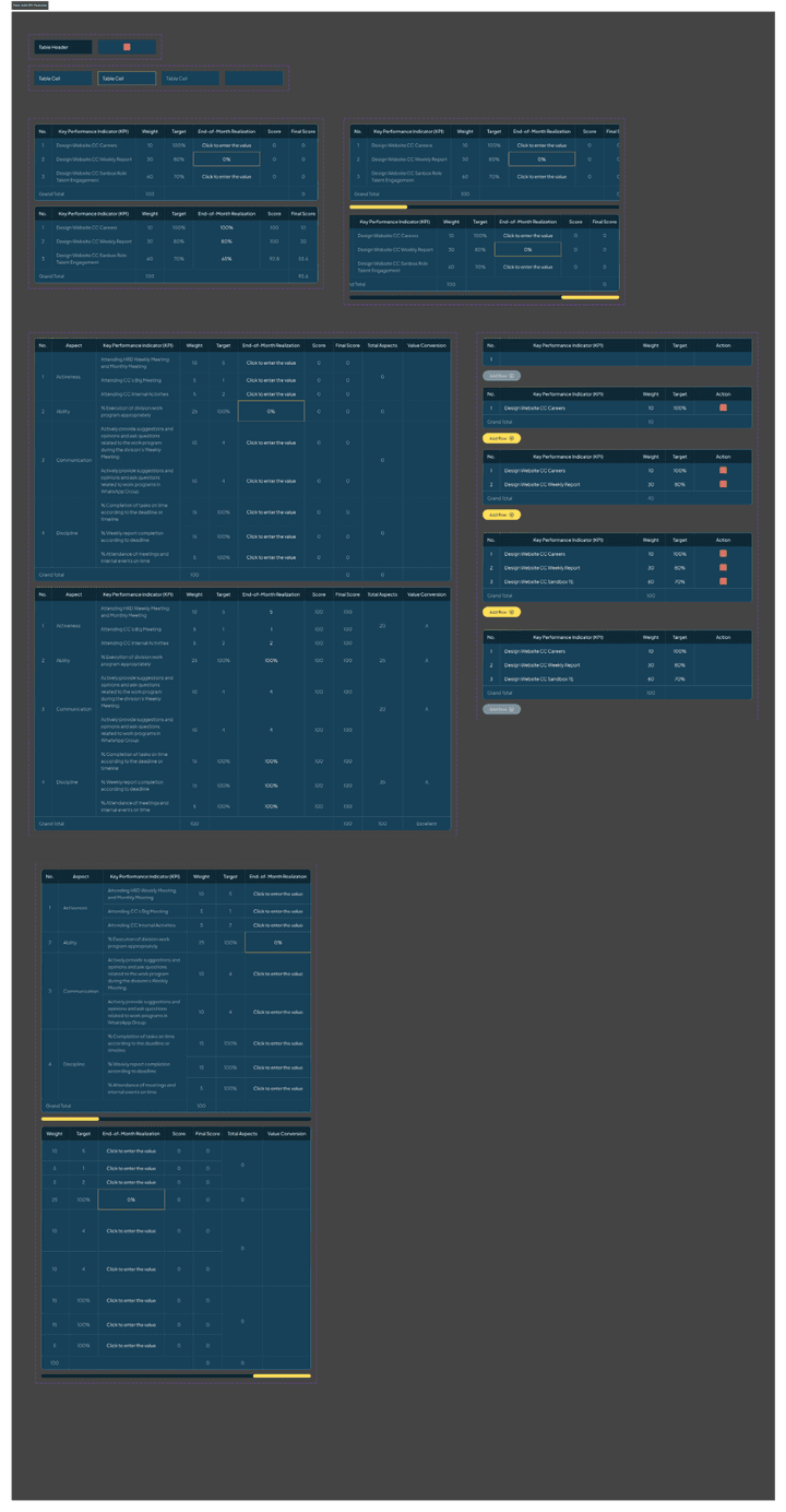
Another addition that is given is to add a feature to asses KPI on head & co-head and C-level version of CC Weekly Report. What is a KPI, a Key Performance Indicator (KPI) is a measurement that can be given to certain parts of the organization to assess whether their work meets the established criteria or not. In this case, the head & co-head will asses KPIs for their staff, while the C-level will asses KPIs for their managed divisions.
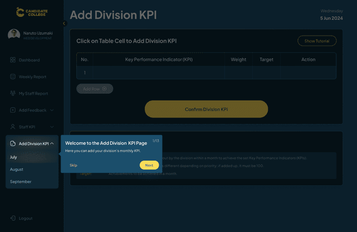
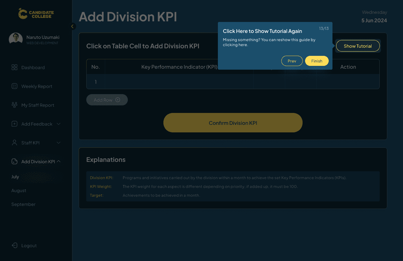
Since this is a new feature and can be quite complex since involving various instructions, guides will be displayed when users first access this feature and can be viewed again by clicking on the Show Tutorial button. The guides now have a skip option since it can be a long to follow all of it when users just want some guide on certain parts.

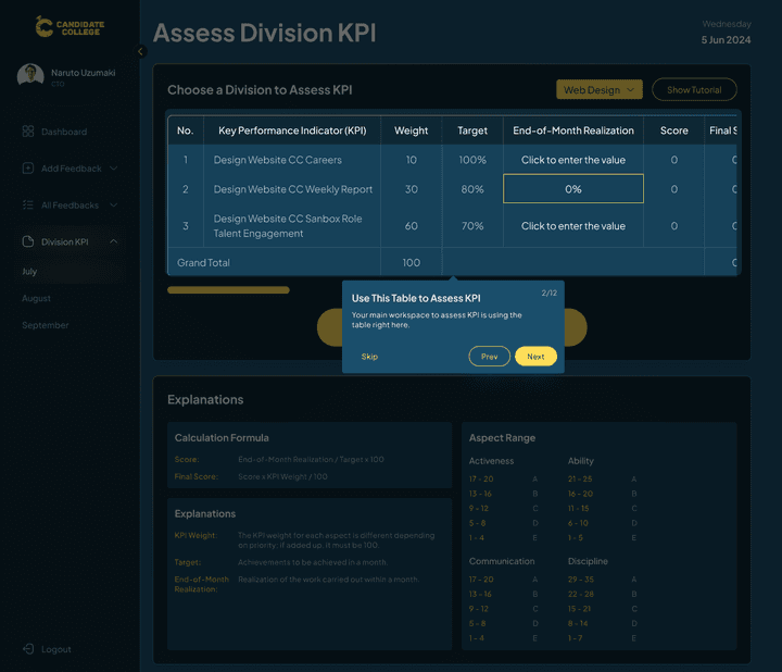
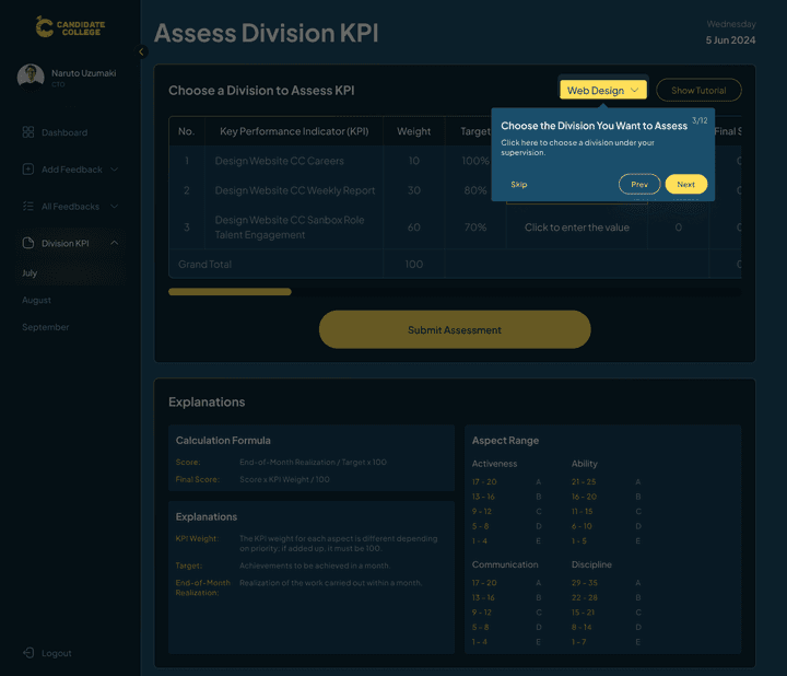

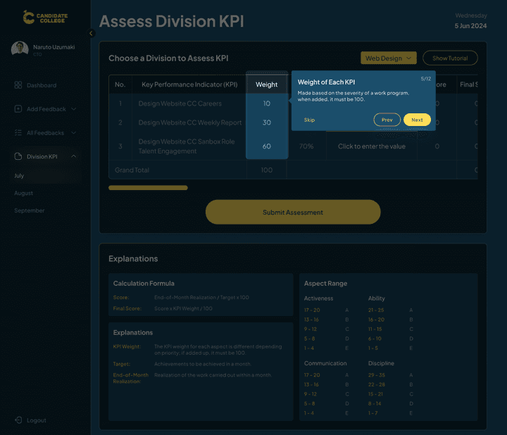


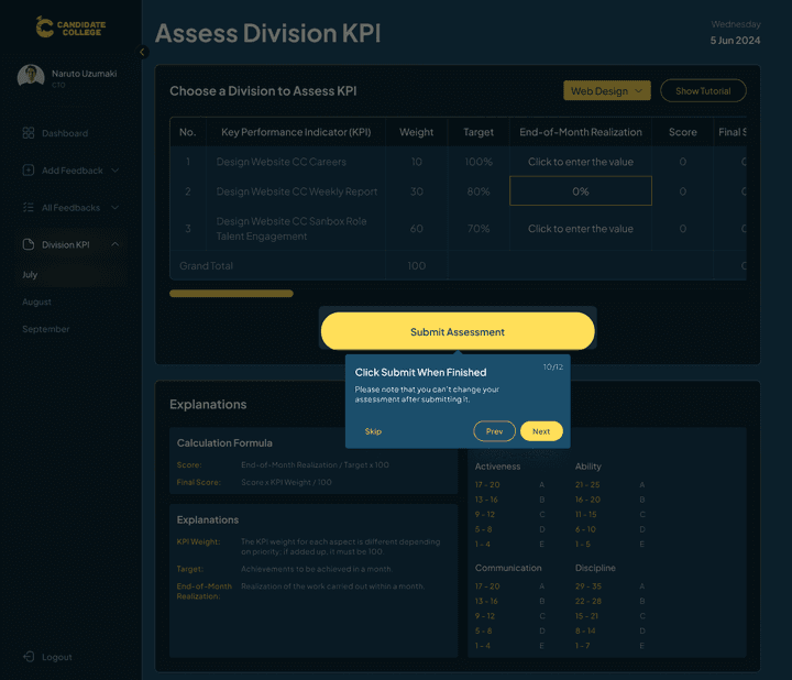

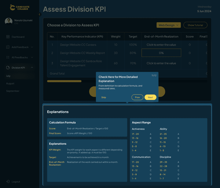
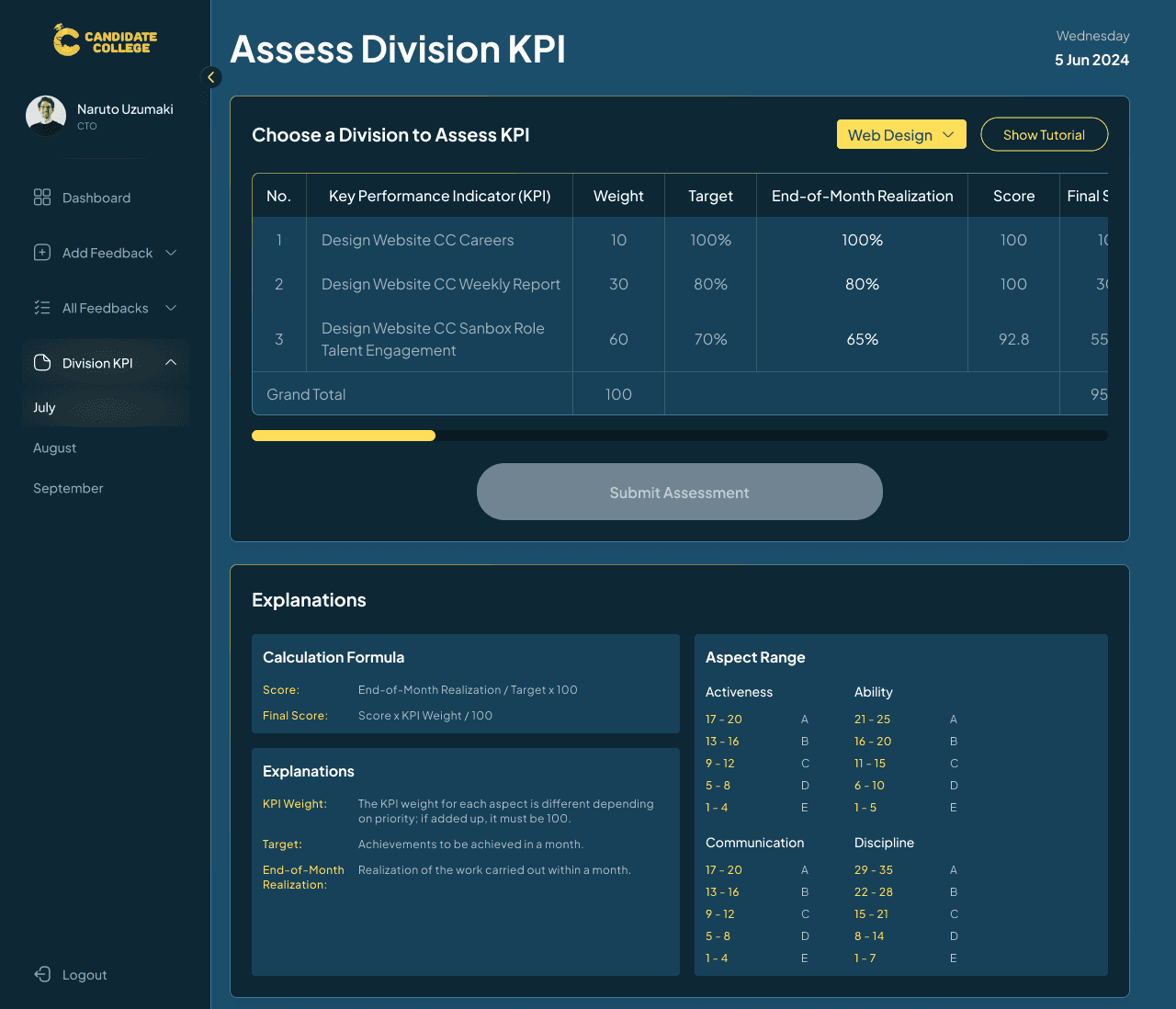
The first one is the Assess Division KPI on the C-level version. For context, each month, every division needs to fill out their target of the month, we call it the Work Program. Those work programs will have a weight and target based on the difficulty of it to be completed at the month. The Head & co-head are the ones responsible to create a work program for their division each month and then at the end of the month, the C-level will asses whether the target has been achieved or not.
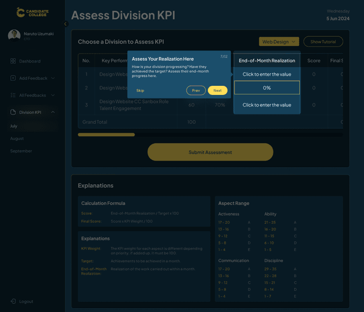
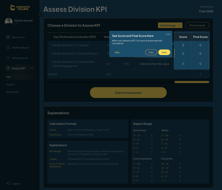
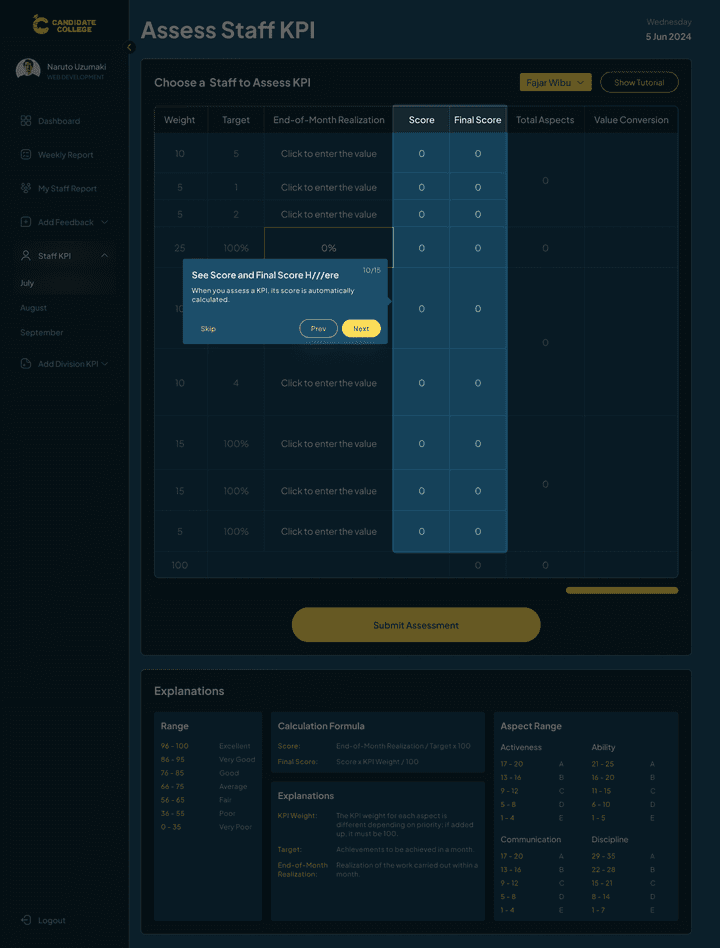
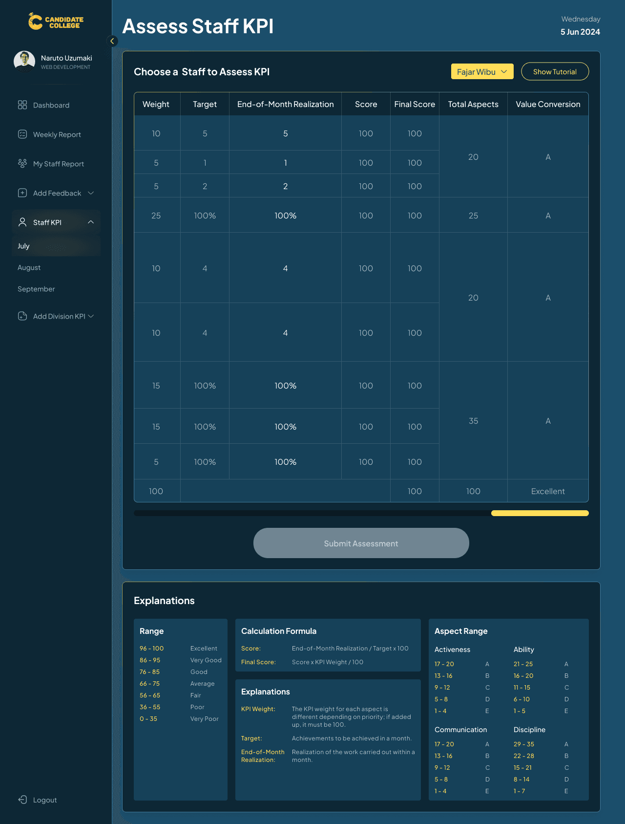
When assessing, users just need to fill out the End-of-Month Realization column. They need to enter the real target achieved for every work program. For example, if a work program is targeted to achieve 100% completion at the end of the month but in reality just achieves 80%, then C-level can just write 80% in the Realization column. After filling out, a score and final score will automatically be generated. There is also an explanation section under the table in case users want to know more about what every information on the table means.

This is the version when the division KPI for a certain month is already assessed.
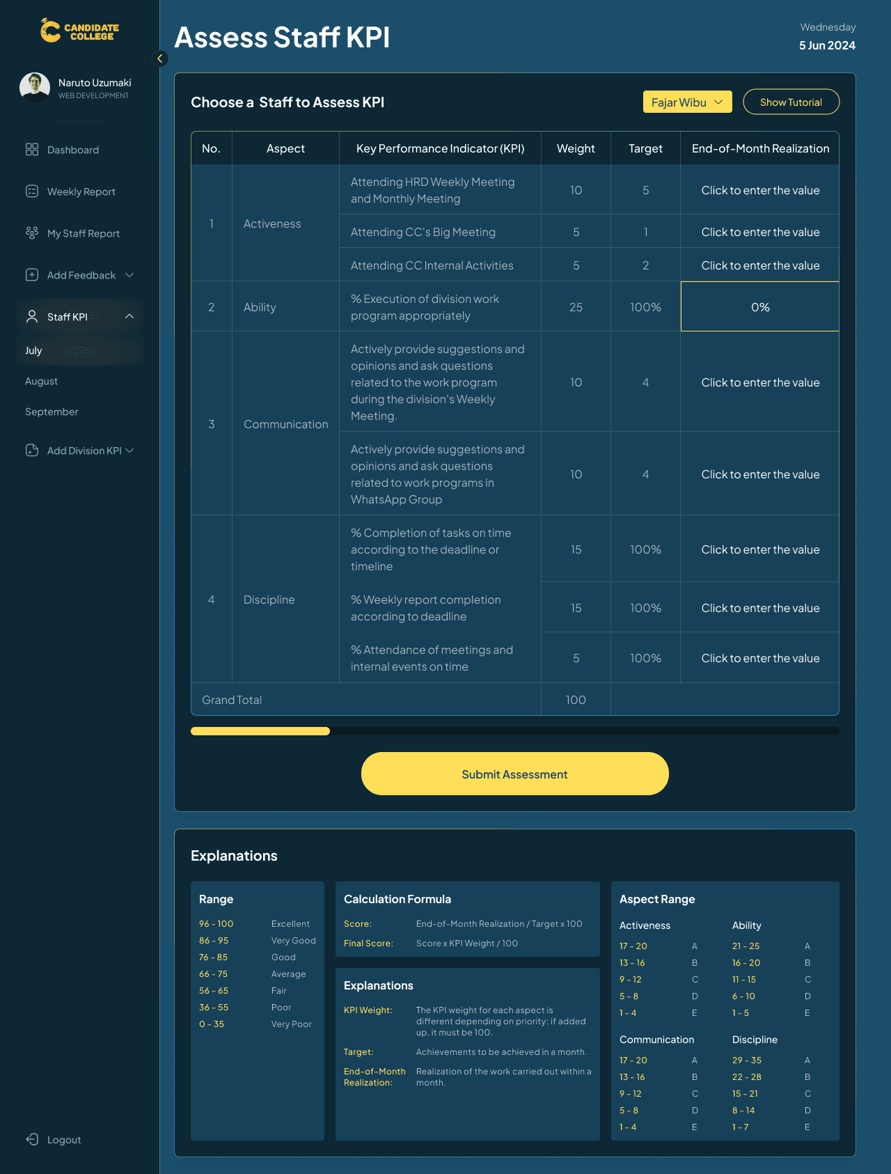
Head & Co-Head Flow, Asses Staff KPI
The Asses Staff KPI for head & co-head is much the same as the one in the C-level version, but instead of using a KPI that differs on each month, the Staff KPI is always the same on each month meaning that the criteria are already setup by HR division so head & co-head just need to asses it.
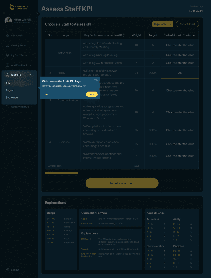

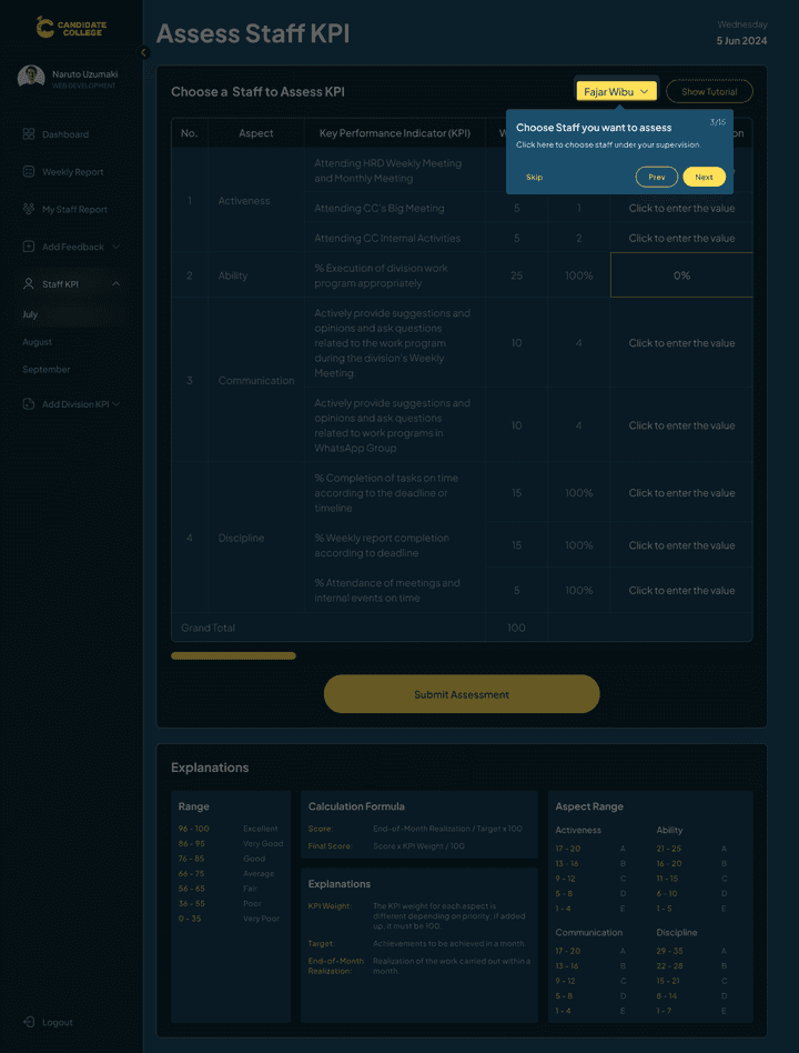
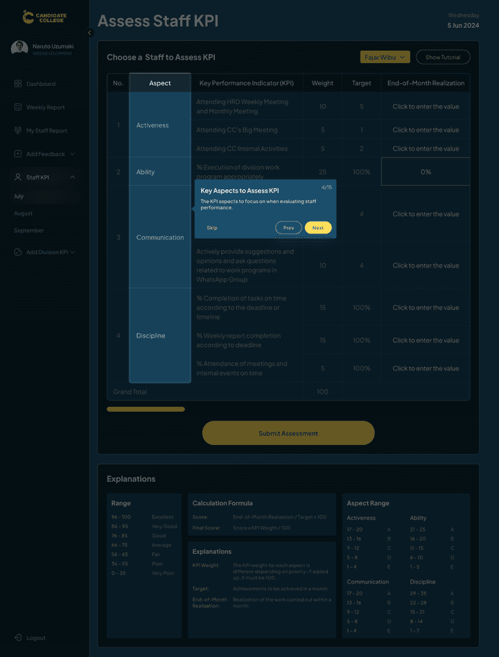


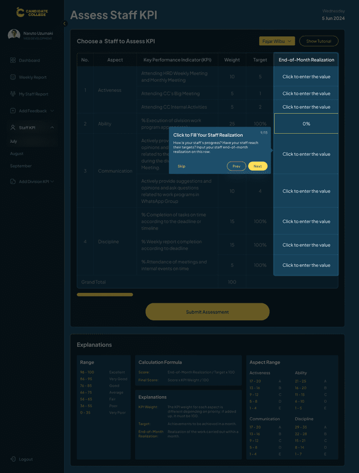


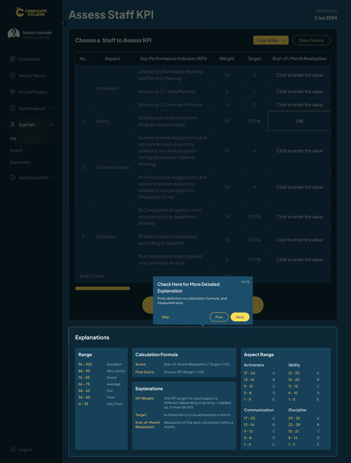
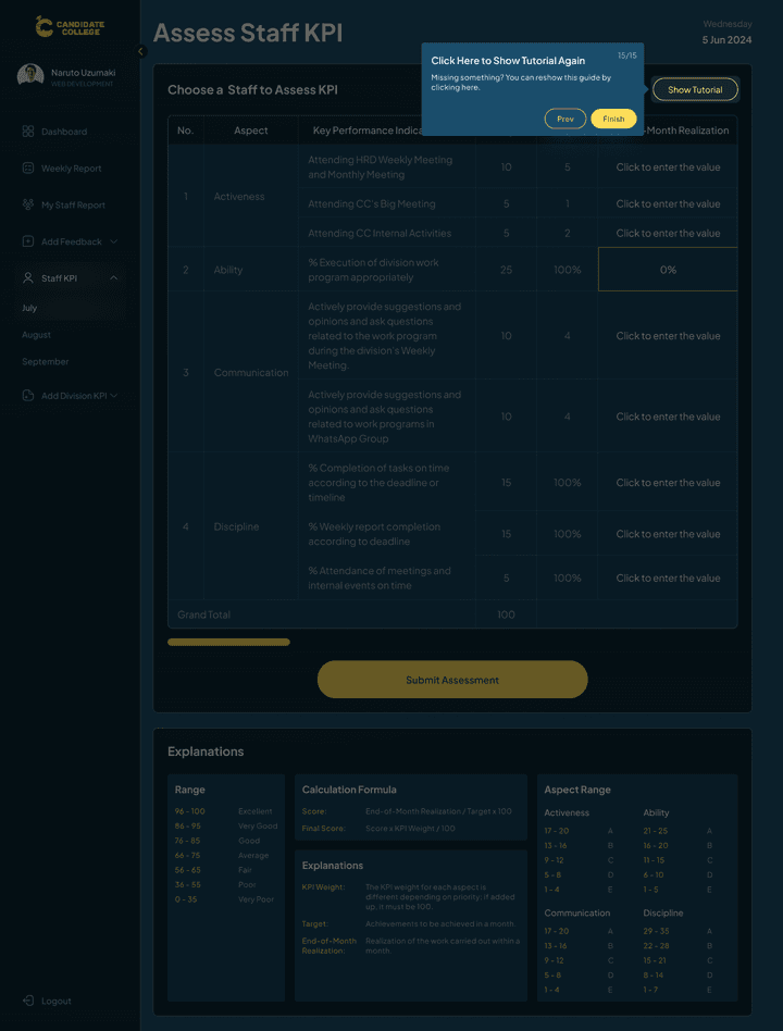
The aspect criteria are already set up and will be the same each month so what the users do here is just to choose a staff and then asses their Realization based on the criteria like how much point for their activeness this month and more. The Head & co-head will need to asses every staff on their division one by one and then submit it, the submitted data will go to the performance grade section on their staff dashboard.
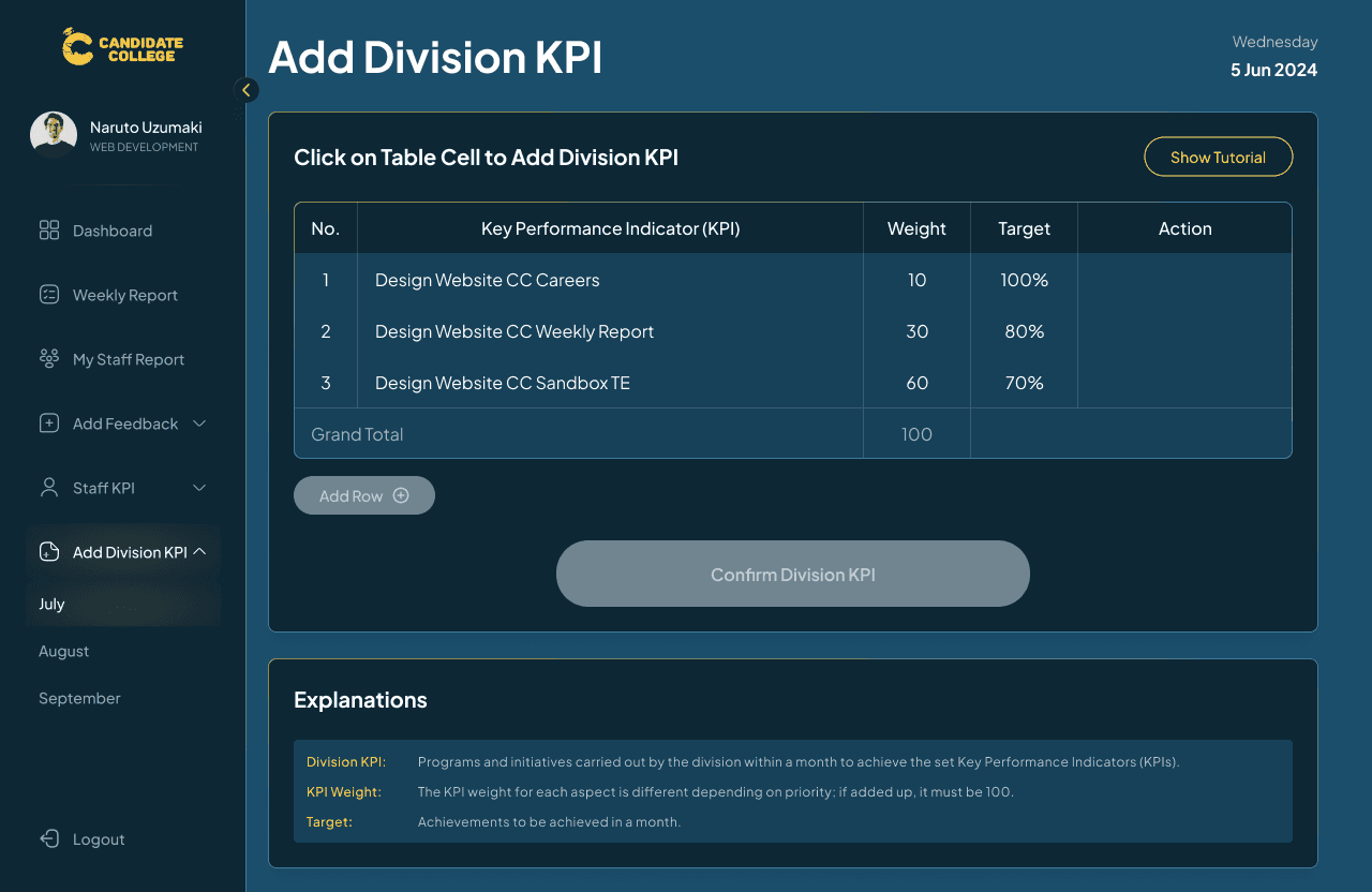
Head & Co-Head Flow, Add Division KPI
Another thing that the head & co-head can do is add division KPI each month, this is the work program that they will do that month with certain targets that will need to be achieved. Same as with other features, there will be a tutorial that will guide them about the features and information that need to be filled out.

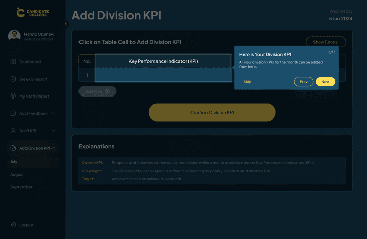
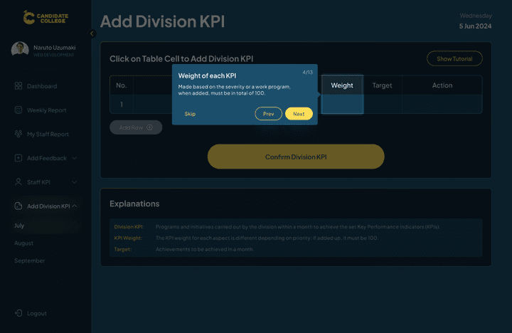


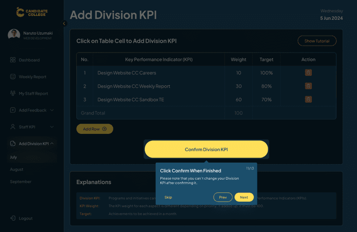

The work program will be entered in this table along with other information like the program weight and target. While entering, there will be an option to delete, edit, and add another row but after submitting, nothing can be changed. The weight column represents each work program's weight based on the difficulties. The total weight on each month should be 100 so users can write their program weight on any number as long as the total is 100.

Loading Animation
Since this CC Weekly Report is rather new, the CTO asked us to design a loading animation, they just want a simple one so here is our exploration:

The chosen one is the one with Candidate College's name on it because it’s simple and engaging enough also easy to develop.
On Development Page
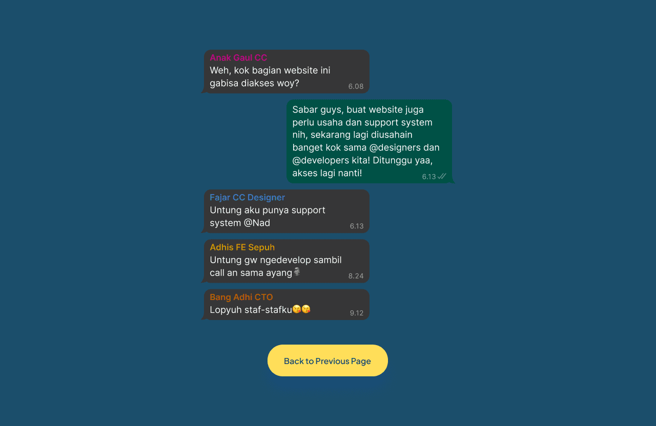
Another thing that is requested is a page to show that a certain part of the web is still in development, something like a 404 page. The CTO wanted the page design to be funny and extraordinary so I had to look for any exciting ideas to be used in this page. My final decision is to create this fun documentation of our WhatsApp chat that displays a discussion about a user who asks why this feature is not available yet and replied in the tone of all our team is working hard for this so please stay tuned. This design is instantly approved by the CTO and I myself personally proud to have created this funny page design.
Prototype
Enough with all the explanation, here is the prototype of the design.
Measurable Outcomes
Since the design is already developed instantly as it’s done, we haven’t conducted any usability testing to measure the success of the outcomes. It was later when the first version of the web was developed and released to staff, that we could get feedback on how the design met the criteria of an internal website. For the design side, most of the comments that we get are that it was great and easy to understand, many issues come from the technical one but the design itself is good. Some user indeed talks about the bad colour scheme of the website but yeah, as I explained above, that was because it’s following the brand identity of the company itself. Apart from that, I’m so proud that I can design this internal site that will be used for CC staff now and later.
Limitations & Lesson Learned
Completing this project was not an easy task, especially with the strict timeline on the first version of the website, but, in the end, I was able to finish it along with the design addition and revision. I learned a lot in designing this website like working directly with developers and stakeholders to discuss the use cases and flows and also get in hand experience by designing all the websites by myself. It was a nice experience to be able to work on this project, I’m glad that I can bring impact to company with this and hope it can be good for future use on the company.