A web UI/UX Design for a photography, videography, and graphic design organization.
CLIENT
UFO Veteran Jakarta
ROLE
UI/UX Designer
SERVICE
Landing Page Website Design
Project Details
Problem
UFO Veteran Jakarta want to update its website with a fresh look to represent more about its organization and activities.
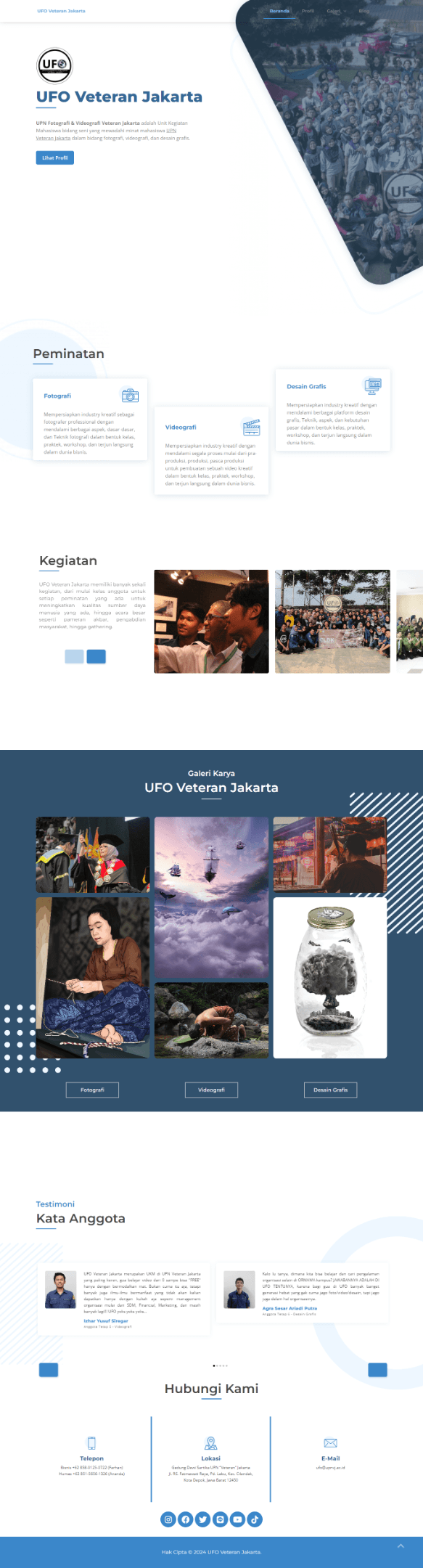
They have an old website with an outdated look that has been like that for years, so they want to revamp it to look better. Here is the overview of their old website:
The main website function is to showcase information about the organization, attract new college student to join and participate, and promote their services. Here we need to balance the content of the web so it can meet all the relevant goals in harmony.
Goals
Create a website for UFO with several pages to showcase their information, services, and organization. They didn’t specify the design to be using a specific style so we’re free to explore any style that will look good both visually and for users.
Role & Responsibility
Our role here is as the UI/UX Designer. The scope of work is just to design and create a prototype. After the design is complete, it will go to development but that’s not in our scope so we just work with the design on Figma to create the desktop and mobile version of the website.
Constraints
The design that needs to be created is quite common, a website with several pages so there is no real constraint that prevents our design process. The design brief is clear and easy to understand but they didn’t have fixed content for the site at the time so we just need to create a placeholder for some content fields.
The timeline for this project is not long but the tasks were given one by one meaning I didn’t get all the briefs all at once but instead got a page or two briefs per month and another will be given at different times. This is due to the client's need to organize all their requirements so we just wait for the brief and finish any available tasks.
Design Process
We’re free to explore any design styles for this project but the project manager specifically requested a glassmorphism style. We also didn’t create the low-fidelity design since they just wanted to see the final one with all the visuals and high-fidelity design elements.
Reference Research
We started this project by looking for similar websites on the internet, we then found many inspirations that later combined and polished to create the final design. We’re also researching the UFO brand styles and how they look across social media. This is the reference to their brand colour on their Instagram feed:
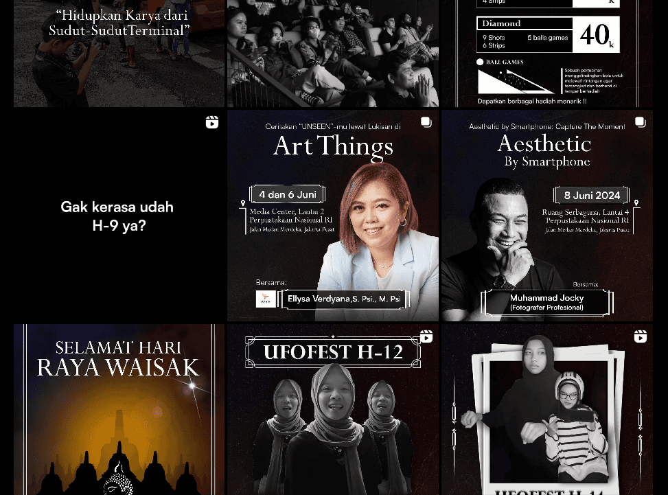
Most of the colours there are black with a monochrome style, we were asking about this to the project manager and they approved to design of the website in a dark mode to match their brand style. Aside from black, they did have a blue primary brand colour, but on this design, we will only use that colour on certain CTA and combine the style with a dark theme and monochrome style.
Design Style Guide
Our first scratch on the design is to explore some layout and design while also documenting the design style guide for consistent use. Here, we’re showcasing the design style guide for the UFO Veteran Jakarta website.
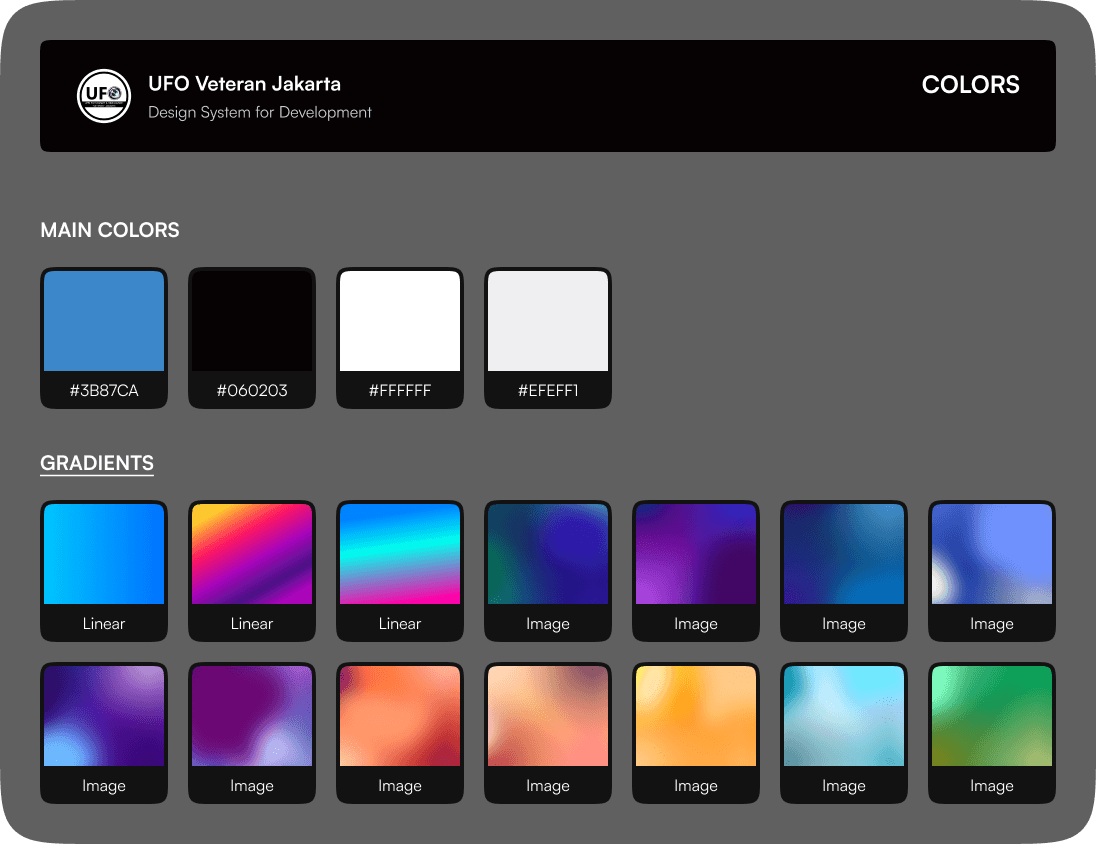
Colours
Aside from the primary blue colour and the dark theme, we heavily use gradients on various design elements to trigger the visual beauty of glassmorphism. We use various mesh gradient styles on hero sections, visual elements, and more.
Typography
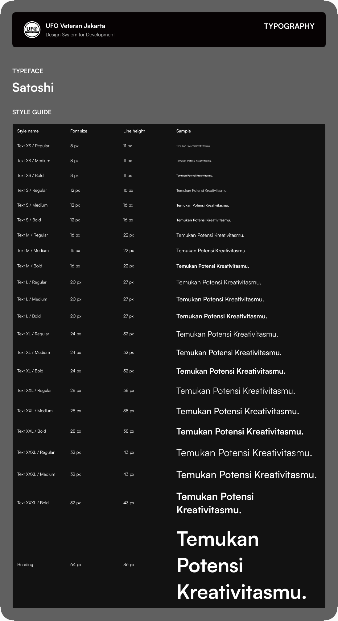
The typeface used is Satoshi because it’s quite a versatile typeface for any use including interface. We’re defining a style that all the headings will need to add a dot (.) at the end of the sentence. For example: Temukan Potensi Kreativitasmu(.). This was meant to give more uniqueness to the design style so that not just the colours and other design components can give a special feel, but also the typing style.
Spacing System, etc.
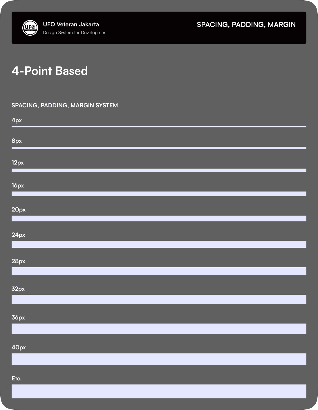
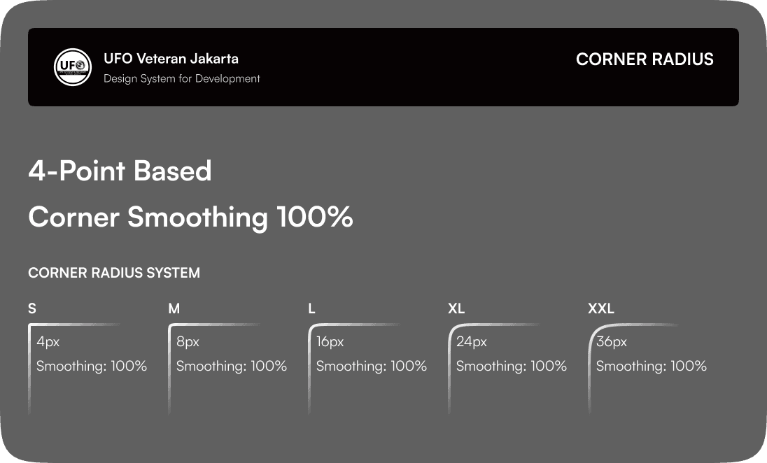
We always use a 4-point base for any values including spacing system, margins, padding, corner radius, and so on. This is a standard in the interface design for its consistency and great scalability.
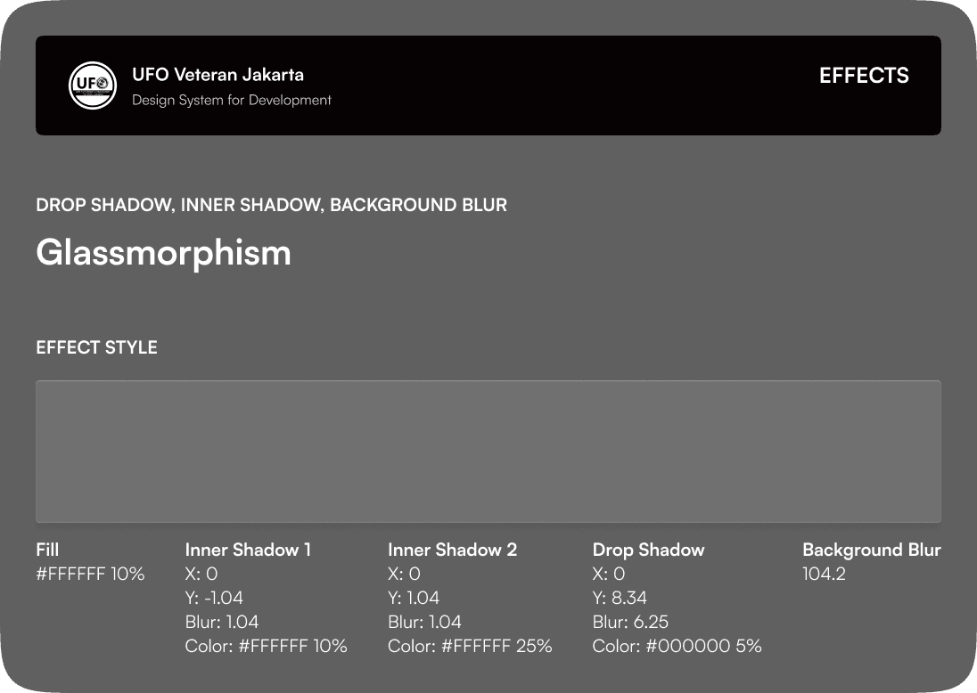
Effect Style
We used glassmorphism as the main design style and that’s why we’re also documenting the effect as a style. Glassmorphism is a design technique that is purposed to create a visual glass-like element that can be applicable to many things. Glassmorphism is created by adding background blur to the low-opacity layers, making it blur all the content on its back and that’s why it’s perfect to match it with a gradient background.
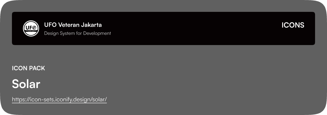
Icon Pack
We’ve used Solar as our main icon pack because of its simplicity and clean looks.
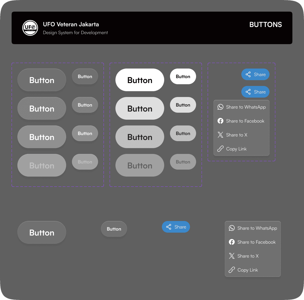
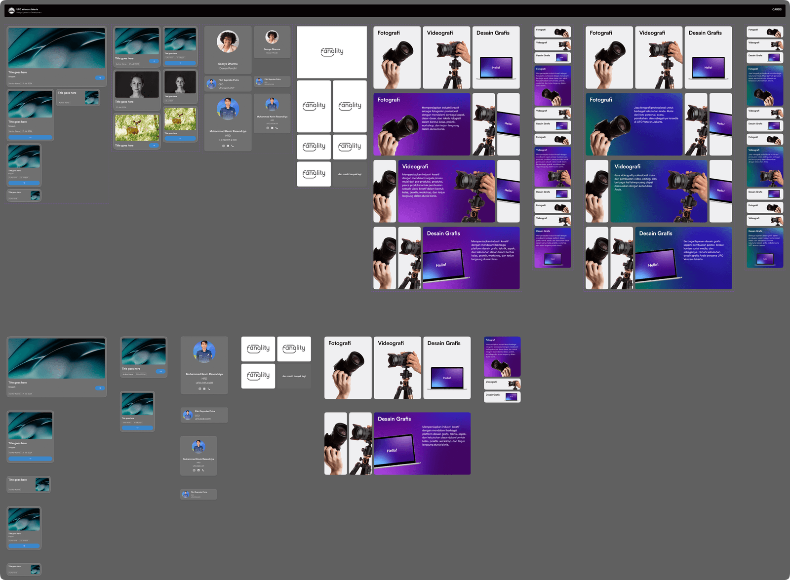
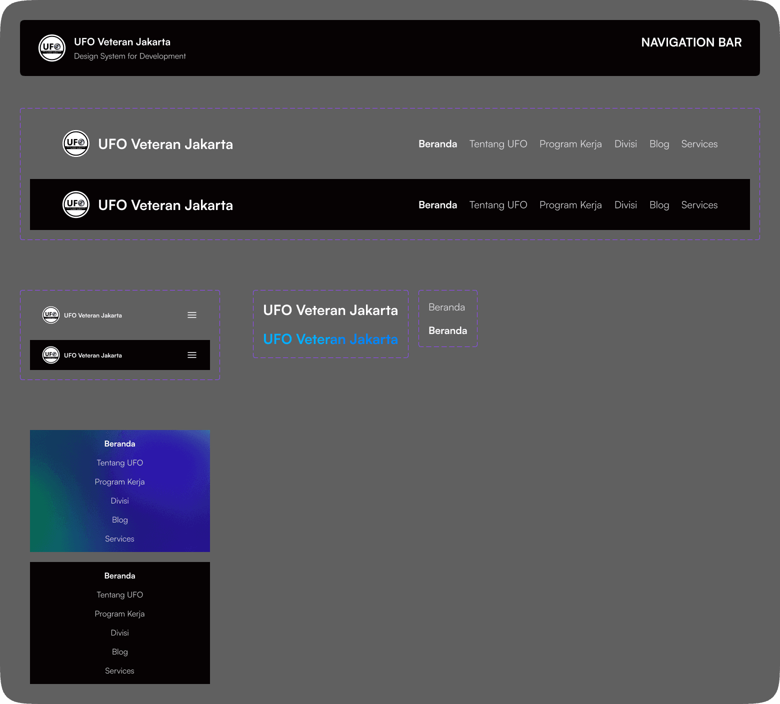
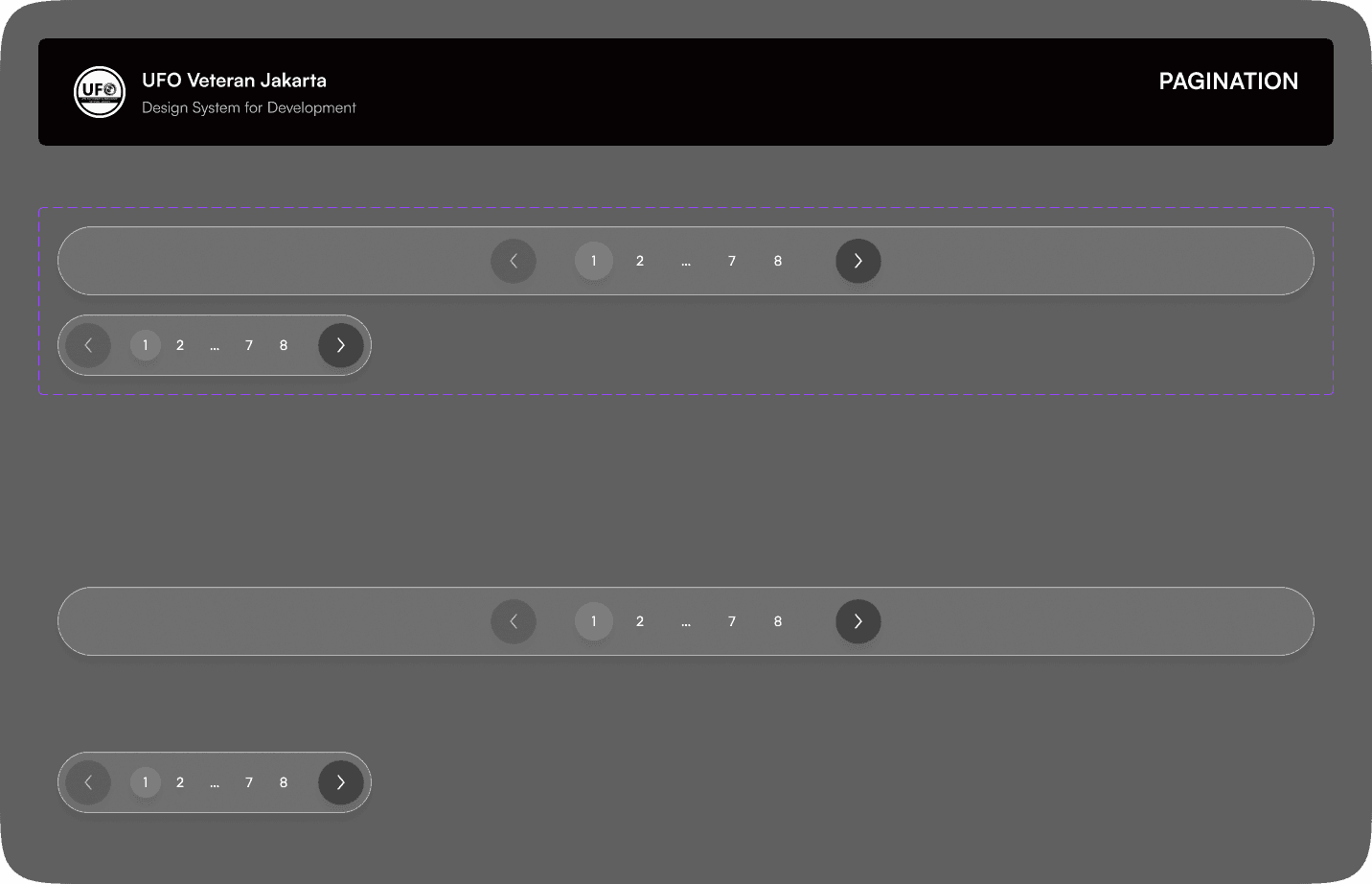
Components
We also created various interactive components that are used in the design. Most of the components here are just a placeholder, meaning it still doesn't have any fixed content to place. All components are created for desktop and mobile versions.
Final Design
We didn’t create a low-fidelity design, our design exploration was to create a final, high-fidelity one, so, what we’re showing here are the final versions that have gone through various explorations and have been approved.
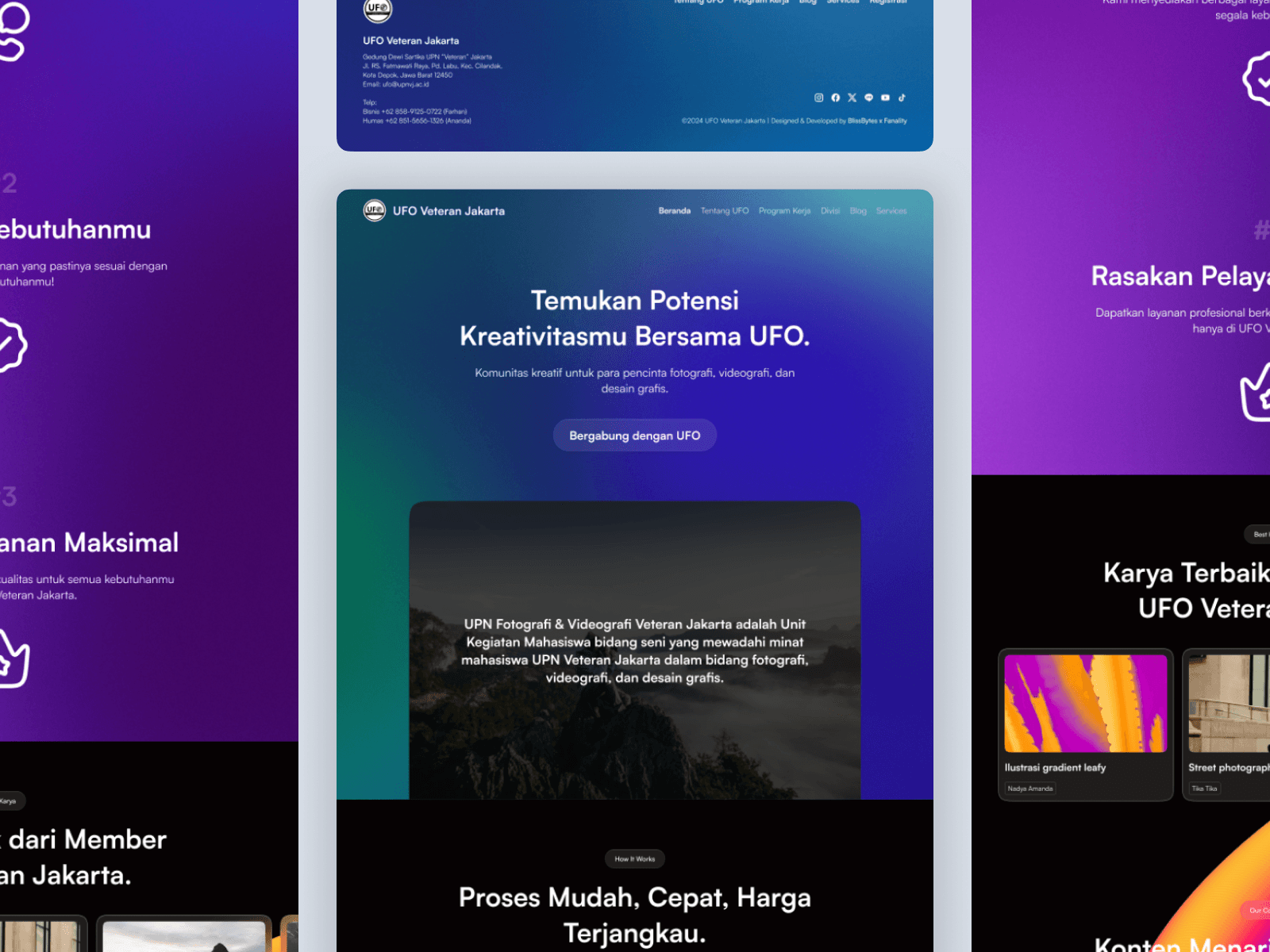
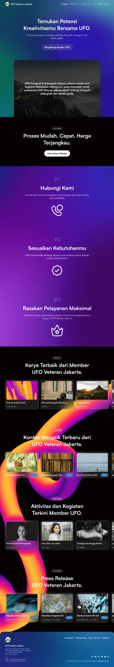
Home Page
As the first page that users will see, the home page needs to catch attention and engagingly display information. Here, we use a combination of gradients, interactive elements, glassmorphism, and stunning visual elements to give the best experience for users to see.
Hero Section
The hero section is designed with a vibrant, stunning mesh gradient background. This was due to the goal of catching users' attention in the first saw. The gradient colour here is matched with UFO's blue primary colour. The writing for the title and subtitle is created as engaging as possible while also showing UFO as a perfect place for people who want to participate in various creative activities. Why doesn’t it focus on the service they prioritize UFO is an organization that provides creative services, and the CTA itself is directing users to join as an organization member.
Under the text and glass button, there will be a video that shows footage of UFO’s activities and works. On top of that will be a text that explains briefly what UFO is. This layout style is much like a SaaS landing page that shows what the company is about in a single view.
How it Works
Aside from the focus on attracting new members. the client wants to add a How it Works section to guide users about how to work together with UFO. This is a bit unmatched by the first goal but we’ve tried to add a bridging between those messages by saying that UFO is an organization that also offers photography, videography, and graphic design services.
The How it Works itself consists of three step points that explain how to easily work with UFO’s services. We’re also playing with some gradient background here but with different colours to add a more engaging feel.
Contents
The content section contains various cards on categories like result showcase, new UFO content, latest activities, and press releases. All the content is still a placeholder because we didn’t receive the full content to be placed on each card.
The cards here use a glassmorphism style with each CTA coloured using primary blue colour. The section background uses a 3D visual illustration with a vibrant gradient colour scheme that matches perfectly with the dark background. We used this visual element is because we wanted the glassmorphism to shine with a gradient background but didn’t want it to just a full-width background so we created it as a swirling illustration that goes on the whole of this section.
Footer
The footer was created with a blue gradient and has all the relevant information and navigation of the website.
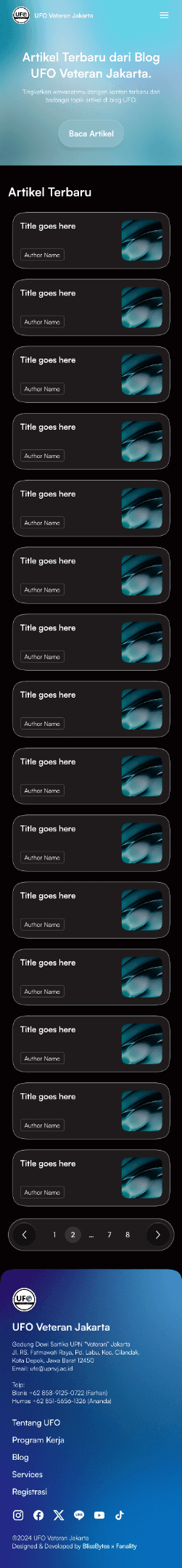
We also created the mobile version of this design and tried to make all the design elements responsive.

About Us Page
As the page that explains all the information about the organization, this page contains many sections and a variety of contents. The design style itself is matched with the home page which uses a mesh gradient background on the home page and some sections, and a glassmorphism style on cards. The gradients themselves are using various colours but they can match together to build fresh, colourful, and engaging feels.
Hero Section
The hero section pattern on this website will be the same using a background of mesh gradient with different colours. The reason why the colour is different is because we use an image asset for it and not manually create it, but, other than that, the colourful vibe of each gradient is designed to give a fresh feeling no matter where are the users located on every page of the site.
Vision & Mission
The vision & mission section uses a large card with an illustration background that is similar to the one on the home page. The reason why it’s created like this is because we want to highlight the vision and mission card and make sure users are able to read it since it’s quite long, so we don’t want to make the section too monotone.
History
The history section contains an image carousel with card text on the side. The image is still a placeholder but it was meant to show images of the organization's activities and important moments. The description itself is a detailed explanation of what is UFO and its history.
Members
This section contains cards about UFO founders and leaders across the years. The design is quite straightforward with 3 cards on each row that show their images, names, and titles.
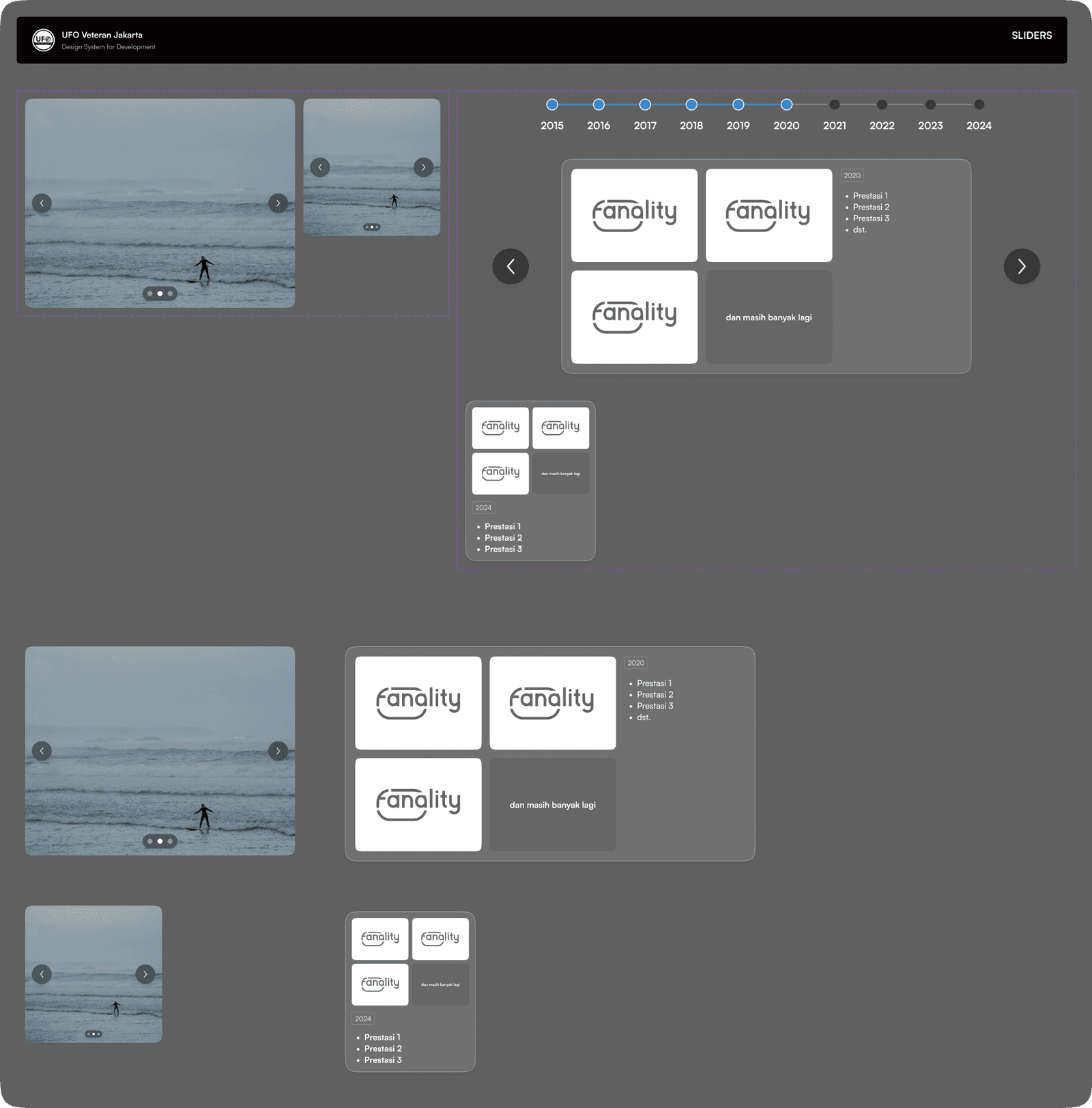
Milestones
This section contains a carousel slider on each year which users can swipe to see the journey of UFO. Each slide will contain images and a description of what happened that year.
Organizational Structure
The organizational structure is quite complex to design since we had to display all those structures with many people on it but still looks easy to understand. We’re finally able to create those layout designs after exploring various other versions.
Awards
The award's design is similar to the milestone section design but instead of showing images, the project manager wants to show all the awards logos in the section. So, the design displays a highlighted awards logo that UFOs won in that year along with a list of all their awards in each year.
Partners
This section shows a list of companies and other organizations that have worked together with UFO. Much like a clients list, so we created this section with 3 rows of moving lists of clients' logos to showcase that UFO have been trusted by many institutions for a long time.
FAQs
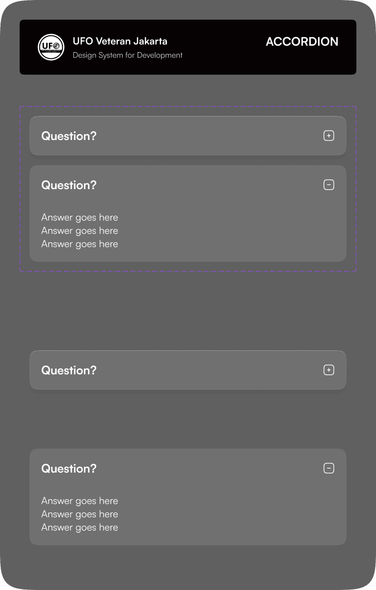
The FAQs section contains 8 frequently asked questions and their respective answers in accordion components. This is also straightforward like any other FAQs section on most websites.

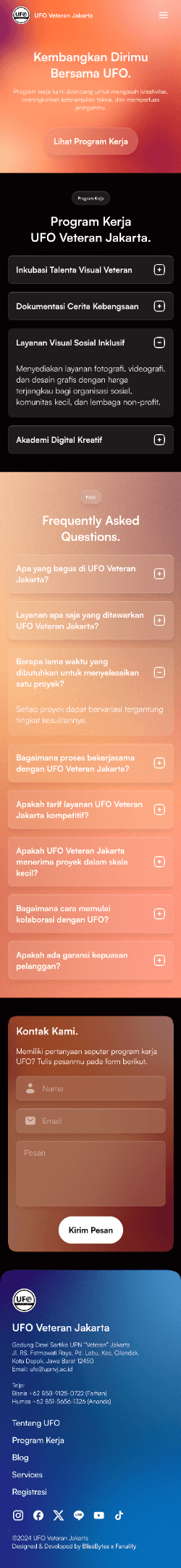
Here is the mobile version:
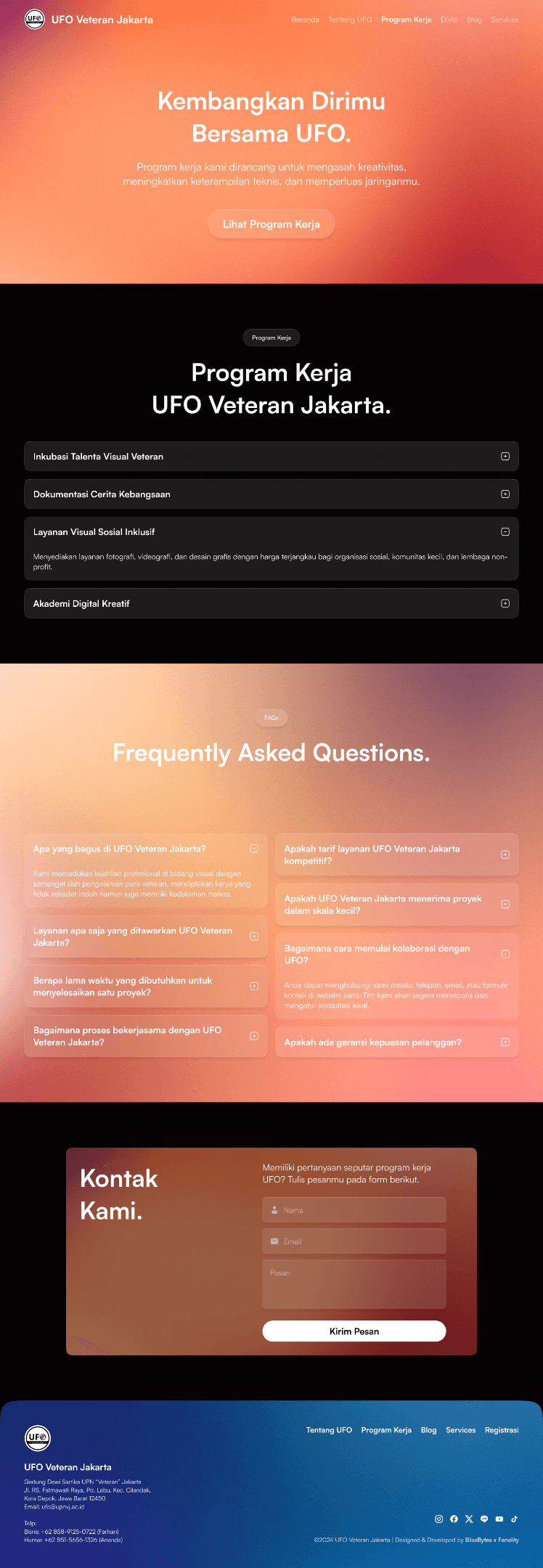
Work Program Page
The work program page contains a list and description of the organization's work program. The page design is quite simple with the work program displayed as an accordion, then there is a FAQs section about those work programs, and finally a contact section. From the visual side, it’s still following the design pattern with colourful gradient backgrounds and glassmorphism cards.
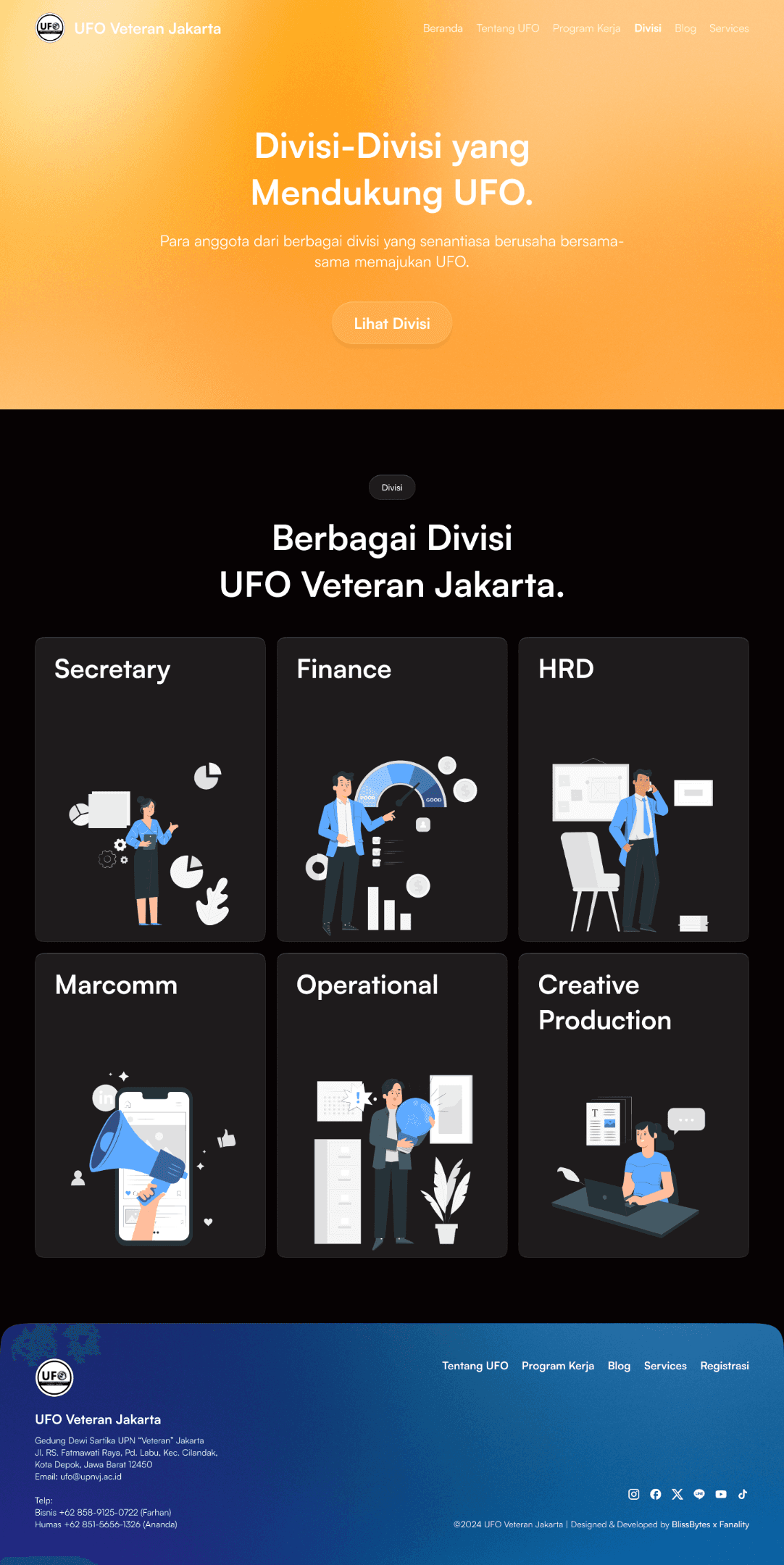
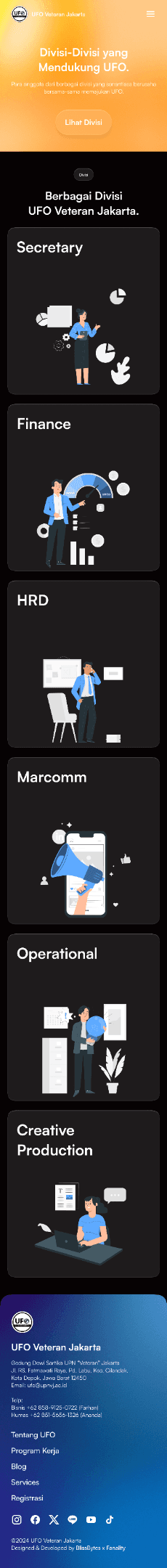
Division Page
The division page displays a list of every division that is in UFO. The division cards are still using the glassmorphism style but with the addition of illustrations that represent their respective divisions.
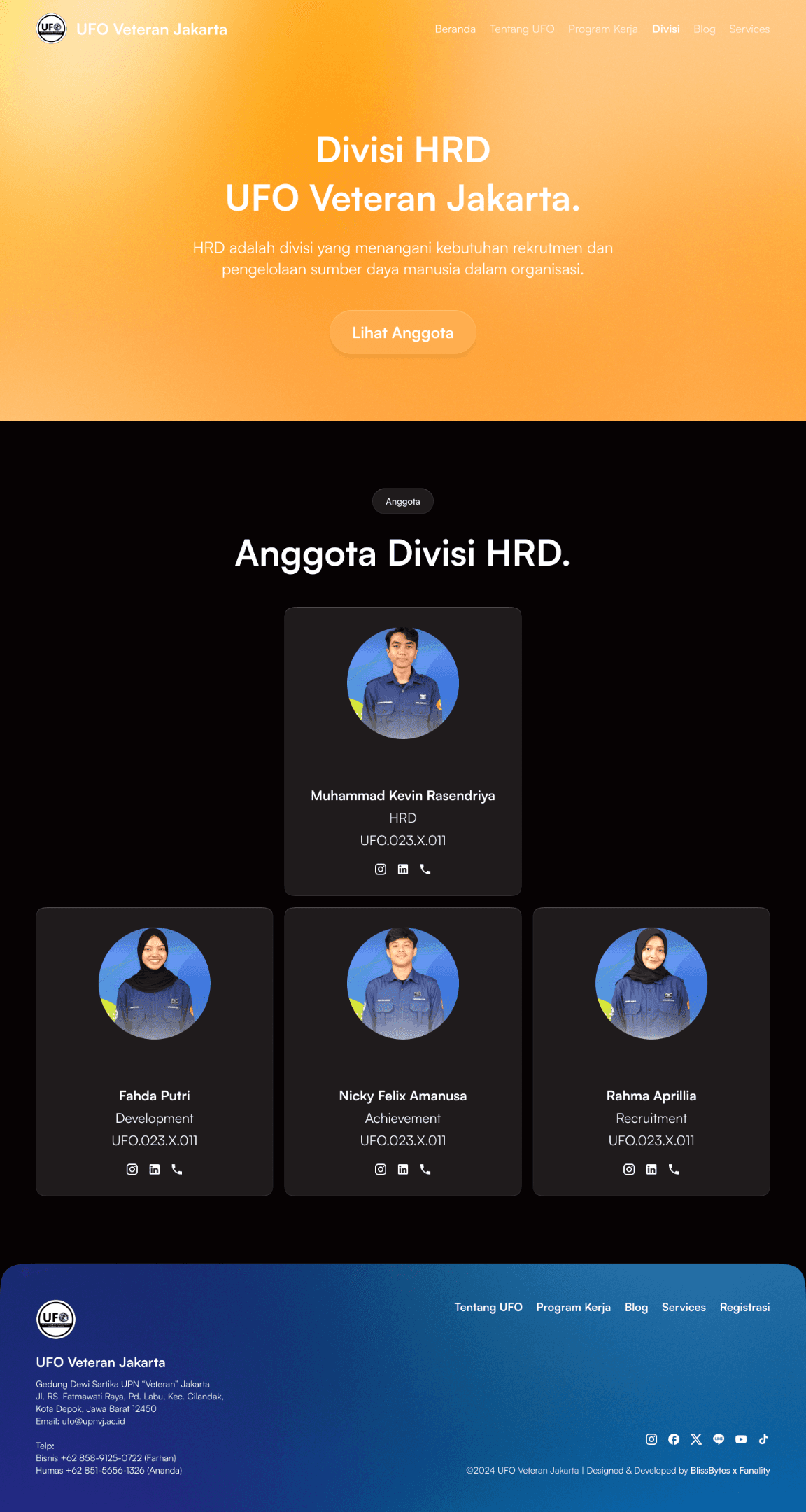
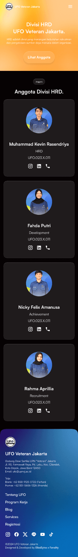
Division Team Page
When a division card is clicked, it will direct users to a specific team page that shows all the members of the division. The design is similar to other sections with 3 cards on each row and since each division has its own leader then we designed the layout to match the organizational structure.
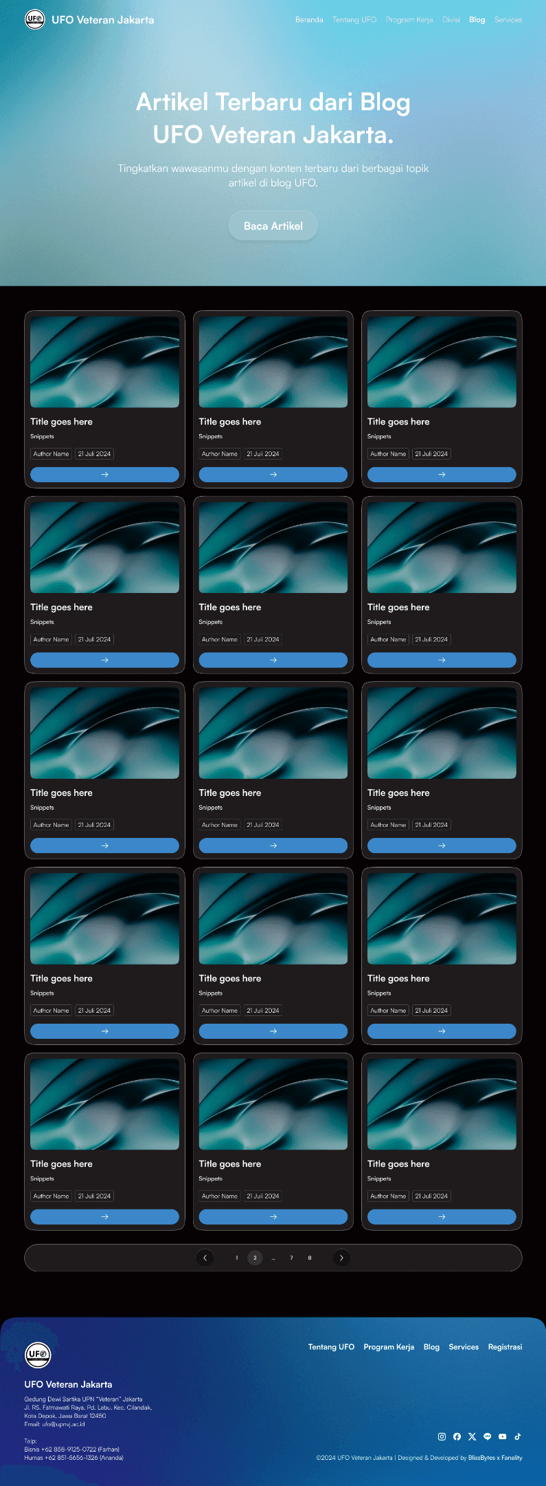
Blog Page
Then there is this blog page. The project manager requested that this page look like a newspaper site with a highlighted big card and many other small cards on the side. The content here is just a placeholder but on each card, there should be an image, article title, snippets, author name, and published date.
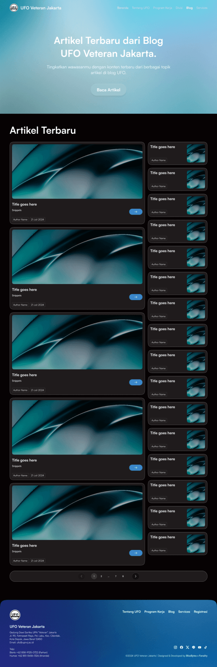
The card will have a pagination and when switched to another page beside the first one, the layout will change to displaying 3 x 5 article cards.

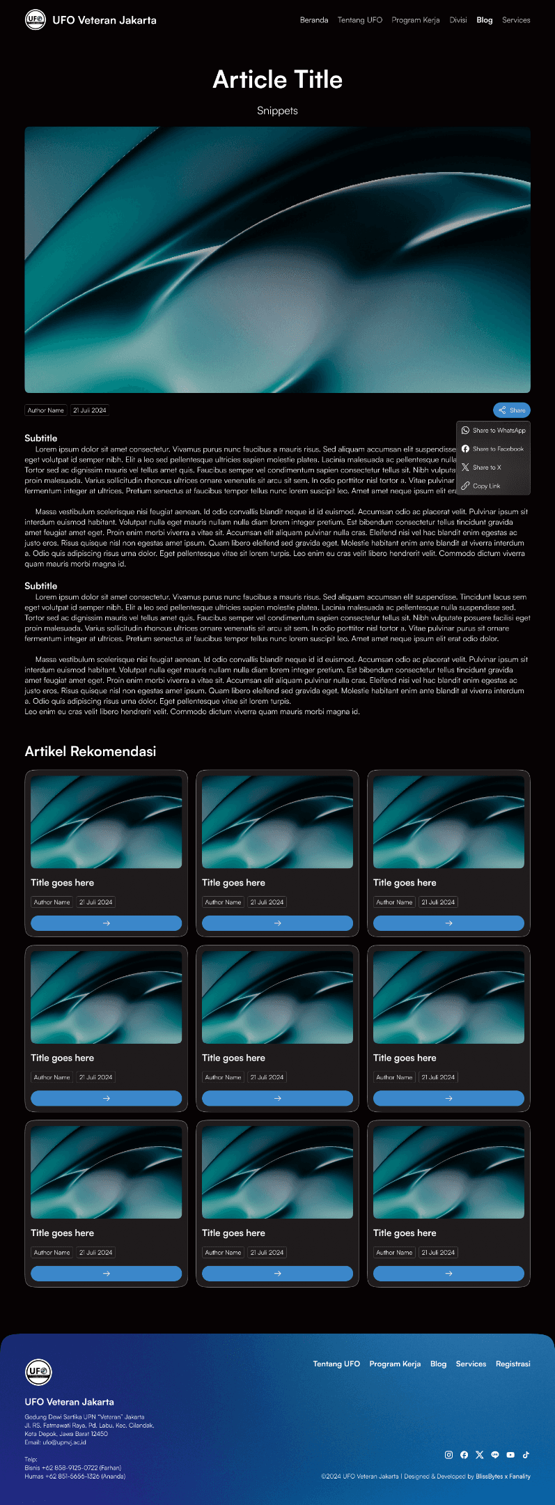
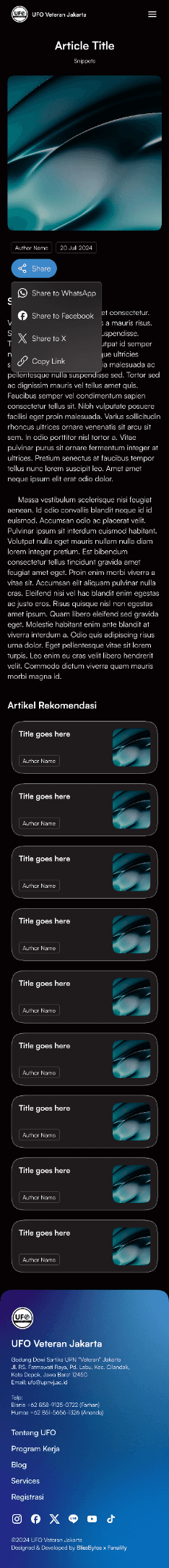
Article Page
On each article page, the design will be like this with a huge image thumbnail, a full-width text, a share button, and 3 x 3 other article cards in the recommendation section. All of these were requested by the project manager such as the specific image ratio and the total of cards in the recommendation section.
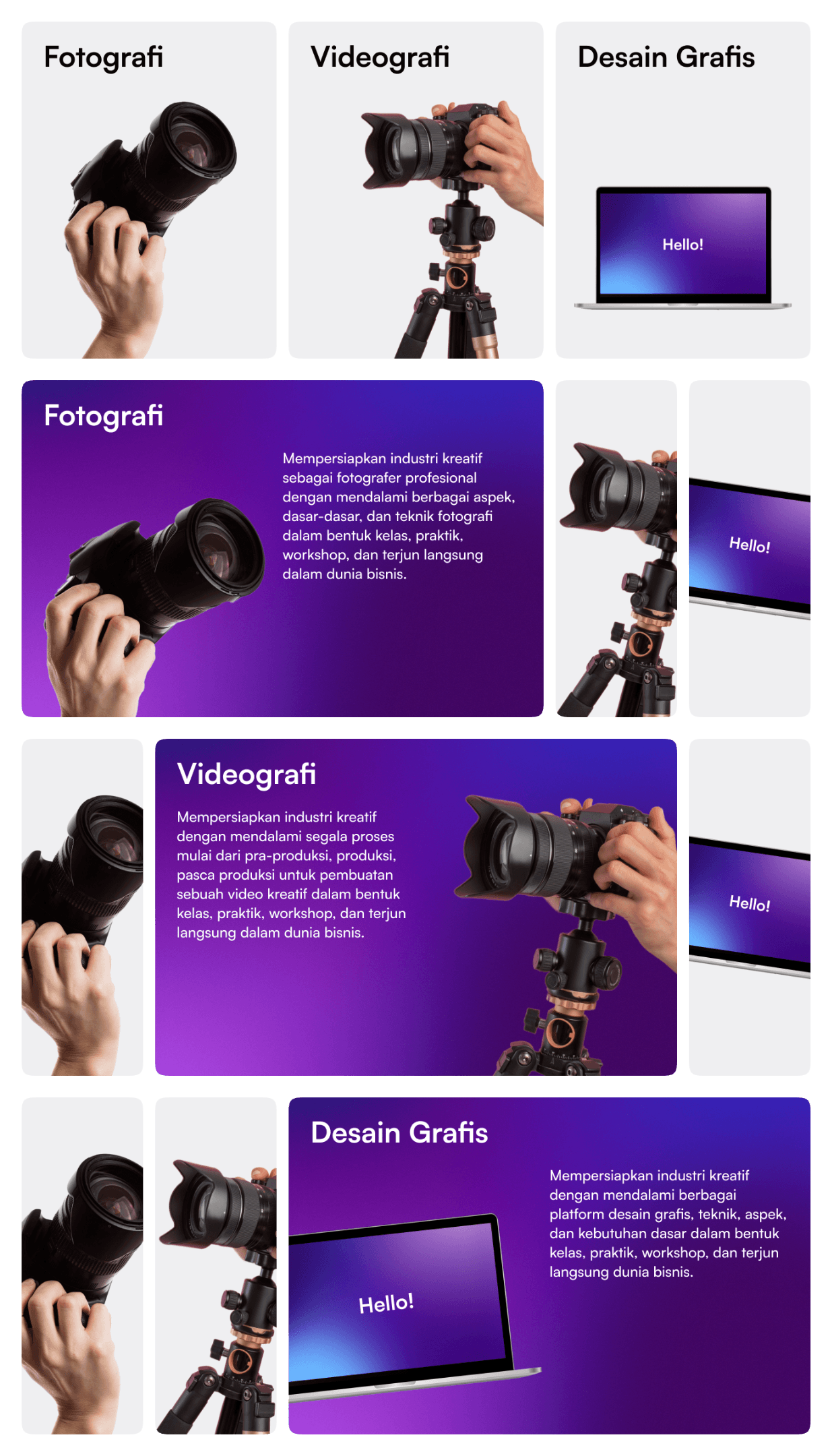
Services Page
The last page that we designed is this service page that shows UFO’s service, their advantages, and proof of work. This section is specifically designed for users to know all about UFO’s service and see their portfolio.
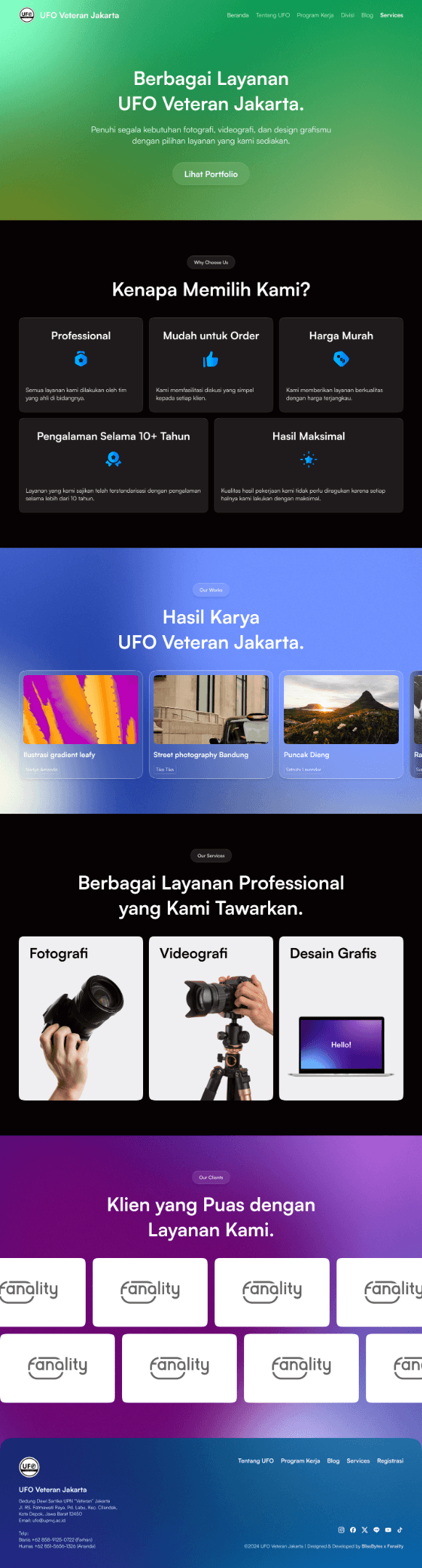

For this service page, we created interactive cards that show all UFO’s services compactly and simply:
Measurable Outcomes
After we completed the design of each page, we sent it to the clients and they approved all of it without any revisions. This was due to their wanting the website to live as soon as possible so every design that is done will go directly to the development stage. Hence, we can’t measure how the design outcome with usability testing or using other metrics.
Limitations & Lesson Learned
Working on this project was a nice experience, exploring various design styles and giving room for exploration with unusual themes. We’re happy to be able to participate in creating a new experience for users when using UFO’s website with the fresh design and interactive elements. Their collaborative way of work also made us enjoy working on this and giving the best of our design quality.